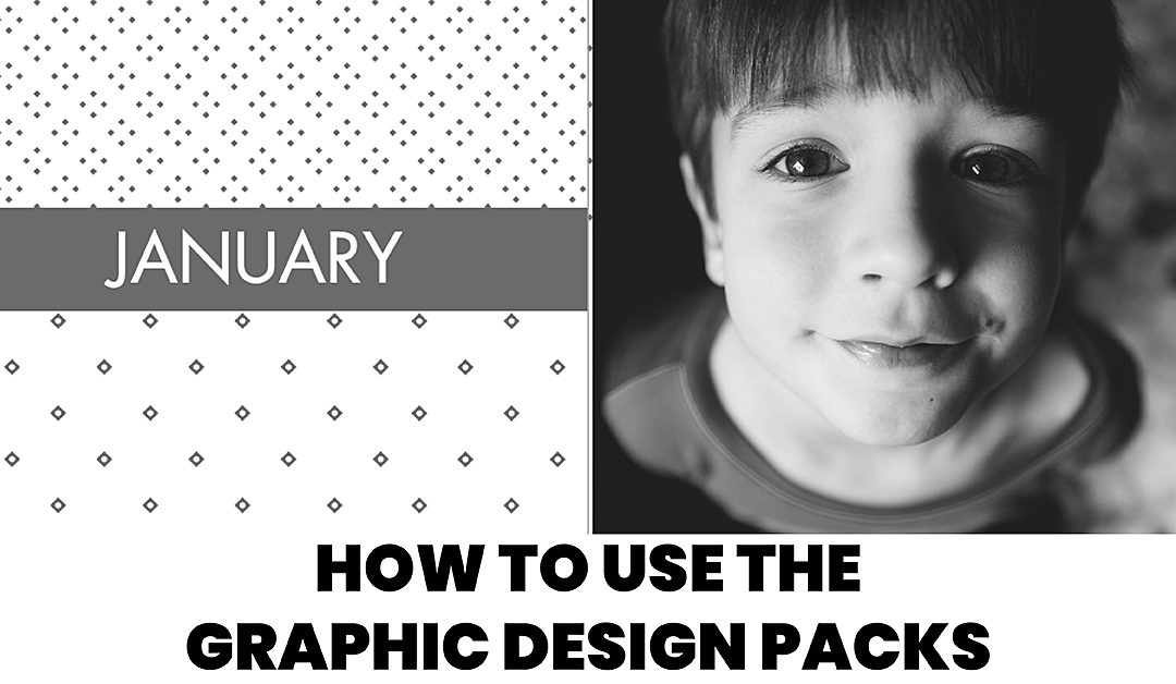
Using the BTP Graphic Design Packs
Disclosure: Some of the links below are affiliate links, meaning, at no additional cost to you, I will earn a commission if you click through and make a purchase.
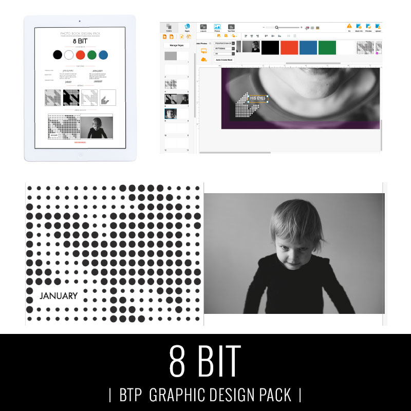
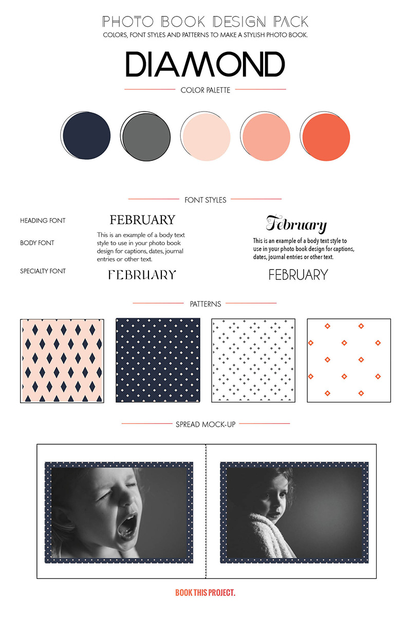
One of my goals this year is to flex my graphic design muscle. It’s been a while since I’ve focused on how color, font styles and patterns can come together to customize a photo book. And with everything in life, one only improves with practice.
So this year, every month I’m creating free graphics – that includes color jpegs + CMYK values, font ideas and several patterns – to help “dress up” your photo book. My graphic packs are free during the month they are released and then will be in my shop for $10 when the month concludes.
While every download comes with general instructions, I thought it would help to see how exactly you can use these graphics to transform your photo book from blah to amazing.
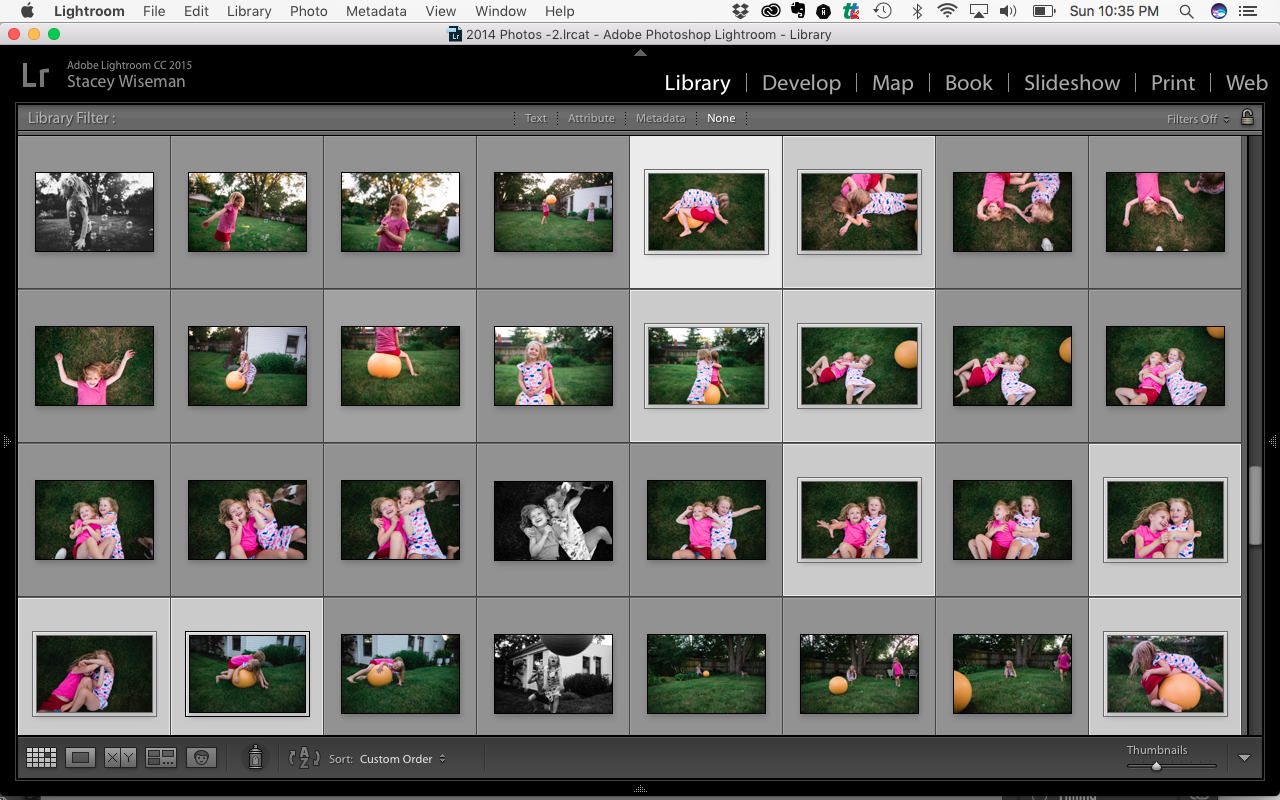
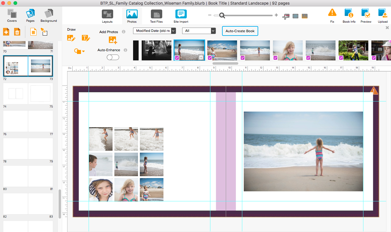
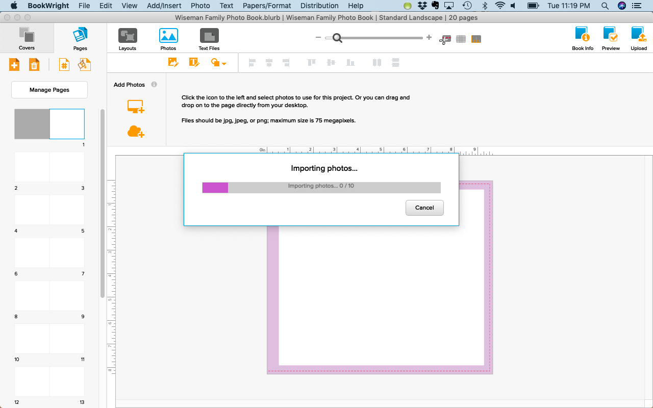
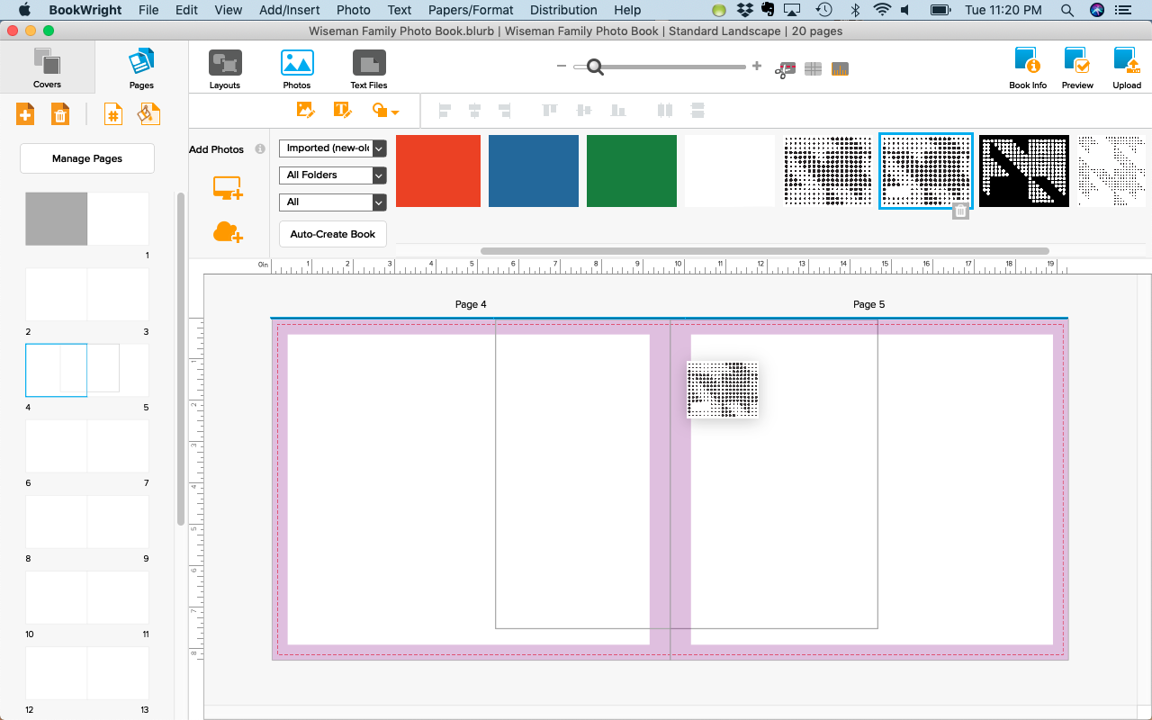
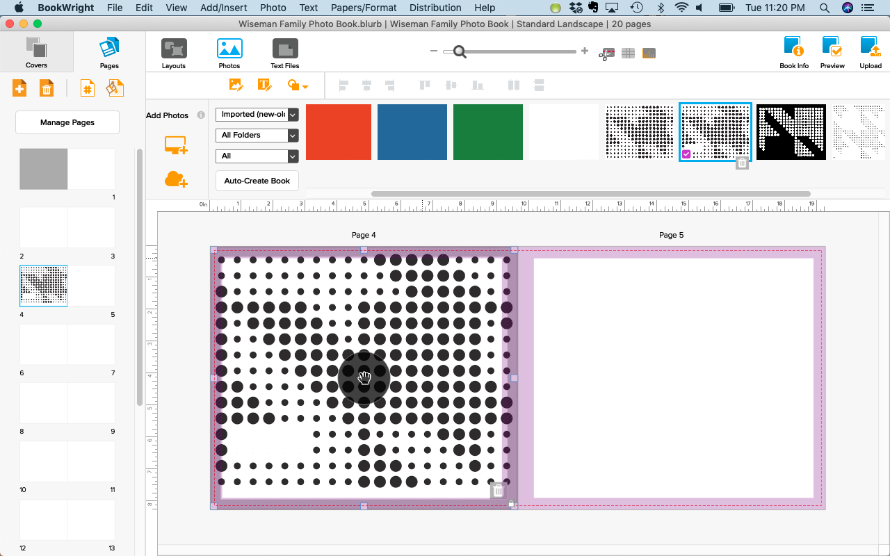
Import and use the graphic images from the design pack you want to use in your photo book just as you would any other photo.
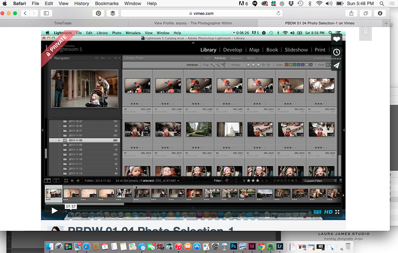
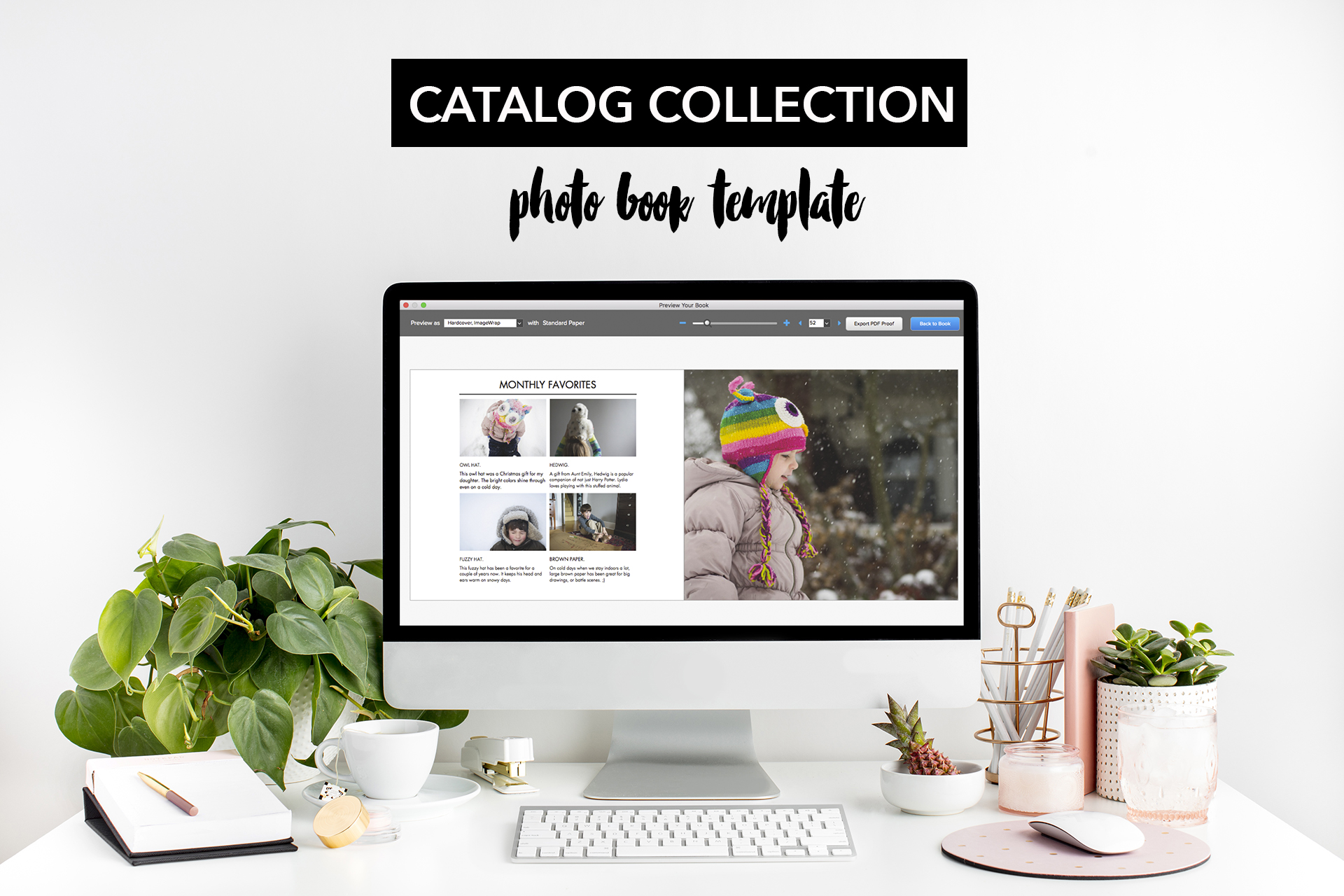
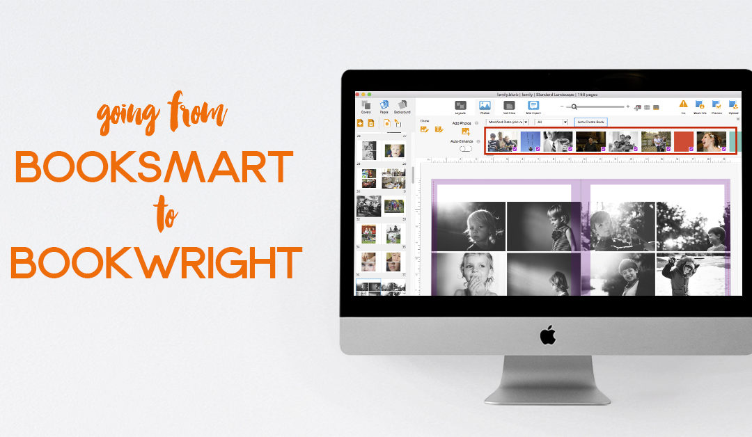
If you’re new to making photo books, I recommend Blurb’s BookWright free software tool (clicking this link will support Book This Project) and you should definitely check out my workshop, Document Your Year. This workshop shares everything you need to know to make a beautiful photo book for your family.
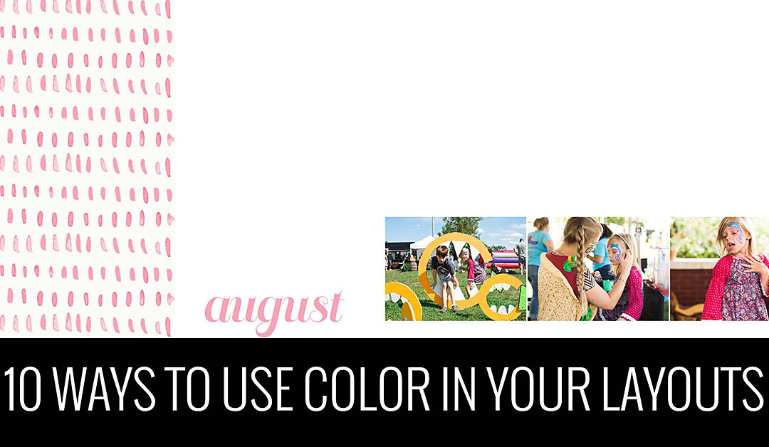
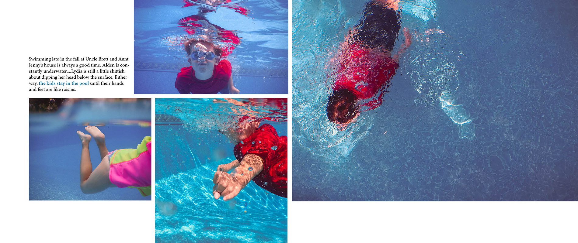
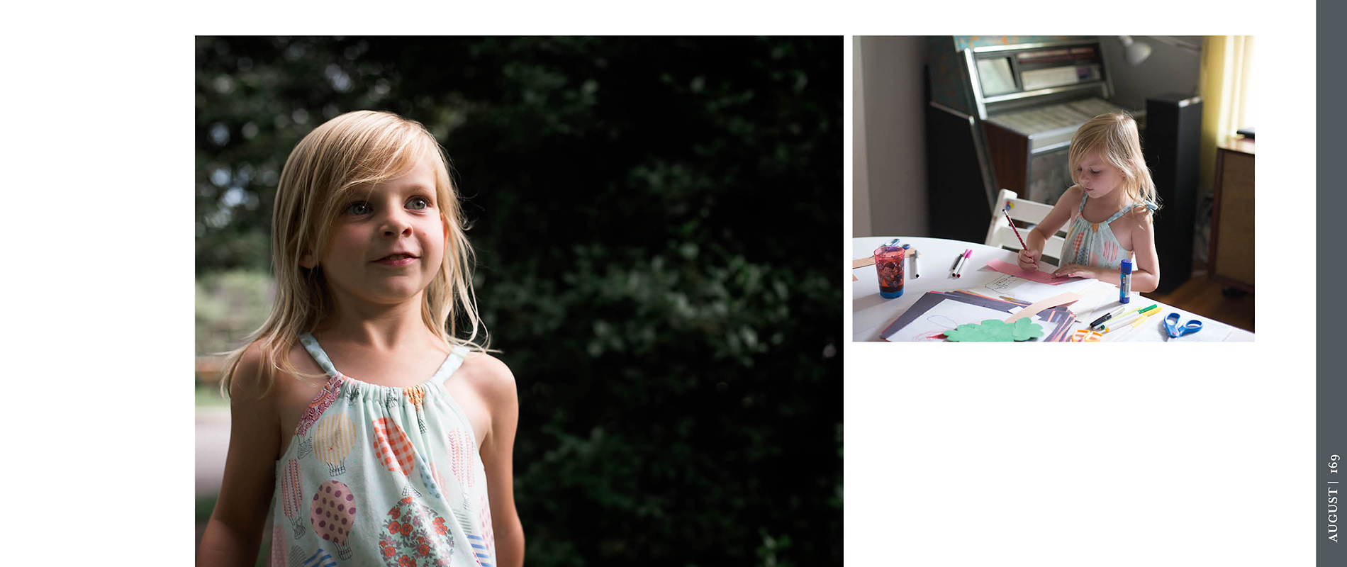
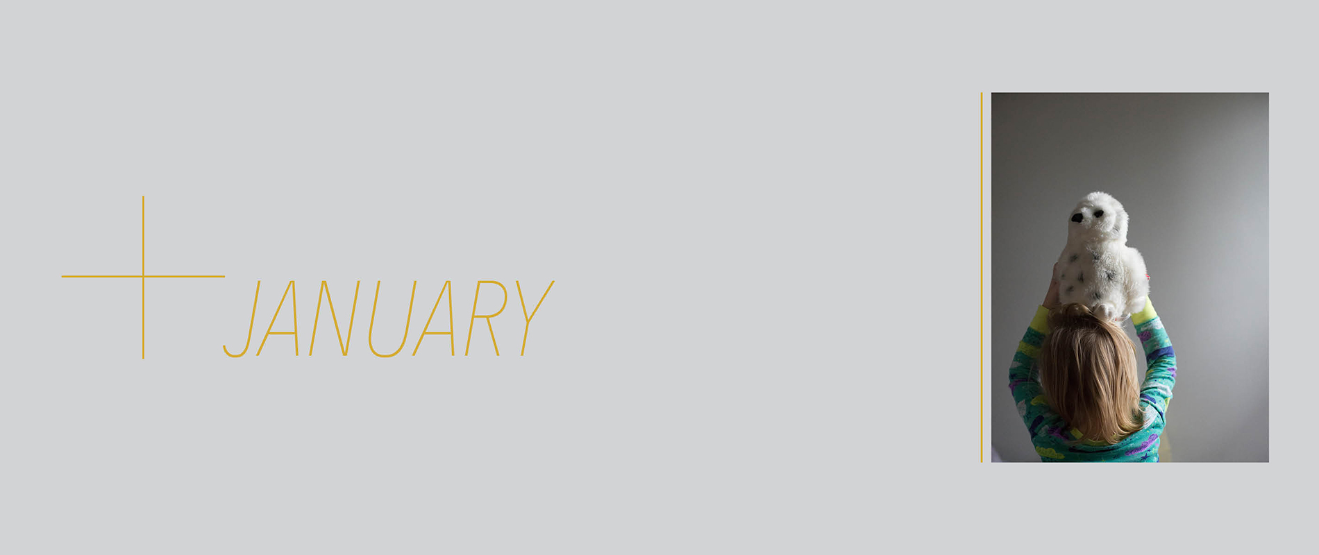
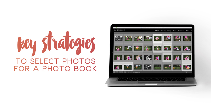
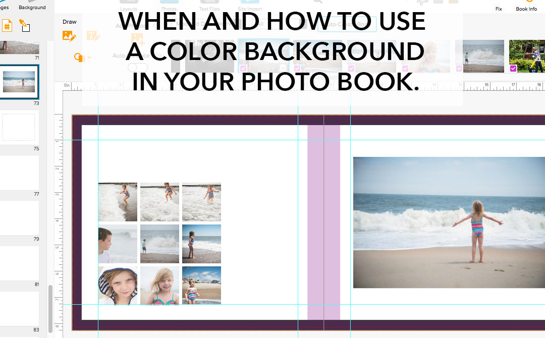
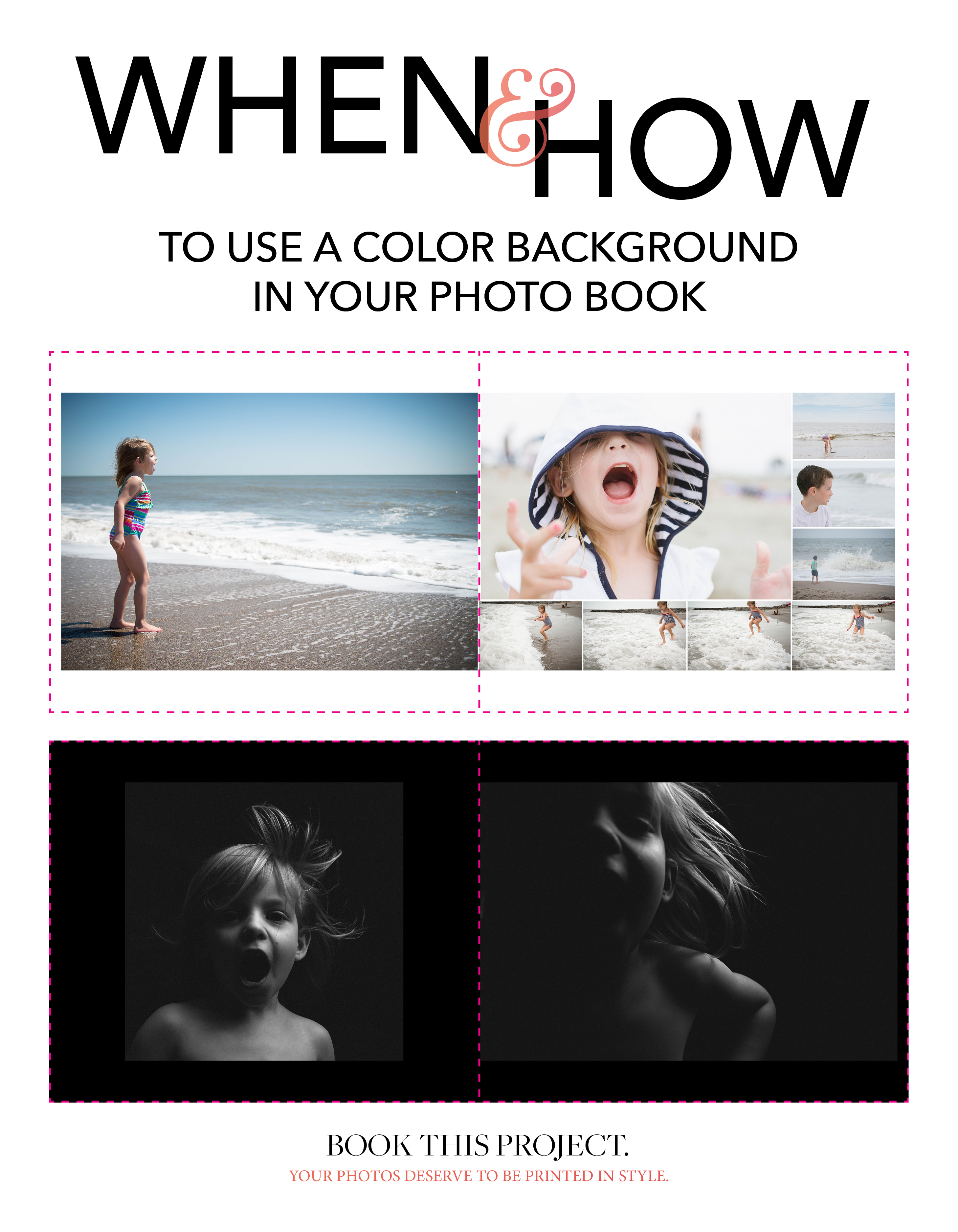
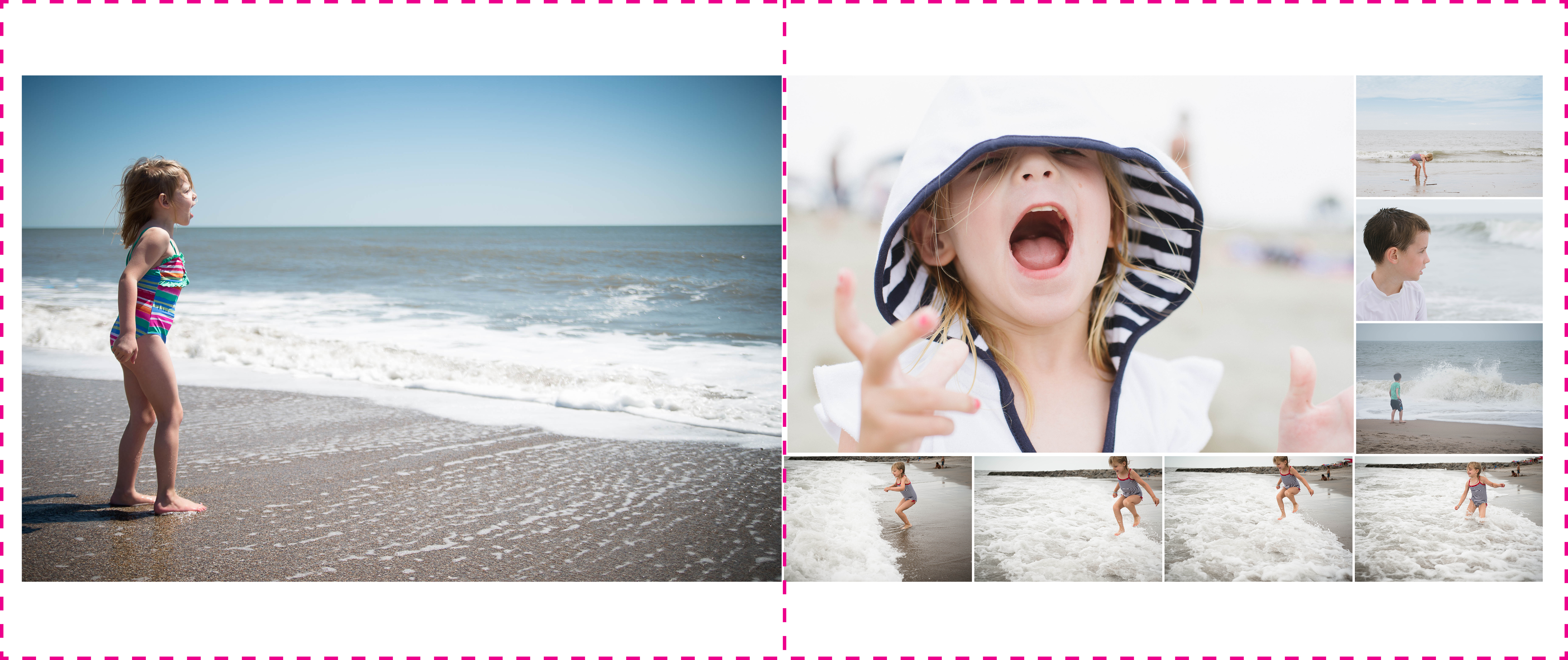
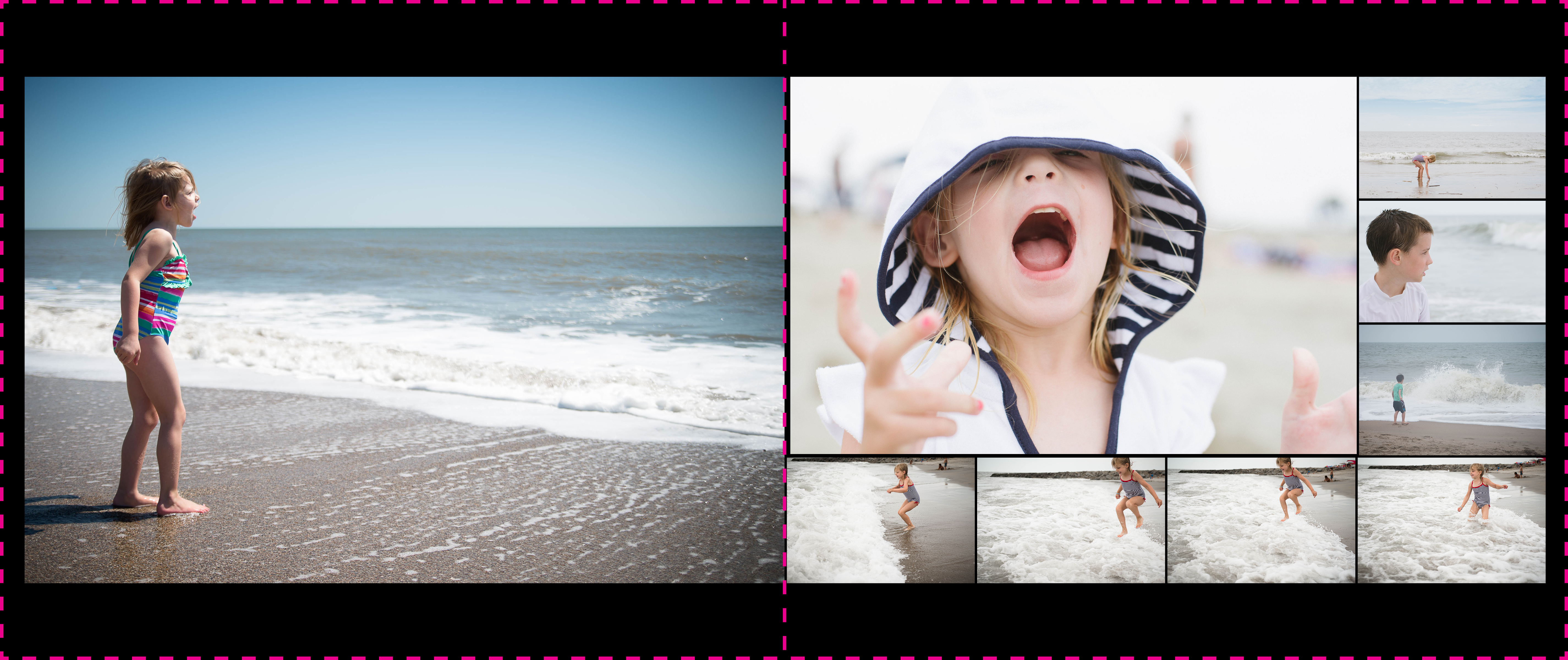
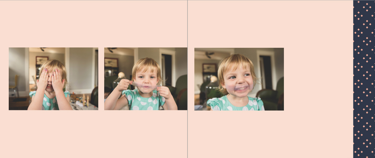
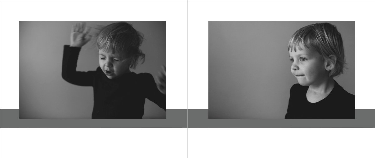
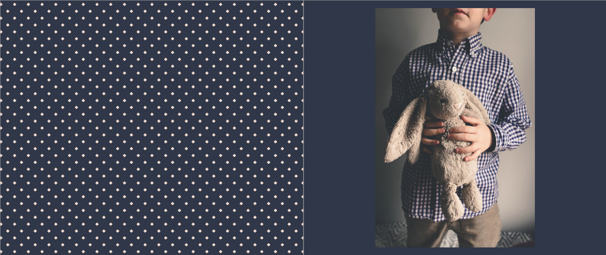
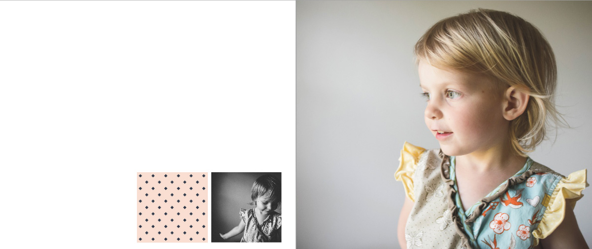
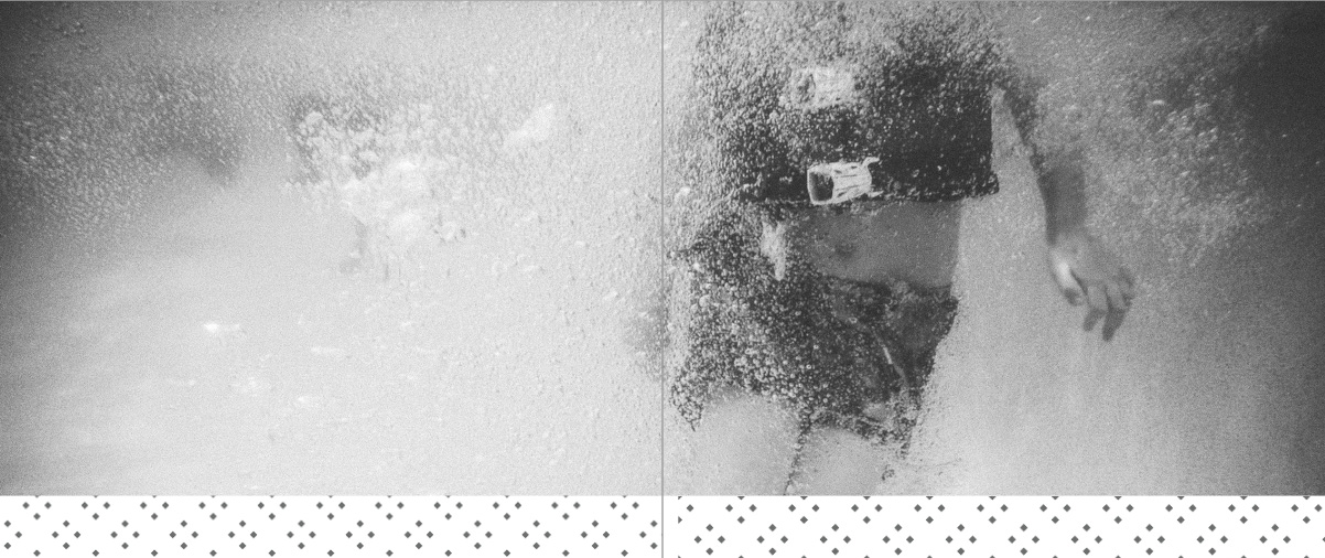
Once you download the BTP Graphic Design Pack you may be thinking, “This is great….but now what do I do with them???” So I wanted to share 12 layout examples to show you how the BTP Graphic Design Pack can make your photo book amazing. These examples are just to get your creative juices flowing. There are so many ways you can use the colors, fonts, and patterns in the graphic design pack to make your book a perfect reflection of your design aesthetic.
I’ll be sharing more examples on Instagram – make sure to follow me here. And I’d love to see how you incorporated the graphic elements into your own photo book. Simply use the hashtag #btpgraphicdesignpack when you post a screenshot of your example.
In these examples, notice the scale, placement, and mixing of different elements are incorporated on the page.


Sign Up to get the current free BTP Graphic Design Pack.
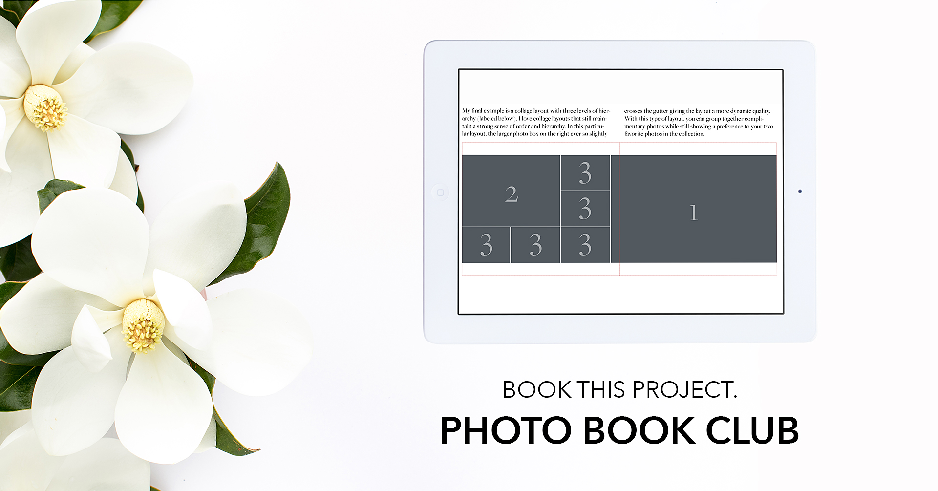
Check out other BTP Graphic Design Packs.