What is one of the biggest reasons people do not finish their photo book? Photo selection.
I hear it over and over again from people who have a hard time finishing – well, even starting – their photo book.
It’s easy to understand why. We become so connected and personally attached to our photos, it’s difficult to look at them with an objective eye. I completely understand. As someone who designs photo books for myself and others, it’s much easier for me to select photos for my clients than it is to select my own photos for a book.
But never fear! I have two key strategies to help you select photos for a uncluttered photo book.
1. Message
The first strategy is to define what is the message you want to convey for a particular day, event, moment? What is the perspective you want to come across when viewing a particular set of photos?
You could focus on the action of an event. Or interaction. Or facial expressions.
Any of these work. It’s just a matter of defining the message you want for a set of photos to be placed in your photo book.
2. Hierarchy
Once you’ve figured out what message you want to convey, it’s time to decide the hierarchy of the photos.
Hierarchy is an important concept in design that essentially establishes order within the design elements. This can also help as you select photos because you can decide what photo is the most important to convey the message you want to convey and what, if any, photos need to play a supporting role.
In some cases, you may only need one photo to convey the main take-away message you want. Or you could have several photos that play an equal role in developing the message. Other times, there is one photo you want to feature with other photos to support the main photo.
Think about this typical photo-worthy event: documenting a visit from your kids’ grandparents. Here are three likely scenarios:
1. Emotion. Select one photo from the visit that highlights your the excitement felt during the visit. It could be the initial hug between them when the grandparents first arrived.
2. Interaction. If you wanted to focus on the interactions throughout the visit, you could select two photos that feature your favorite two moments – such as reading a book together and eating lunch together. In this example, you don’t have to select a photo for every single interaction; just your two favorite.
3. Activities. Let’s say this was a longer visit than normal and a lot occured during the trip, it may be hard to select one or two photos. In that case, you may want to create a collage of images, 8-12 photos, documenting the visit. For this example, select the strongest photos that best describe the visit so it doesn’t become too overwhelming once they are placed in a layout.
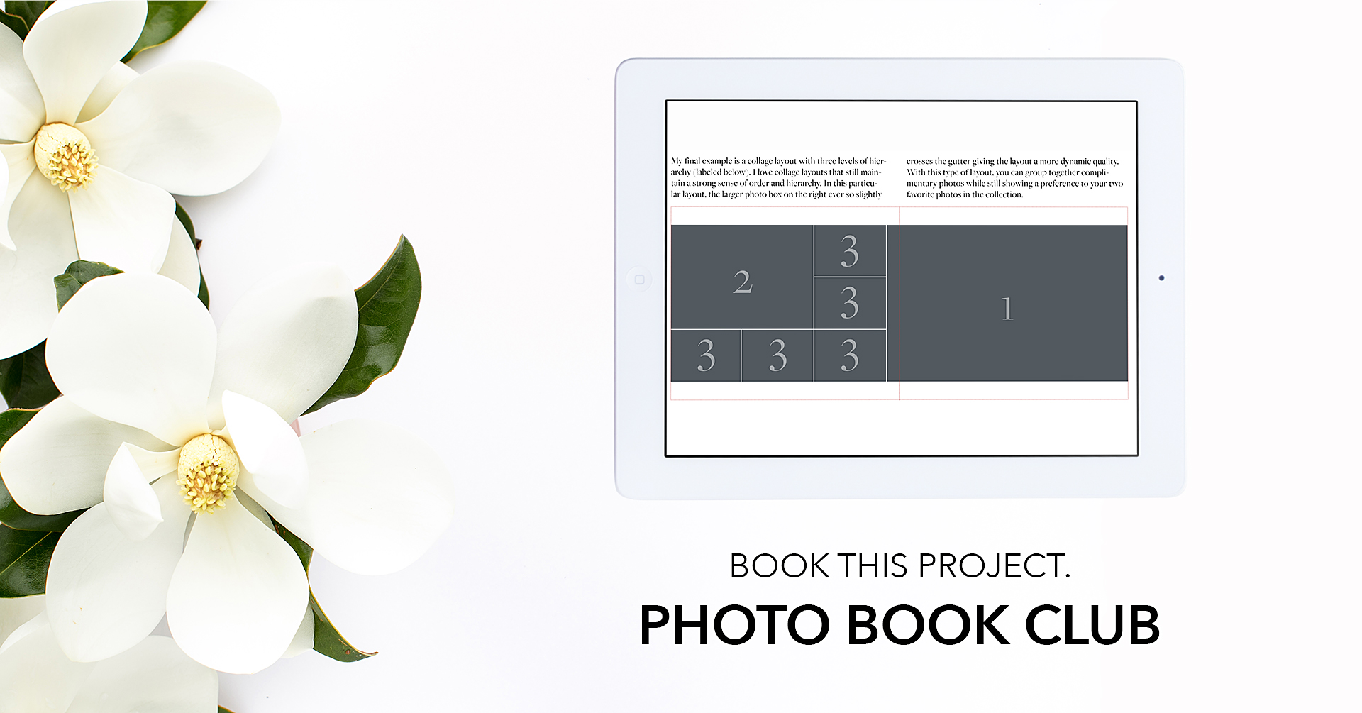
Example
Sometimes it takes seeing an example – from selecting photos to designing the layout – to make everything click.
First, let’s start with the photos in my catalog for a particular event – a family weekend at my mom’s where my daughter had a blast playing with her cousin.
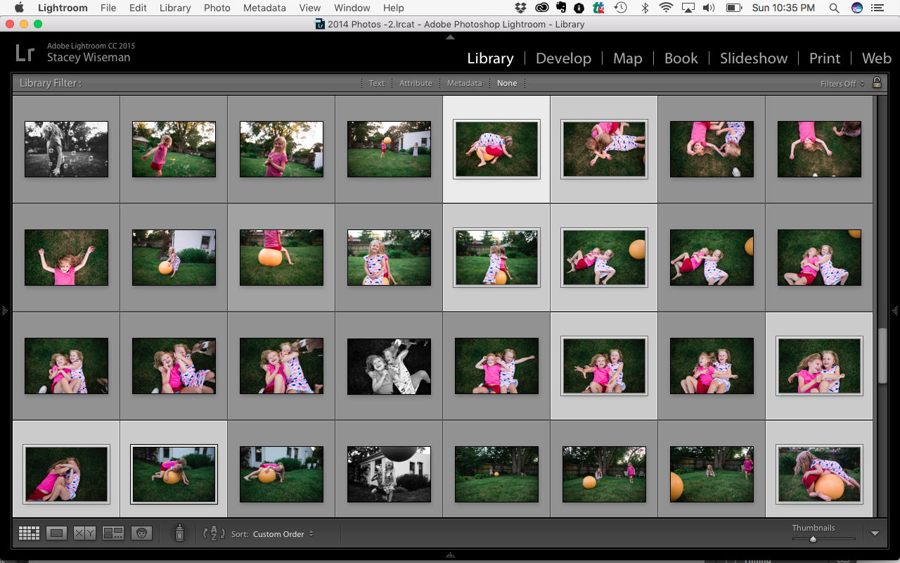
From the 32 photos above, I selected my favorite 9 photos. Already, I’ve narrowed it down to a quarter of the original photos making it easier to define what it is I want to say and the best way to say it.

With these 9 photos, there are several ways I could select and design a layout based on what message I want to focus on and the order required to best tell that story. Below are three different examples.
EXAMPLE 1

This layout features all 9 photos….because sometimes it’s too hard to keep narrowing down the photos! But you’ll notice, even in this layout with all of the photos, there is still a message and hierarchy.
Message: Quantity – By keeping all 9 photos, I’m prioritizing the amount of time they spent playing with the exercise ball because they were having such a fun time.
Hierarchy: Two of the photos are featured at a larger scale than the others in the layout. These were my favorite photos from the moment. They both focus on the interaction and bond between the cousins. Also, notice how the page on the left is only of the cousins and the page on the right is all of the photos with the exercise ball. This adds order and purpose to the collage.
EXAMPLE 2

Message: Play. In this selection, I’m focusing on their play to highlight their interaction. I wanted to seelct photos that best exemplified them playing together.
Hierarchy: My goal was to find four images of them tangled together (placed in a grid) to contrast that with one photo – my featured photo – of their interaction where we could see their faces.
EXAMPLE 3

Message: Action. This selection is all about the action – specifically a before, middle and after. Focusing on the action made it really easy to narrow photos. Here, it’s not necessarily about showing everything. Instead, I’m zeroing in on one before, middle, after set of photos to encapsulate the gist of this particular moment.
Hierarchy: When designing the layout, each of the photo boxes are the same size and arranged in a linear fashion to reinforce the action conveyed by the photos. The result is a clean, simple layout.
WANT TO LEARN MORE ABOUT
HIERARCHY IN DESIGN?
BECOME A BTP PHOTO BOOK CLUB MEMBER.
This month’s lesson features how to use hierarchy to create layouts, select photos and use text on photo book covers. When you sign up, you’ll get access to all of the lessons in 2017 plus access to a private facebook group.