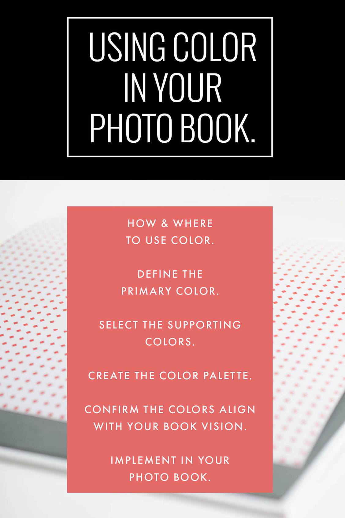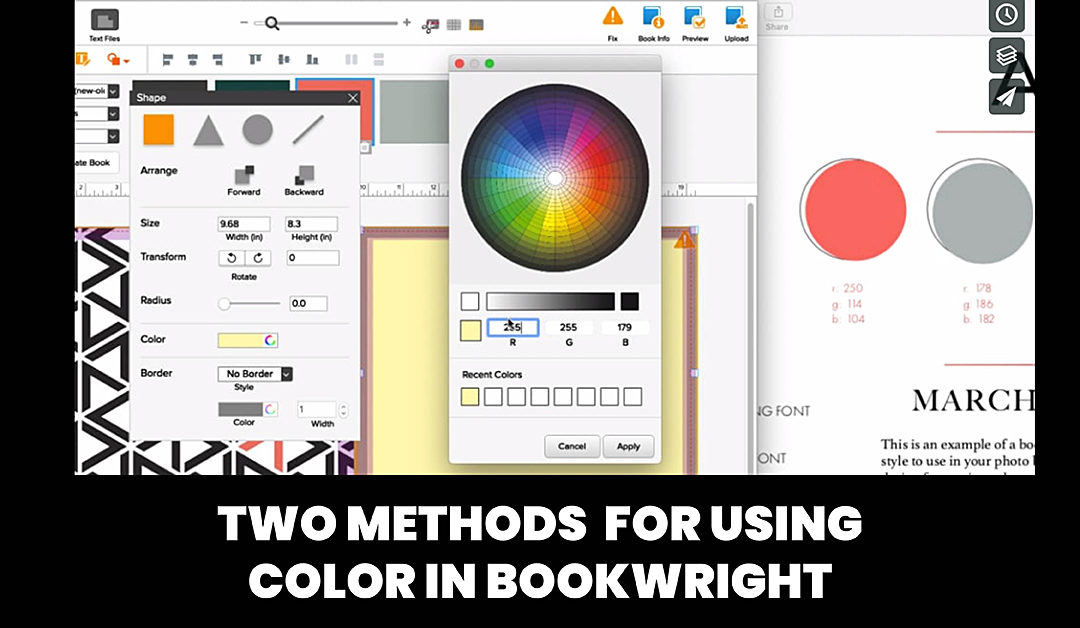
Two Methods to Add Color to Your Photo Book
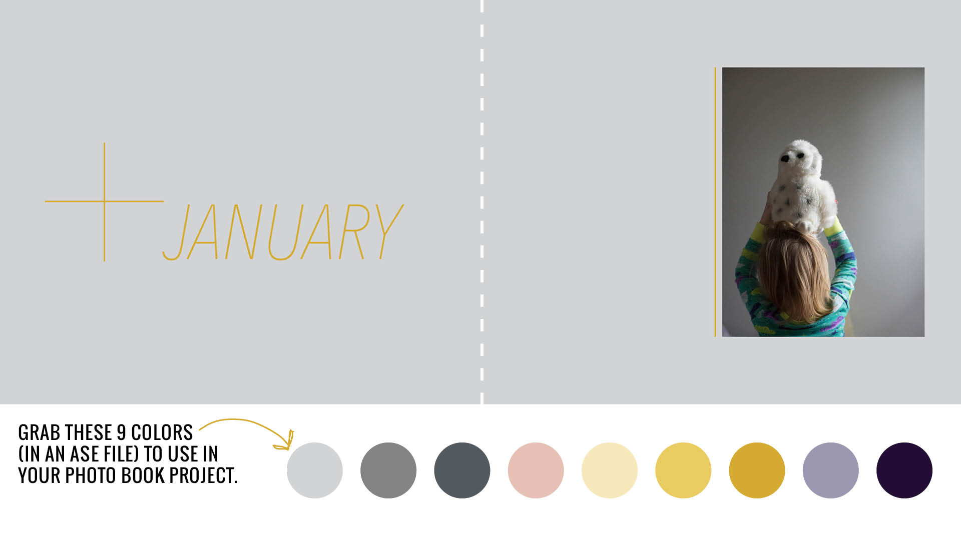
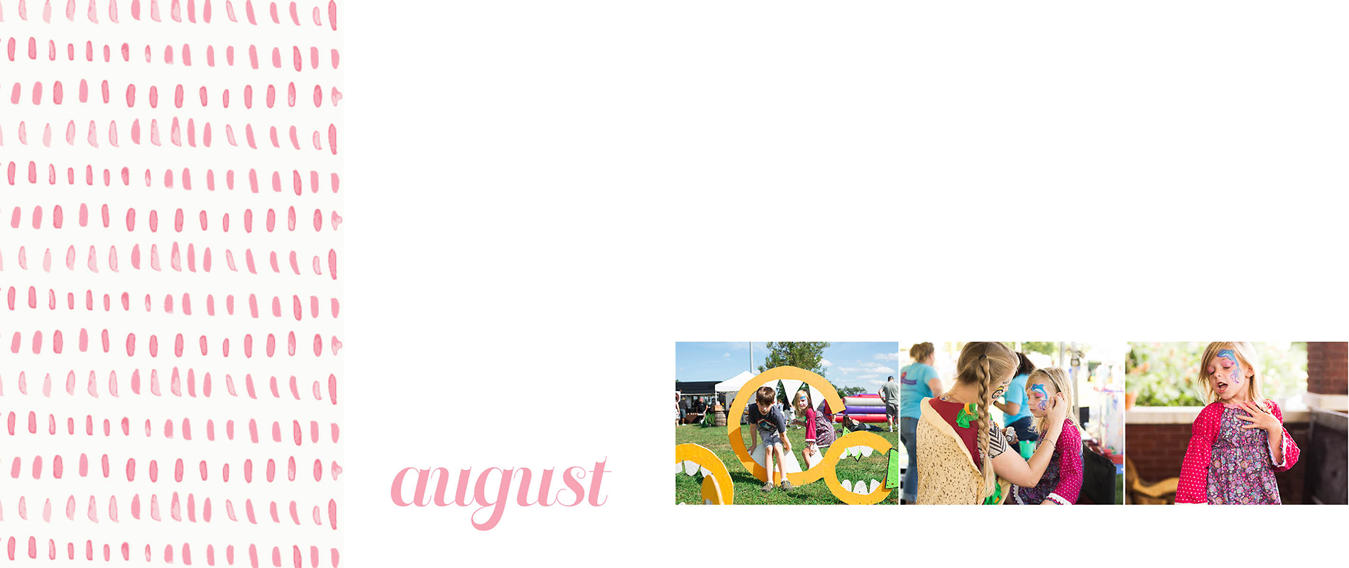
One quick and easy way to make your photo book look more intentional is to have custom designed divider pages. If you’re including these pages in your photo book, I recommend having them stand out from your other pages with design elements, text and/or color. However, I also understand – you don’t have a lot of time to customize these pages.
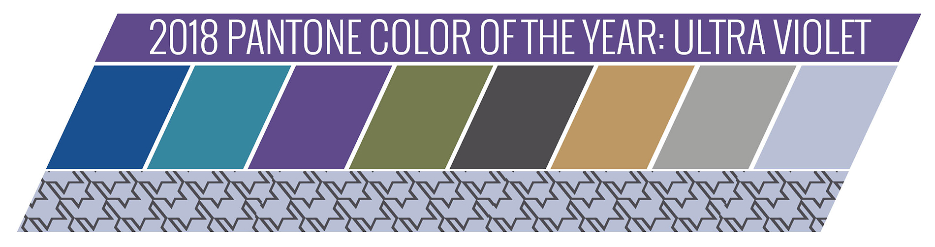
It’s one of the reasons I’m creating my Graphic Design Packs every month. These design packs will quickly introduce color or patterns on your pages, particularly the divider pages in your photo book.
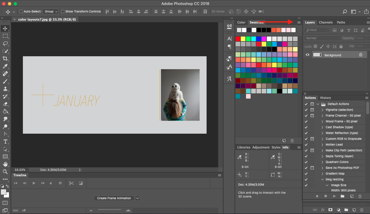
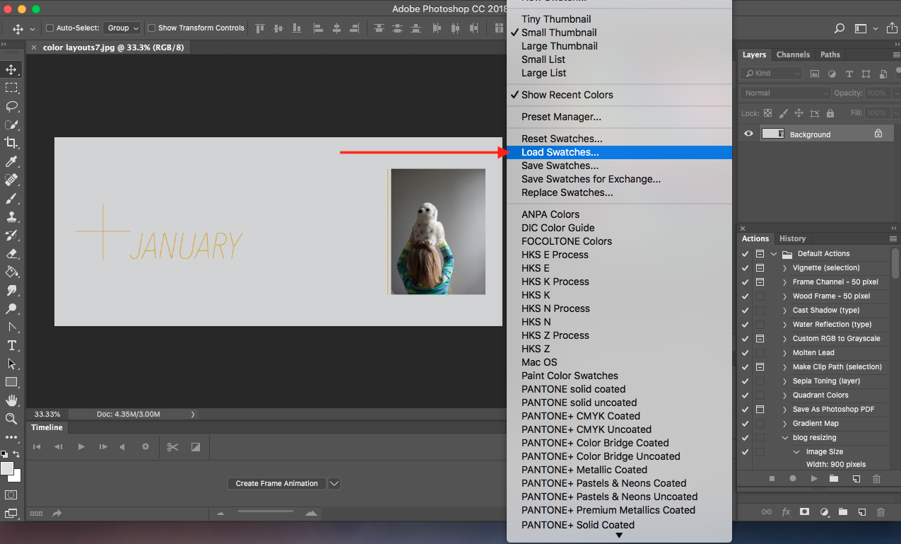
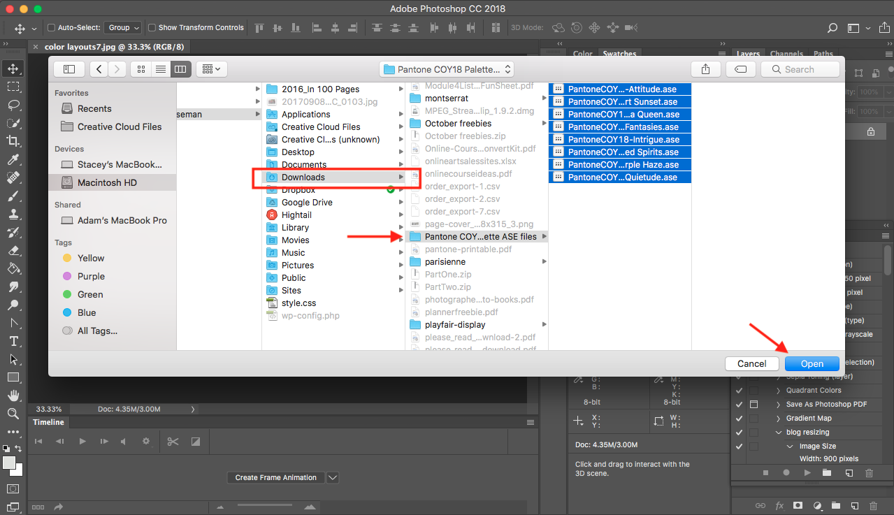
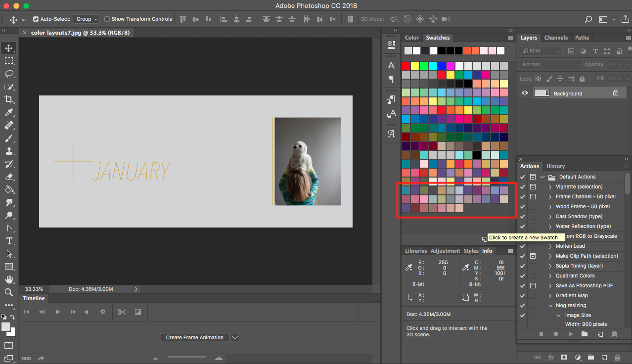
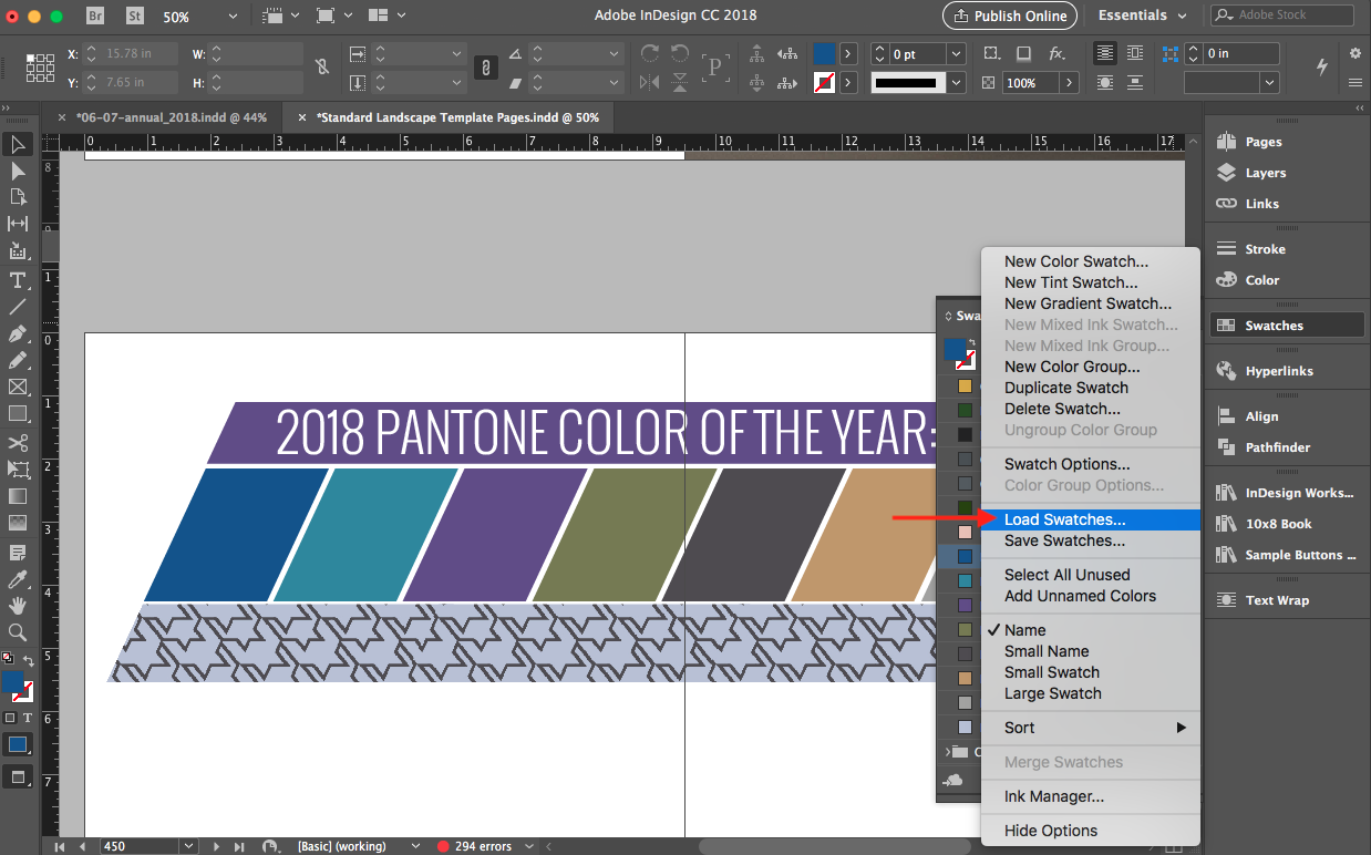
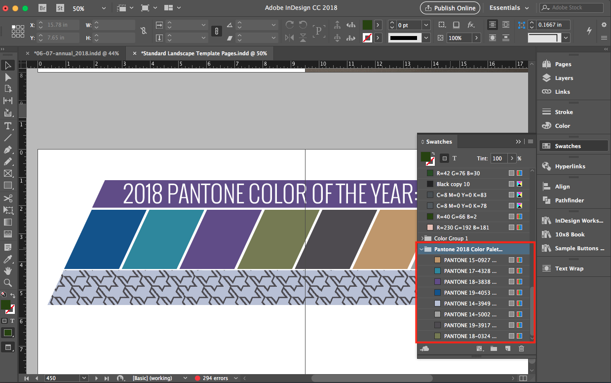
There are two ways to add color if you are using Blurb’s free software program, BookWright. Whether you are using colors from my BTP Graphic Design Pack – or – creating a color profile on your own, this video tutorial shares the two methods to achieve add color to your photo book.
Want to learn even more tools in BookWright?
Check out my free email series sharing 5 design lessons to make your photo book more stylish without overwhelm.