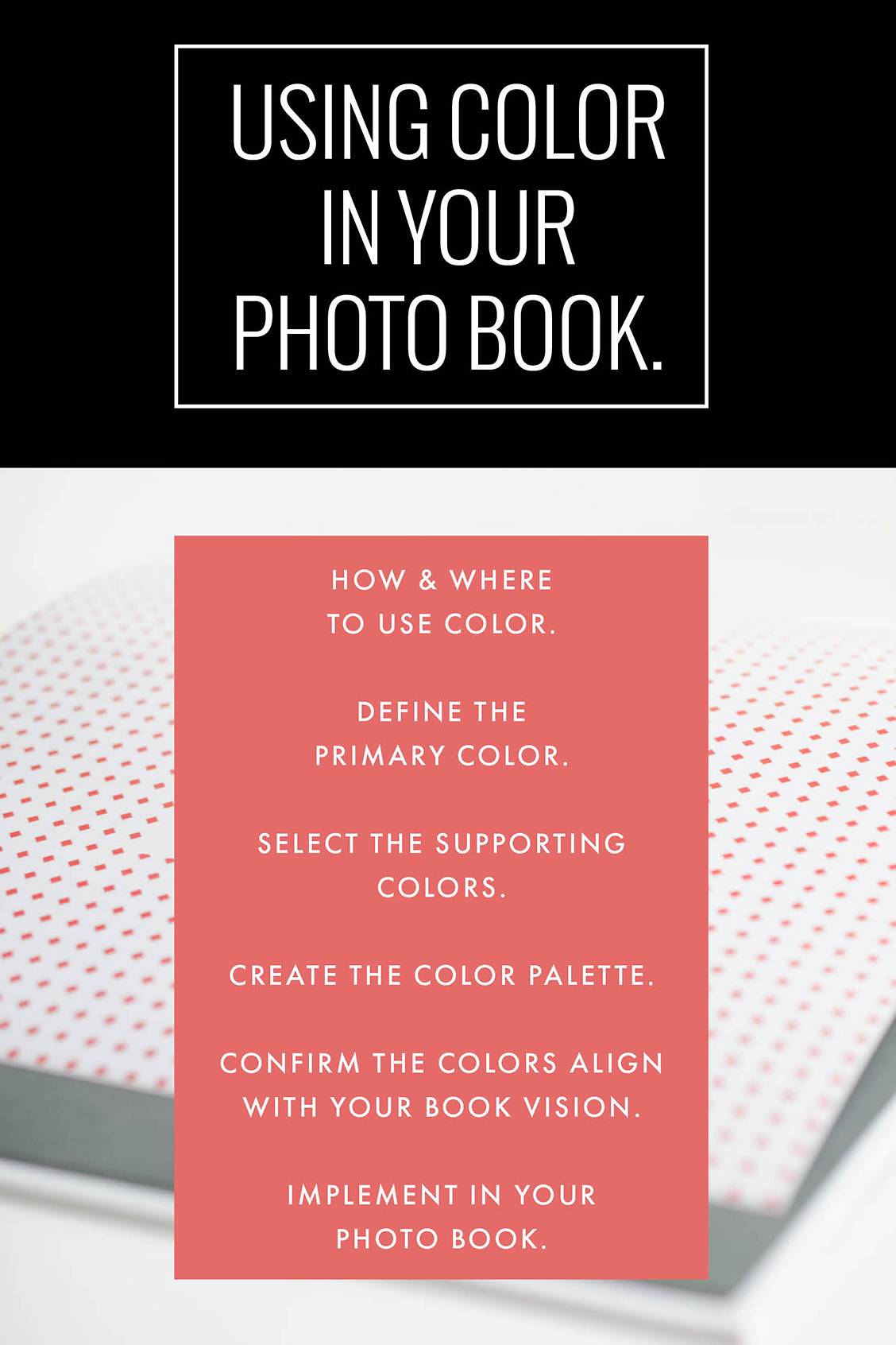
Lately, I’ve been in the mood to add color to my layouts. In my last blog post, I should 10 ways to add color to layouts. But those suggestions were more for you to pick and choose. In today’s blog post I want to share how you can add a color palette throughout one of your photo books.
This step is something that you should consider the beginning of the design process, if possible. Here are my decision-making steps:
-1- Select how and where you want to use color.
-2- What is the primary or dominant color you want to use?
-3- What color(s) could support the main color, if any.
-4- Define the full color palette.
-5- Does this color palette support the overall vision you originally wanted?
-6- Implement in your photo book design.
Now let’s see these steps in action. I’m going to use a typical annual photo book for this example.
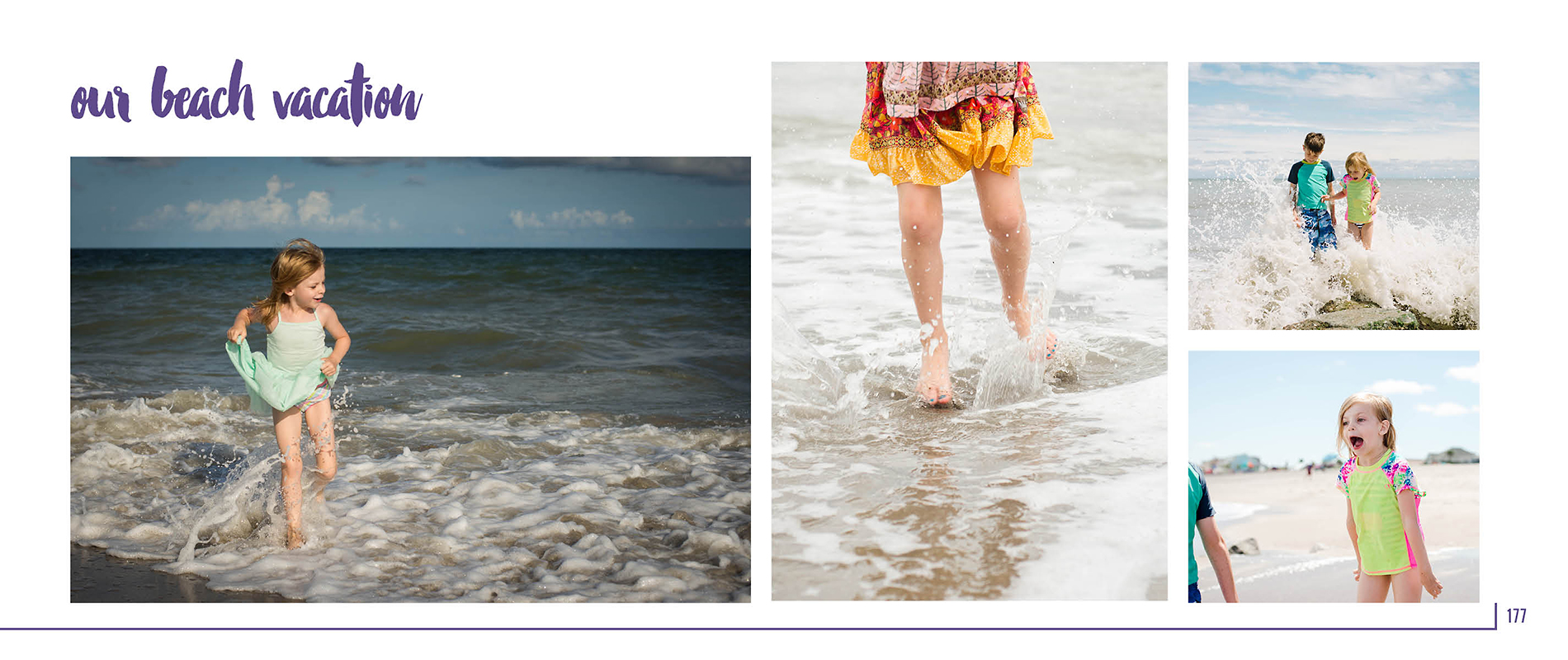
I want to use a color palette for section pages, page numbers and any titles on the page. I want to use the same color for all three places. But on the section page, I want to use two other colors to add design variety.
The dominant color will be the 2018 Pantone color:
The supporting colors should be more neutral to balance the purple color. On the Pantone website, they provide several different color combinations. I selected one that resonated with the balanced scheme I was looking for this particular photo book.
Here is my color palette.

This color palette matches my original vision because I wanted my family photo book to be fun yet classic. I want the design to have personality without being too bold.
And here’s the result:
Section Page:

Typical Page: