Once springtime arrives and flowers start blooming, I yearn for some vibrancy in my photo book layouts. Yes, there’s usually color in the photos, but I’m talking about a consistent and thoughtful use of color to make the photos pop or add a little something extra to the page.
Today, I want to share 10 easy ways to add color to your photo book layouts. If you’ve wanted to add color but not sure how or if it never looks quite right on the page, this post is for you! Hopefully, you’ll walk away with easy strategies to incorporate into your photo book.
1. A BLOCK OF COLOR TO COMPLEMENT THE PHOTO.
Use a color to reinforce the spirit of the photo. In this example, I added a color block that is complementary to the range of blues in the photo but it also adds to the sense of vibrancy, sunshine and overall attitude of boldness found in the photo.
2. A BLOCK OF COLOR FOUND IN THE PHOTO.
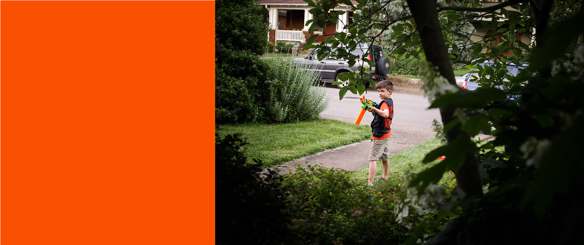
Use a color that is found in the photo. Perhaps one of the easiest ways to use color is to use an eyedropper tool to pull out a color you want to reinforce. In this example, I could have selected a green color and that would have heightened the sense of peaking in on my son playing with his nerf gun. However, I chose to select a color similar to his shirt and nerf gun to highlight the center of the photo and the activity.
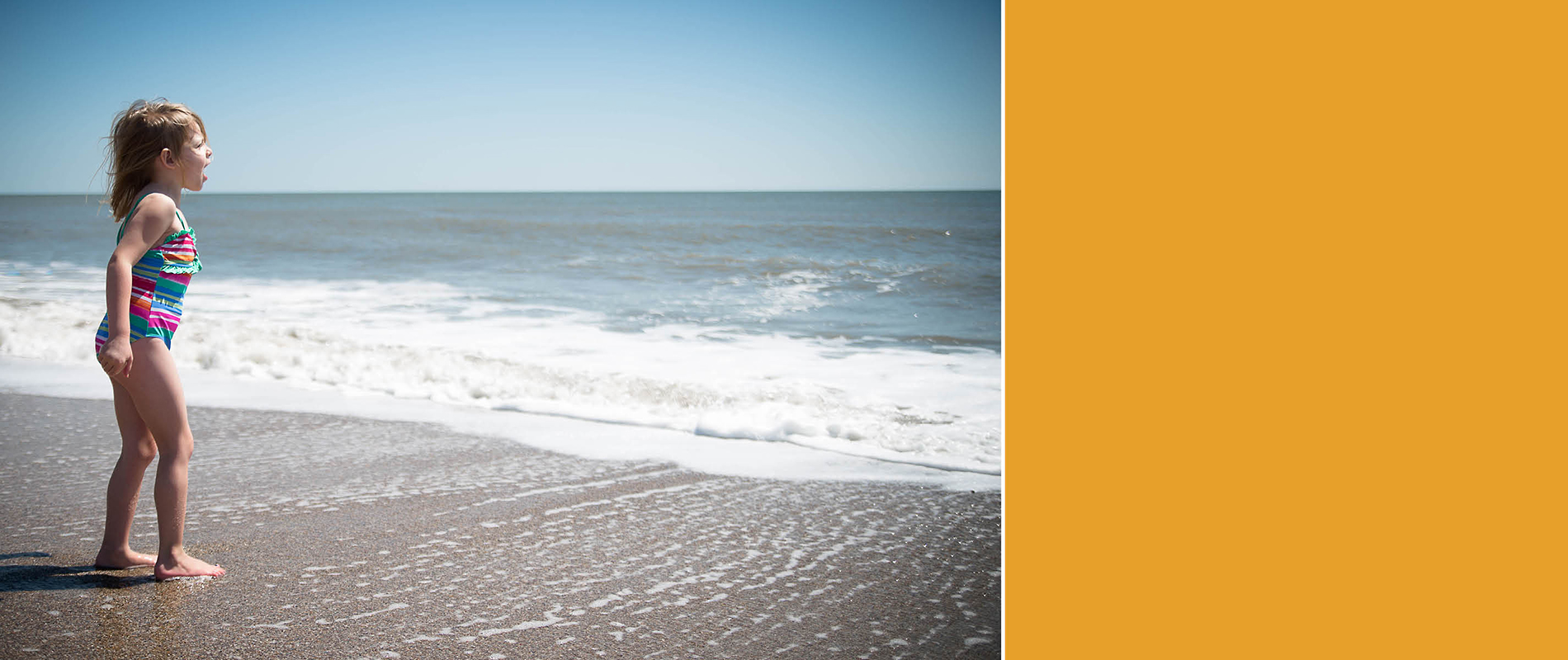
3. COLOR IN THE TITLE.
Use color in a title to describe the photo. This takes care of two things at once: color and a description of your photo. Here, I picked up the red trim from her bathing suit to make the title stand out among the waves.

4. COLOR IN THE TEXT.
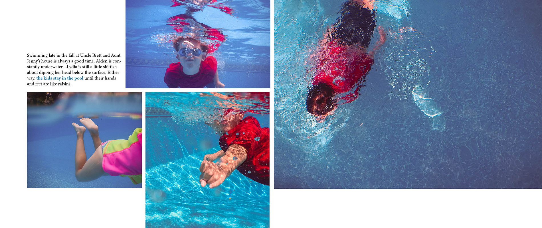
Use color for a specific selection of text you want to highlight. If you plan to use captions throughout your photo book, adding color to the main part of the sentence or paragraph helps to draw the eye to that specific group of words. This is great for people who are skimming through the book to pick up a few key points without having to read the whole caption.
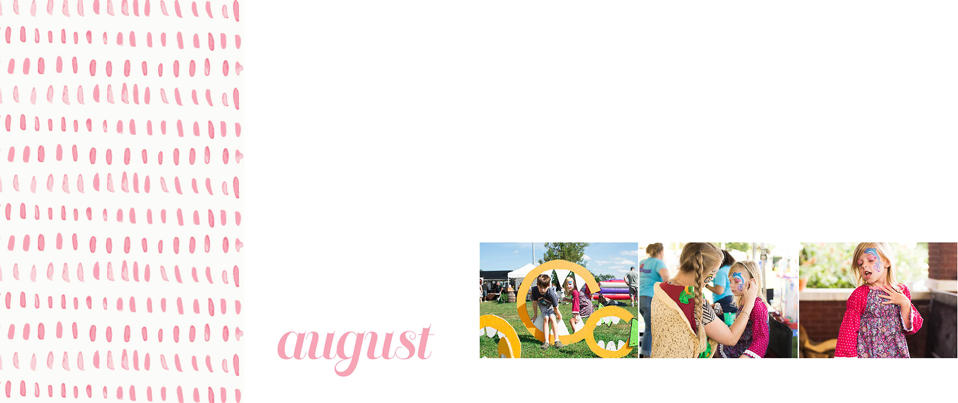
5. COLOR INDICATING THE MONTH.
Use a color block in a similar location on every page to indicate the month. You could use a different color for each month or keep it the same color and switch out the text indicating the month. The color block could be a rectangle or triangle at the corner of the layout or you could use a full width band of color at the edge as shown in this layout.
6. COLOR INDICATING THE PAGE NUMBER.
Use a color font for the page number. This is a very simple way to add color to the layout without it becoming overwhelming. And the great thing with color for the page numbers, is usually you only have to set it once and it repeats the color throughout your book. In this example, I added a small line underneath the page number to add a little extra color!

7. COLOR ON THE SECTION DIVIDER.
Use a color or color combination to specify the different sections of your photo book. In this layout, I’m using a soft gray color with a yellow font to announce each month. The full layout of a color, even a neutral color, makes it very clear when starting a new month in your photo book.

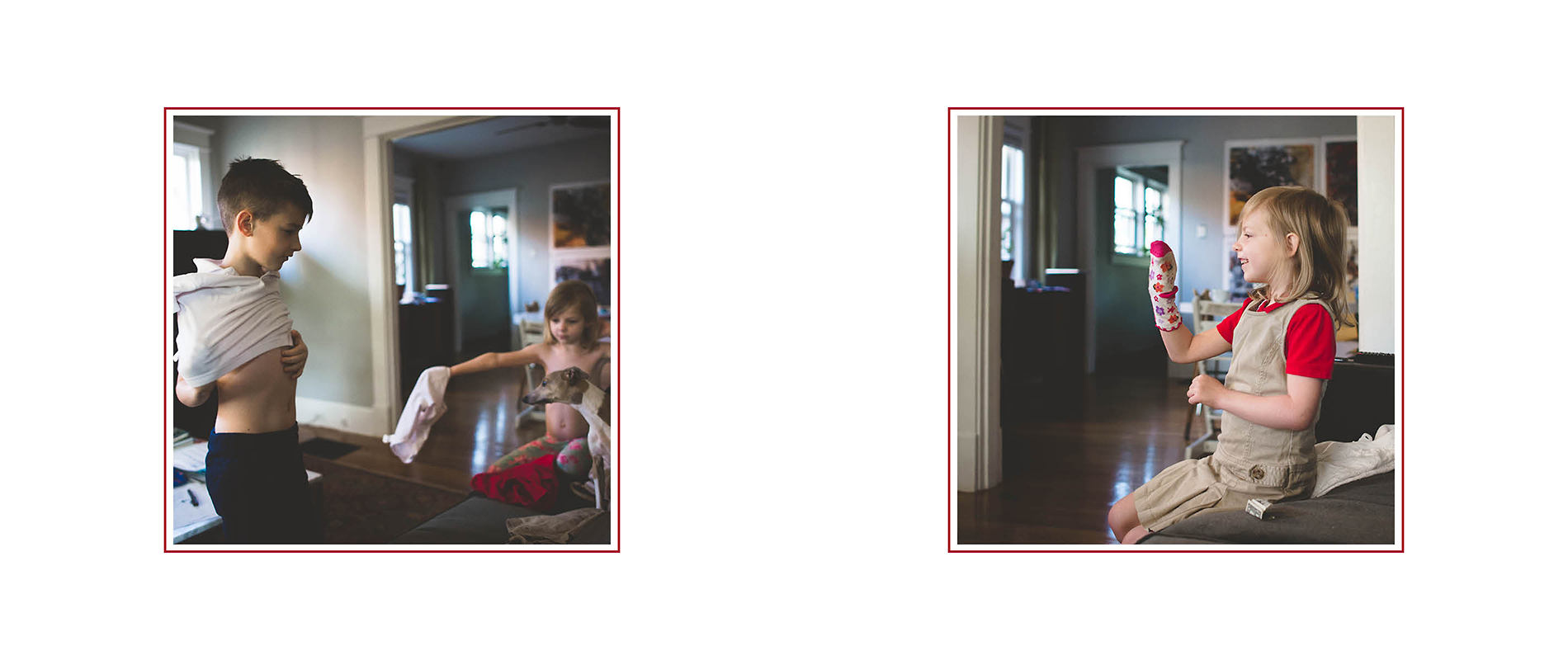
8. COLOR AS A FRAME TO THE PHOTOS.
Use a color to frame the photos in your photo book. This suggestion may be harder to achieve depending on the type of software program you are using, however, adding a thin frame of color around your photos makes them stand out and provide a little more definition on the page.
9. COLOR AS A LINE.
Use a line color in your layouts. Having a simple thin line graphic on the layout add a level of sophistication without a lot of effort. In this example, I created a double line – one thicker and the other dashed – for additional interest. I love how the line graphic in this layout immediately makes her shirt and the piping on the pillow at either end of the photo stand out.

10. COLOR IN A GRAPHIC.
Use a color in graphic or pattern. If you make your own or have purchased your own, adding color to the pattern is a fantastic way to elevate your layouts. The graphic doesn’t have to extend on the whole page or spread. In this example, I’m using a simple line graphic on the left side to provide interest without taking over. A great way to use graphics are on section pages but you could also find ways to incorporate them on regular photo layout pages as well.
So those are my 10 ways to add color to your layouts. Perhaps this sparked a few ideas or spin-off ideas for your own photo book. I’d love to hear in the comments below!


