by Stacey Wiseman | Feb 9, 2016 | Design Series, Inspiration, Photo Book Design Layout, Tutorial, Uncategorized
All too often, I hear people who want to make a photo book. They know it’s important to print their photos and set a goal to make this year – the year – they actually make one. Yet, most people don’t follow through.
Why?
Their goal isn’t stated in a way to set them up for success. It’s not specific or action-oriented. Instead it’s a generic, bland statement without any steps. If you want to make a photo book this year, my recommendation is to define a SMART goal. In a recent post, I explained the core principles but if you want to hear how I reverse engineer my goal into action steps watch this video:
I share the full video, including my specific design vision, in my mastermind program.
Set Your Photo Book Goals in this FREE Workshop.
by Stacey Wiseman | Jun 9, 2015 | Design Series, Motivation, Photo Book Design Layout, Tutorial
You’ve taken the photos and you have the desire to print them. In all honesty, you understand that’s the point. But in reality…it’s hard to find the time to actually complete a photo book.
I completely understand. We are all so busy. Keeping up with chores, errands, dinner, appointments. It’s difficult to find time for anything miscellaneous.
But printing your photos makes your memories tangible.
So what’s the road block?
One reason could be indecision. You don’t know where to start. What type of book? Which photos to select? To add text or not?
There are a lot of small decisions to make when it comes to making a photo book. And if you are not used to making them, it’s easier to not make them. To put it off. To wait until next month to tackle all of the answers.
But here’s the thing: when you wait, it only becomes harder to accomplish.
Today I want to share three easy strategies in getting started with printing your photos.
1) Limit your choices.
It’s been mentioned by researchers like Malcolm Gladwell – too many choices makes it too hard to decide. It’s much easier to decide between two options compared to ten. It’s as true for toothpaste as it is for designing books. So limit your options – for everything from which company to use or what type of book to design.
2) Take quick action.
When I’m feeling indecisive, it’s usually because I’m dwelling (well, agonizing) over the right decision. Should it be this way…or that way? And I could go on and on forever. To move past this point, I remind myself to make quick decisions. I rely on my gut reaction. Being perfectly honest, I make faster decisions when I’m under the pressure of a deadline. If you recognize this trait, give yourself a deadline to help you decide faster.
3) No second guessing.
There are no wrong answers when it comes to designing a photo book. Once you make a decision, don’t look backward; only forward. Keep the momentum going.
To see how I recommend starting your book – and how a Friends’ episode relates to designing photo books – sign up for my 4 free video tutorials.
by Stacey Wiseman | Aug 10, 2014 | Family Photographs, Inspiration, Podcast, Tutorial
I have to be honest, of the various steps in making a photo book, editing the photos is not my favorite part. Occasionally I get sucked into the editing process and really enjoy fine-tuning and improving a photo through the various tools in Lightroom (my preferred editing program).
But for the most part, I do very minimal editing. I cover the basics with my go-to steps. Crop, white balance, adjustments in the basics panel (exposure, highlights, shadows, black and white sliders) are common adjustments I make with pretty much every photo. Some photos require additional editing in the tone curve, HSL panel, cloning, filters and the adjustment brushes.
While that explains my typical workflow, it sounds a little cumbersome but I can actually move through the various panels pretty quickly. Another tip, I’ve created presets based on common adjustments I make to most photos.
My video tutorial this month illustrates how I typically move through editing my photos. If you remember, the first video showed how I take the photos; the second video showed how I select the photos for a book. Today, I’m revealing how I edit – without any presets.
Make sure you stay tuned for next month where we finally see how these photos are translated to a book layout!
by Stacey Wiseman | Jul 20, 2014 | Photo Book Design Layout, Tutorial
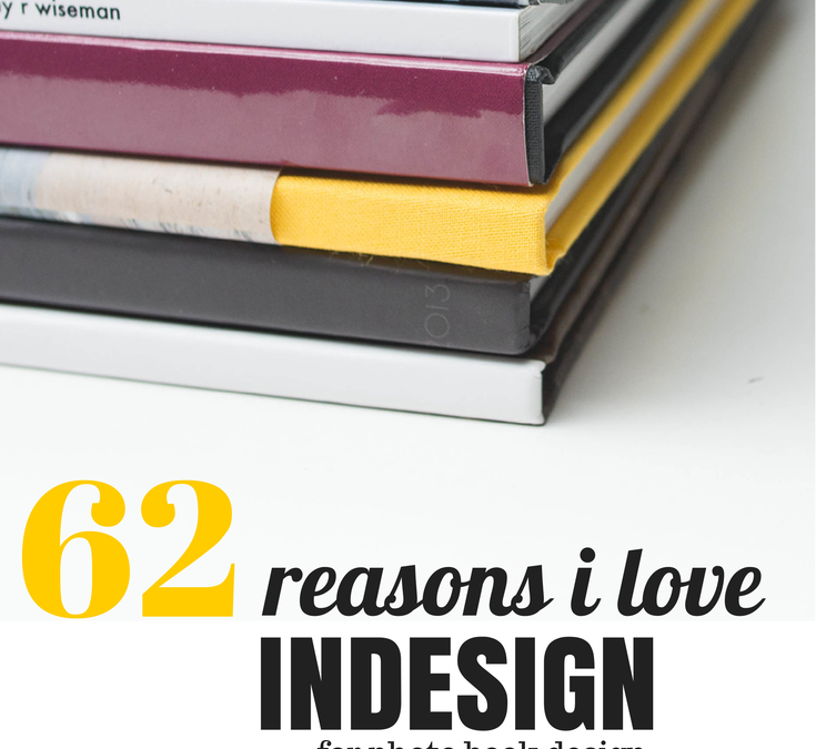
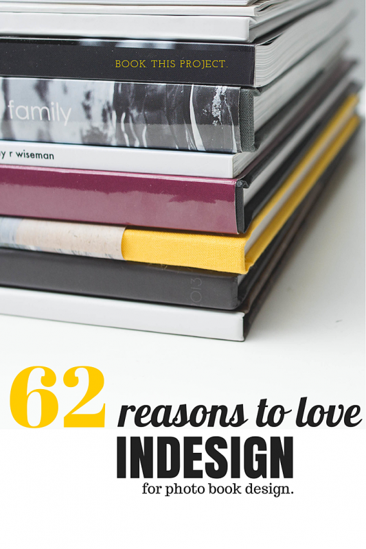
One of the reasons I LOVE Blurb and will probably never stop making at least several books a year with them is because I can use Adobe InDesign and publish my books through them.
Why do I love InDesign???
Because I can create almost any artistic vision I want with this program. I’ve been using InDesign for 14 years and I used Quark Express (a book publishing software) 3 years before that. In that time, I’ve learned to design efficiently and use the program to achieve particular layouts.
If you’re intrigued by what InDesign can do but don’t know much about it, I’m sharing the numerous reasons I love InDesign. Plus, I’m sharing a few layouts that I would not attempt without InDesign. And seriously, for about 85% of my books, I use InDesign.
62 Reasons Why I Love InDesign
1. I can see all of the pages in my book at one time in the pages panel.
2. I can easily add as many pages as I want, where I want.
3. I can move the pages with a simple drag and drop.
4. I can delete the pages by dragging them to the trash can.
5. I can change the properties of the page with a right click.
6. I can add any size of photo box.
7. I can type in the dimensions I want for each photo box.
8. I can place the photo box exactly where I want by using guides or typing in coordinates.
9. I can overlap and layer as many photo boxes as I want.
10. I can add a simple border to the photo boxes (and text boxes).
11. I can rotate my photo box to any degree.
12. I can rotate only the content within a photo box to any degree.
13. I can scale a photo within a photo box.
14. I can scale the photo to fill the frame.
15. I can size the frame to match the photo.
16. I can add a grid of photos by using the arrow keys.
17. I can make a circle photo box.

18. I can make a photo box out of any shape.
19. I can place my text any where on (or a portion off) the page.
20. I can adjust the text to any style, size, color and alignment.
21. I can align the text toward the spine or away from the spine – which is awesome for book design.
22. I can adjust the leading and tracking (vertical and horizontal spacing between lines and letters).
23. I can make the text all caps or small caps with one click.
24. I can increase the size of only the first letter of the paragraph with one one click.
25. I can easily outline the text.
26. I can add a photo inside of the letters.
27. I can add a gradient to my text.
28. I can add a gradient to my photos.
29. I can adde a gradient to only my photo box outline.
30. I can use a gradient color or transparency.
31. I can wrap text around a particular area of a photo.

32. I can connect the text between multiple text boxes and pages.
33. I can align the top, bottom, right, left and center edge of any box.
34. I can space boxes by a specific dimension.
35. I can use smart guides for placing and spacing. They are super smart guides.
36. I can create lines with a particular weight, color, and style.
37. I can create a style for objects within my book.
38. I can create custom colors.
39. I can use color for boxes, shapes, text or outlines.
40. I can make a gradient of several colors or shades of colors.

41. I can use transparency for photos, text, and colors.
42. I can create a paragraph style of all text properties and alignment.
43. I can create specific styles for bold, italic, color, hyperlinks, etc.
44. I can link color to a particular text style.
45. I can change any aspect of a color or style and it immediately changes everywhere it’s used.
46. I can create multiple master pages for different sections or types of pages in my book.
47. I can apply a new master page to pages already in my book with a simple right click.
48. I can make a master page that is dependent upon another master page.
49. I can set up consistent margins for a cohesive book.

50. I can customize my page numbers.
51. I can create a Table of Contents with proper page numbers without having to go through my book.
52. I can use layers or I can ignore them.
53. I can display all of my photo book links.
54. I can refresh links when I make a change/edit to a photo in my book.
55. I can spell check, of course.
56. I can easily find out where my text doesn’t fit in a box or my photo resolution is too low.
57. I can create hyperlinks to my text or images.
58. I can assemble all photos, text, and graphics when I’ve completed a project.
59. I can export to blurb in one click.
60. I can export to pdf or jpeg in one click.
61. I can customize my export options.
62. I can make an interactive pdf with embedded hyperlinks.
If you’re interested in learning more, you’ll be excited to hear that I’m opening up my InDesign Workshop where I show you exactly how I design a photo book using InDesign. If you’re unfamiliar with InDesign, I walk you through every tool you need know. Each lesson comes with a pdf download and video tutorials.
This workshop experience is unlike any other because it is a combination of a workshop and a mentorship. I’ll open up the program for three months. Within that time, you can tell me when exactly when you want the lessons to start.
You’ll receive the lessons via email, access to a private Facebook group and two private 1:1 calls to discuss how to apply the material to your specific project.
For more information, click here.
If you want to remember this tutorial, make sure you pin this image.
by Stacey Wiseman | Jul 9, 2014 | Design Series, Tutorial
One of the biggest struggles I hear from my readers is the photo selection process. We are all connected to the photos we take. So connected in fact that it’s hard to choose one photo over another. However, photo selection is a crucial component of a photo book. Too many photos in a book creates an almost overwhelming aspect to your photo book and in the end, it can take away from the photos themselves.
I’m in the process of developing something to tackle this issue but for now I have a video that I hope will help. This is the 2nd of 5 videos on the photo book process.
If you remember the first video, I showed you how I photograph my kids on a casual Saturday afternoon.
Today, I’m going to show you my unedited, unculled photos – specifically so I can show you how I narrow photos of my kids for a photo book.
My white balance was crazy – especially in the first couple of photos. But that’s fixable. As you see next month!
Plus one thing to keep in mind, the funky white balance, under/over-exposed photos may not be the photos you want to include for your book. So you don’t always have to obsess over the details. Especially at this stage.
Check this video out and share this post with your friends!
by Stacey Wiseman | Jun 18, 2014 | Description, Tutorial
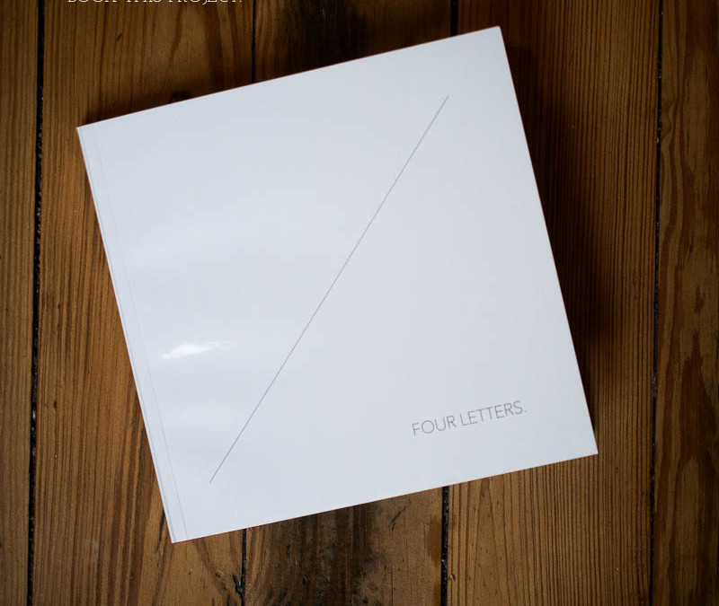
Recently, I wrote about Blurb hosting a photo book contest to design a book for your favorite person. This was right up my alley so I used it as an opportunity to design a book for my husband.
Now I’ve never designed a book specifically for one person so I knew it would be a challenge – and ultimately a learning experience. And you know me, I’m always up for sharing what I’ve learned!
Here are my 6 key takeaways from my most recent book.
1 | Define the book concept.
I spent more time developing and defining my book concept than I did actually working on my book. It may sound a little strange, but I spent over a month visualizing my book. I thought about the overall look but also about the details – graphics, page numbers, titles.
This process allowed me to quickly execute the book once I was ready with the photos and text.
One crucial element to the entire book process was to select a very particular theme. This helped tremendously with selecting my photos and determining how the book would be organized.
My book concept: four letters. I divided the book into four sections – all around the theme of a (nice) four letter word that describes my husband. Then I wrote a small letter to go with each theme. My themes were:
Draw.
Bike.
Cook.
Kids.

2 | Select photos with a clear concept.
With a clearly defined theme, selecting the photos was a breeze. First of all, I could easily narrow the photos because they were centered around my husband as a subject. Plus, I don’t have massive amounts of photos of him.
If I was completely organized, I would tag the person in the photos immediately upon import. But alas, I’m not THAT organized! So I went through the last four years of photos, scanned for my husband and if it fit a particular four letter word it got a special keyword.
3 | Let go of perfect editing.
Once I finally selected my photos, the deadline to submit the photo book was quickly approaching. I didn’t have the time to go back though each and every photo before I exported them. I went with them.
This tells me two important things. 1) It helps if you do minimal white balance and basic edits when you import. And 2) If you didn’t get to editing, don’t worry about it. If the photo means something to you, it doesn’t matter if it’s edited or not, it’s preserving the memory and needs to go in your book!
4 | Write text ahead of time.
For this book, I wanted a short description to start each section. This way I didn’t worry about captioning photos or how to explain the photos. Before I even started with the book layouts, I wrote what I wanted to say in a word document file. I could easily edit, check spelling and for this book. I even did a word count to make sure my descriptions were pretty even in length so they would look comparable on each section page.

5 | Design a simple layout with one distinct move.
It was part of my design concept to keep this book simple and modern with a lot of white space. This suits my husband’s style but it also makes it possible to design a book in a short amount of time.
But I also knew I didn’t want the book to be boring. So I included a thin graphic line on a diagonal to add some interest. This graphic then defined the margins for the book which established how the photos were positioned on the page. I carried this look even down to the page numbers.

6 | Work toward a hard deadline.
This book would probably never have been completed if I wasn’t working toward a hard deadline. A deadline that couldn’t budge. I’m a huge deadline advocate. If I don’t schedule something with a firm and real date, it’s most likely not going to get done.
Find whatever way you can to give yourself a deadline to finish your book. Using a coupon code is one way to work toward a specific deadline. Social accountability is another great way to stick to a date. I do this with my accountability group every month….but here is your opportunity to get in on the action.

Leave a comment below with your type of book and when you want to finish it.
I will follow up with you to make sure you finish it!
One great example is finishing your vacation book within one month of when you return. Are you willing to commit to that this summer? If so, make sure you leave me a comment below!
by Stacey Wiseman | Jun 8, 2014 | Design Series, Family Photographs, Tutorial
I’m so excited to kick off a new video tutorial series. Throughout 5 videos, I’m going to take you behind-the-scenes of how I pull together a photo book. With this series I’m going to focus specifically on taking photographs in a very familiar location within my home.
This spot is my go-to place for photos of my kids. I’m comfortable with the light, the framing, and the background. I’m using one of my favorite locations to illustrate how, from beginning to end, you can shoot with a photo book in mind.
Here are the topics I’ll cover in this series:
Part 1: Taking the Photographs
Part 2: Selecting the Photographs
Part 3: Editing the Photographs
Part 4: Designing the Layouts
Part 5: Adding Design Elements
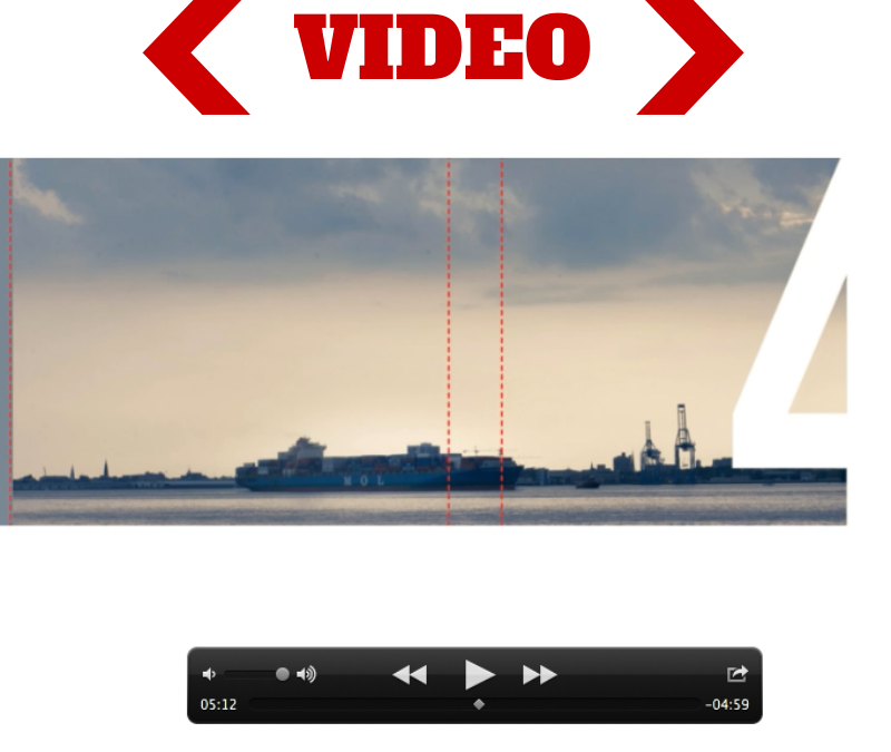
For today’s video tutorial, I’m sharing how I take the photographs. My goal is to take a portrait of one – or both – of my kids. We’ll see what I get!
Plus, with this video, you’ll find out my 10 Tips for Attempting Portraits of my Kids.
Now, before you watch this video, I had to use two different cameras because I ran out of memory in my first one. I apologize for the difference in coloring, focal length and quality. Also, I recorded this on a Saturday morning. I’m not fancy or dressed up – this is as accurate as you can get to how I really shoot in my home. 😉
I’d love to hear from you. When you take photos of your kids, does it look like this? Do your kids act crazy? Run away? Fall down? Evade the camera? What are your tricks?!? Tell me your experience in the comments below! <3
I’ll see you next month when I show you my photos!
by Stacey Wiseman | Apr 9, 2014 | Design Series, Podcast, Tutorial
This month’s photo book video tutorial is a special behind-the-scenes on how I approach design – specifically when designing a photo book cover.
Covers are the outward face of your book and are really the place where you can be the most expressive! Because of this, it can sometimes be a little daunting to create.
Lucky for you, every Friday, I provide a photo book cover design for you to pin or to inspire your own creation.
In this video, I’m going to show you the 8 steps I took to create last week’s cover example.
I would love to hear from you! What other design aspect can I go behind-the-scenes and show you? What are you yearning to learn how to do? Let me know in the comments below – or – if you have 3 minutes, fill out my brief survey.
by Stacey Wiseman | Feb 19, 2014 | Photo Book Design Layout, Q&A, Tutorial

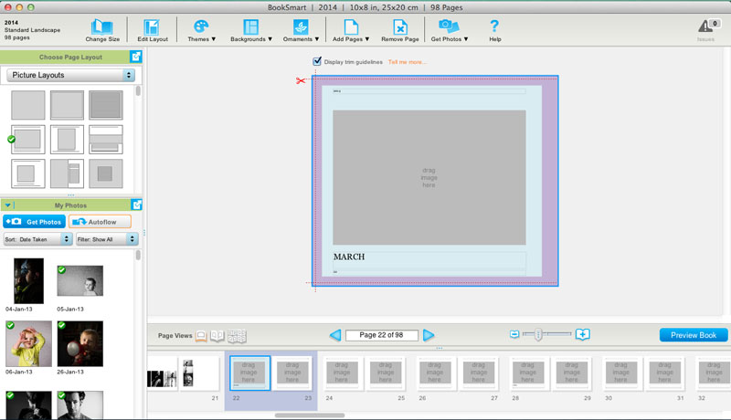
Question: What is a spread?
[divider] Answer: Oh – great question! This is a little more technical of a question when it comes to the book design process. If you are brand new to making, designing or custom design services for photo books, you may come across this term and think, “What in the world is a spread?”
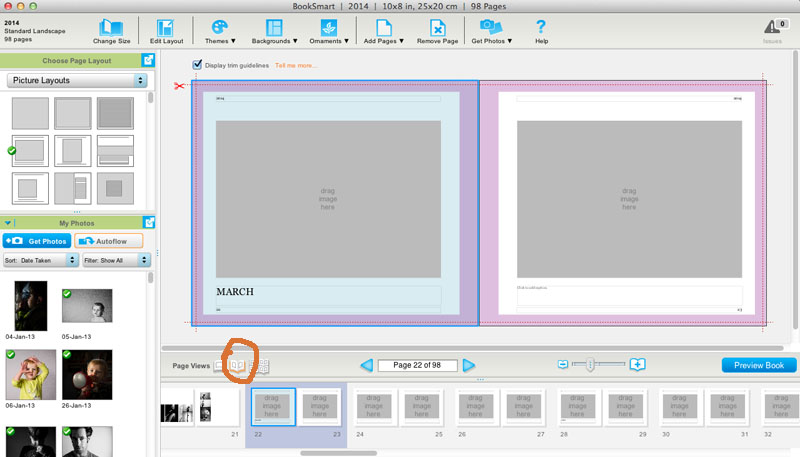
[divider] With books, a spread refers to the pages of a book laid open with both the left and right page showing.
[divider] So why is this important…well, when you are designing books, the typical default is usually to see and design one page at a time.
[divider]
[divider] But, why would we design one page at a time when we actually see the pages together when we are experiencing the actual book. You’ll see great improvements in your layout design when you can design with the spread in mind.
[divider] Yep, paying attention to a book spread, immediately ups the game on your photo book layouts!
[Click it Tweet][divider] Look for a tool to view the spread as you are designing.
[divider]

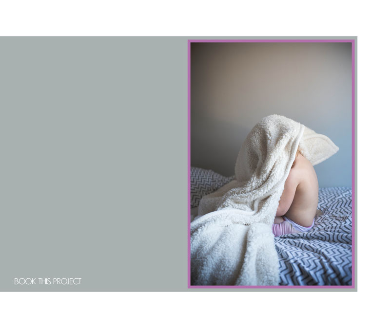
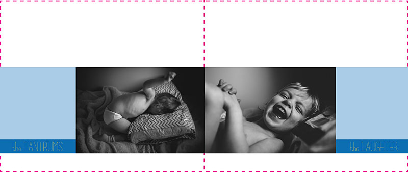
[divider] Without paying attention to the spread, you could design a layout that looks like this:
[divider

[divider] Not terrible…but it could be better. Nothing feels together and well-thought out with this design.
[divider] By paying attention to both the left and right page, we can begin to align the bottom edge of the photo to create a layout like this:
[divider]

[divider] And if we are really looking for a layout that fully considers the spread and create a story between the two pages, we could create a layout like this:
[divider]
[divider] All because I was designing with the spread in mind.
[divider] I’d love to hear from you, what question do you have about book design? Leave your question in the comments below!
by Stacey Wiseman | Feb 17, 2014 | Photo Book Design Layout, Tutorial
Our winter has been pretty normal up until the start of the new year. January and the start of February has brought a lot of cold, snow and ice. In our neck of the wood, this means a lot of snow days. After it hit double digits of ‘snow days’ from school, the winter blues started to settle in.
[divider] But this
little pin gave me hope that spring is around the corner.
[divider] The Pantone 2014 Spring Colors.
[divider] First, if you’re not following my pin boards,
hop on over and check out my boards! Especially my
color board, where this special pin found it’s way onto.
[divider] Second, when I come across little gems like this, I try to brainstorm fantastic ways to utilize this in my book design. I absolutely love finding ‘pins’ to inspire elements within my books – whether I’m designing for myself or for others.
[divider] In this Design Tutorial, I look at 5 creative ways to use these colors to brighten up your book.
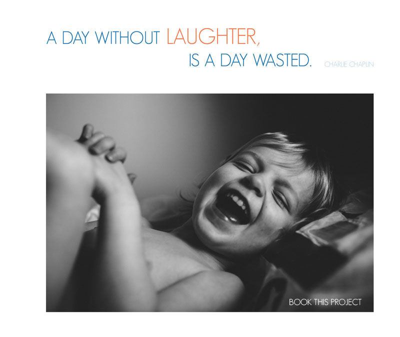
[divider] It can be the colors in a quote:
[divider] Or in a graphic:

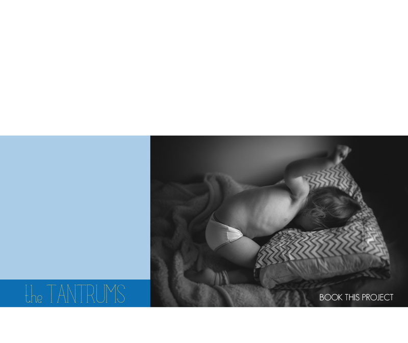
[divider] In a color block:
[divider] A patterned graphic: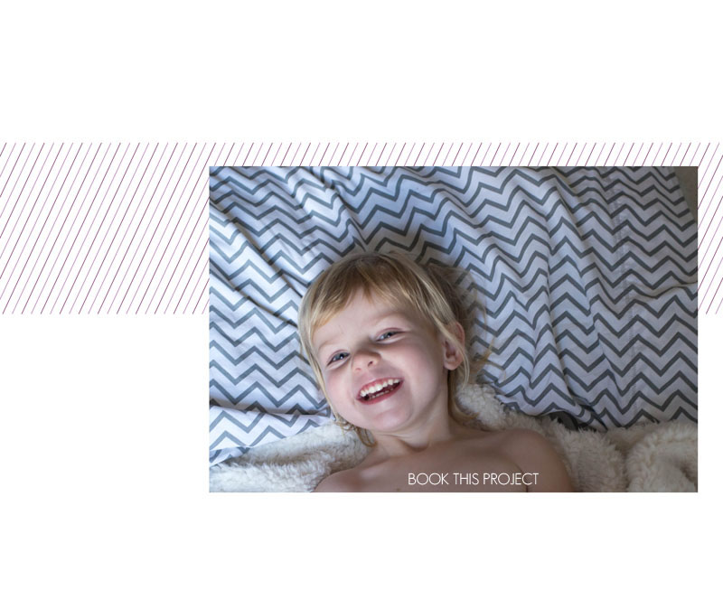
[divider] Or a neutral color block with a colorful border: