Maybe you’ve seen a couple of posts or images of Artifact Uprising books? Or read my recent review of my experience with them? Perhaps you’re curious to check them out but a little intimidated because you’ve never worked in the program before.
Don’t be! My video tutorial this month takes you inside the design program of Artifact Uprising. You’ll see how to create gorgeous photo books that are a snap to put together.
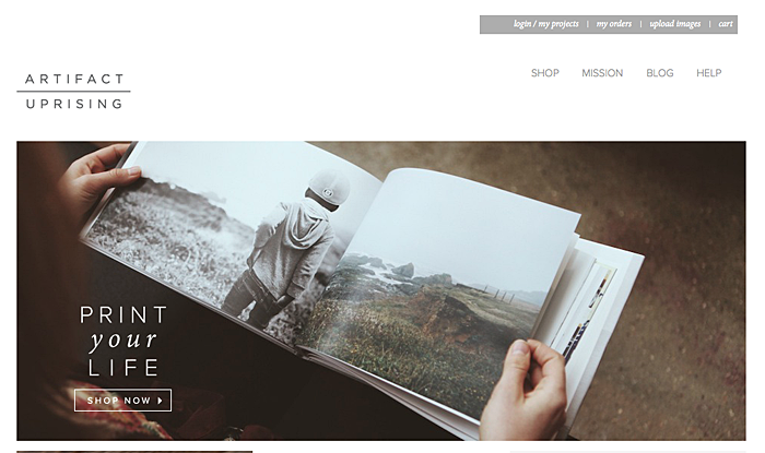
Here’s an image from the Artifact Uprising website.
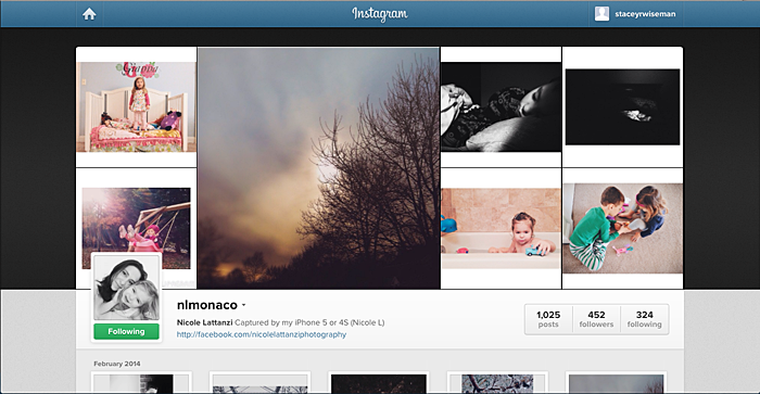
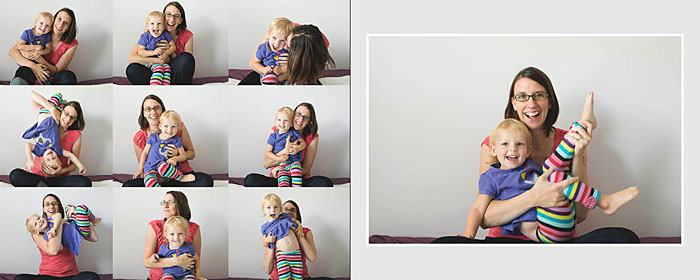
[divider] I wanted to design an Instagram book but – and this may be a big shocker for some of you – I do not yet have a smart phone so taking photos with my phone and/or using Instagram is a little more challenging. I decided to reach out to my good friend, Nicole, and use the lovely photos from her Instagram feed. If you’re not familiar with her work…start now! Follow her on Instagram or Facebook. She always provides such inspiring images of everyday life. And our kids are about the same age, so I relate to so much on what goes on in her household.
[divider] In this month’s video tutorial, I show how easy it is to create a book with Artifact Uprising and reveal my best tip for working in this program.
Let me know in the comments below if you’ve tried Artifact Uprising yet! If not, why not!?!
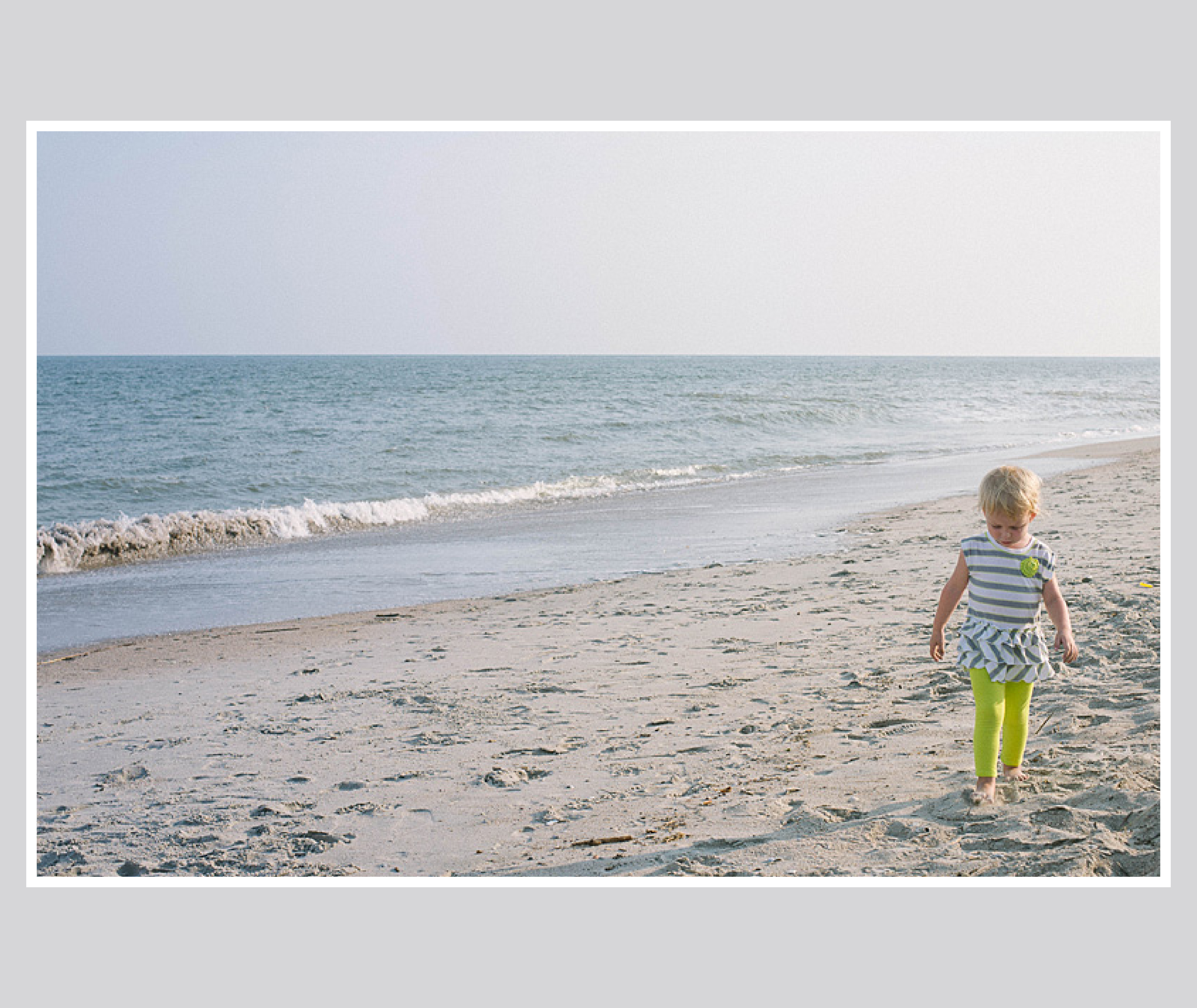
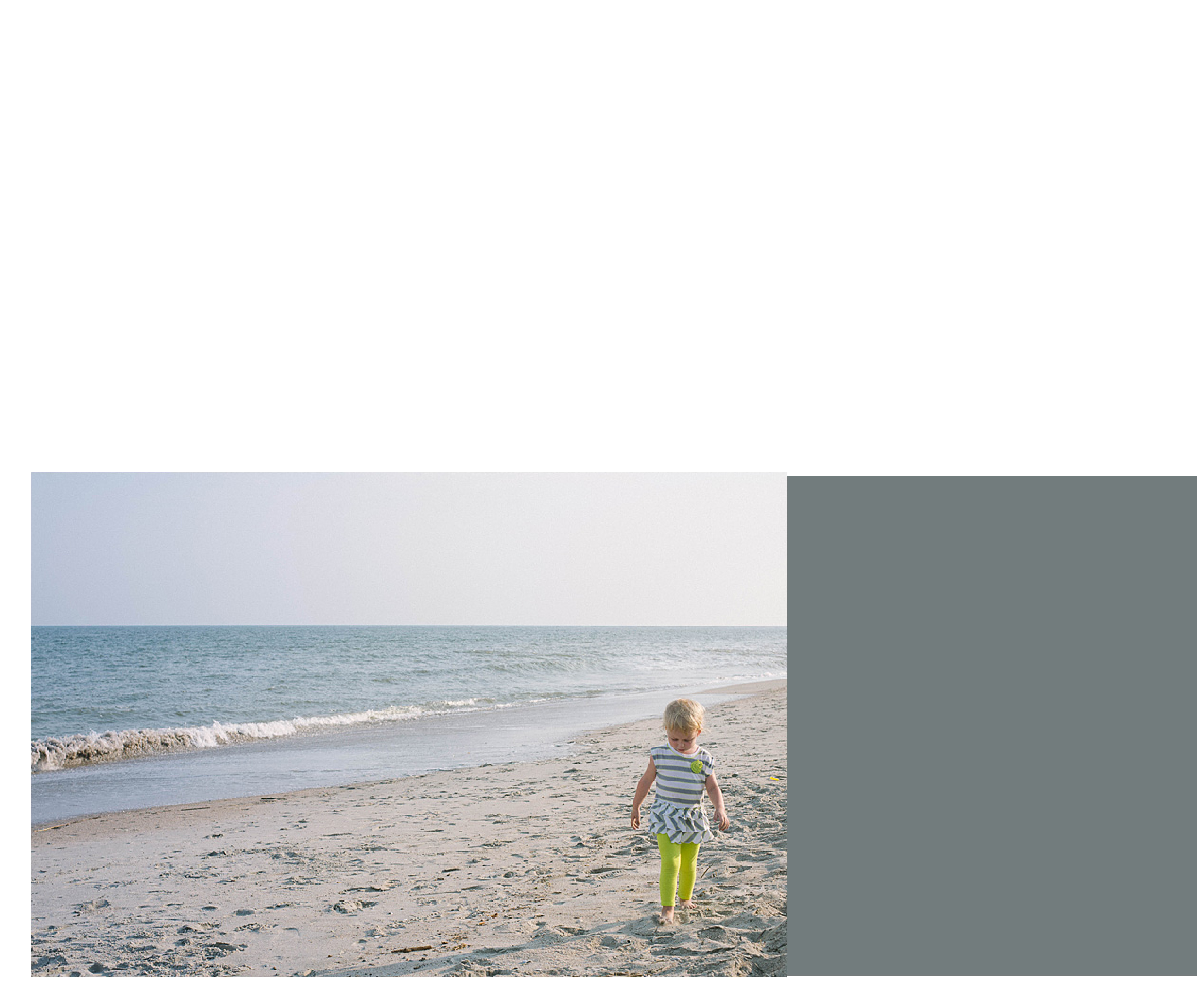
Last month, you may remember my blog post about creating a photo book layout with a single photo on the page. This month, I want to share how to incorporate color onto those layouts.
There are several difference options when it comes to adding text to your page.
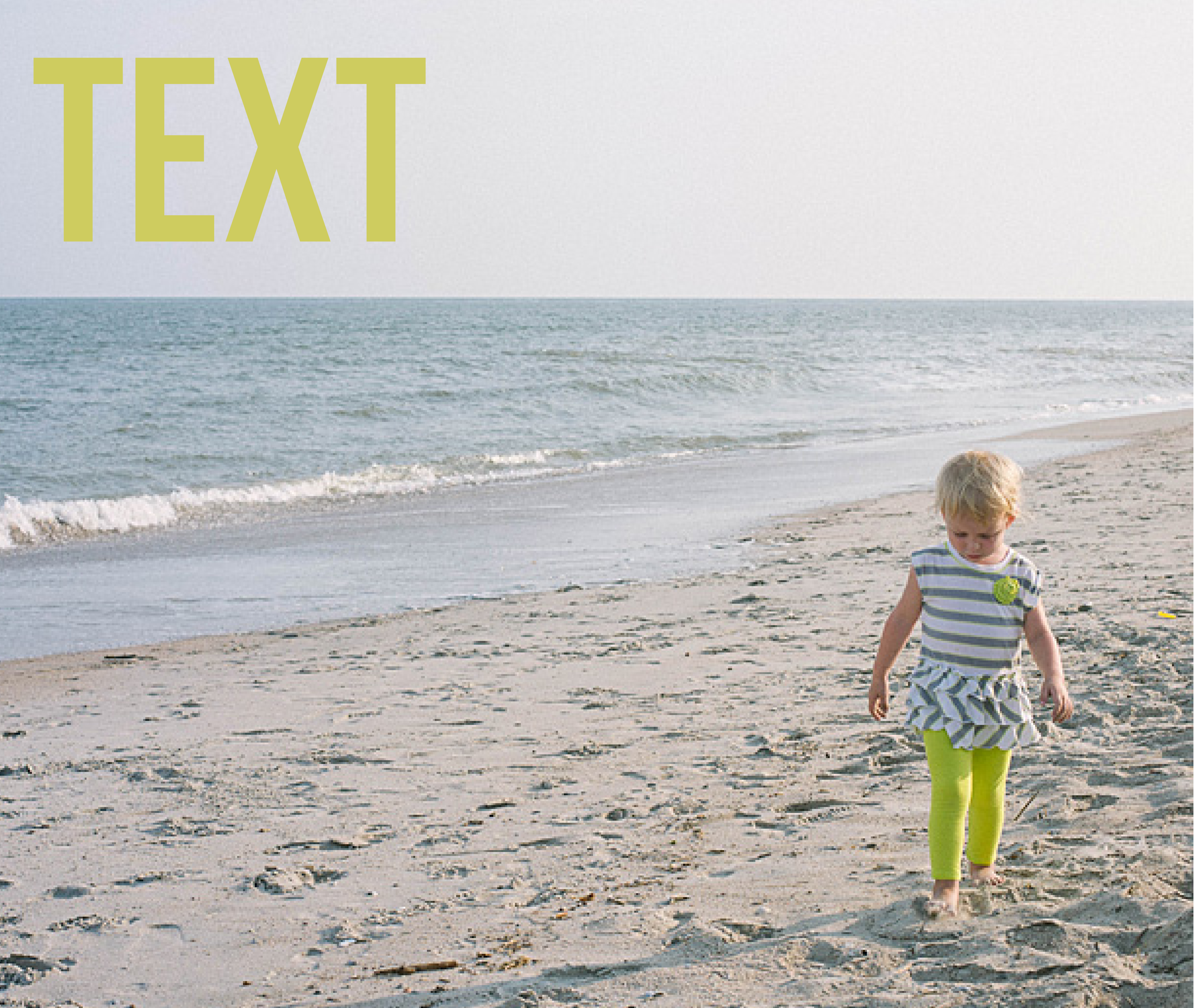
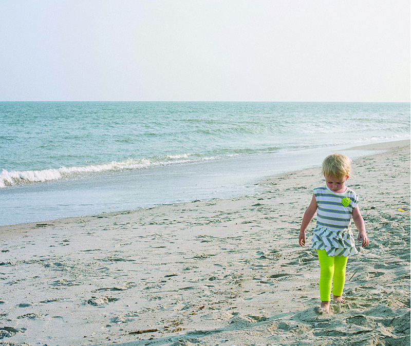
1. Color Font in the Title
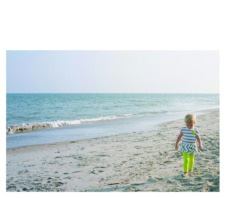
For this layout, I used a bold font with color that picks up on the color of my daughter’s leggings. In this example, the title is in an opposite direction of her pants, so it balances out the layout. The color of her leggings is not the greatest (I should have picked a different color of leggings for her…but she has a fashion mind all her own!) but this should give you an idea of how to incorporate a bright color without it overwhelming the page.
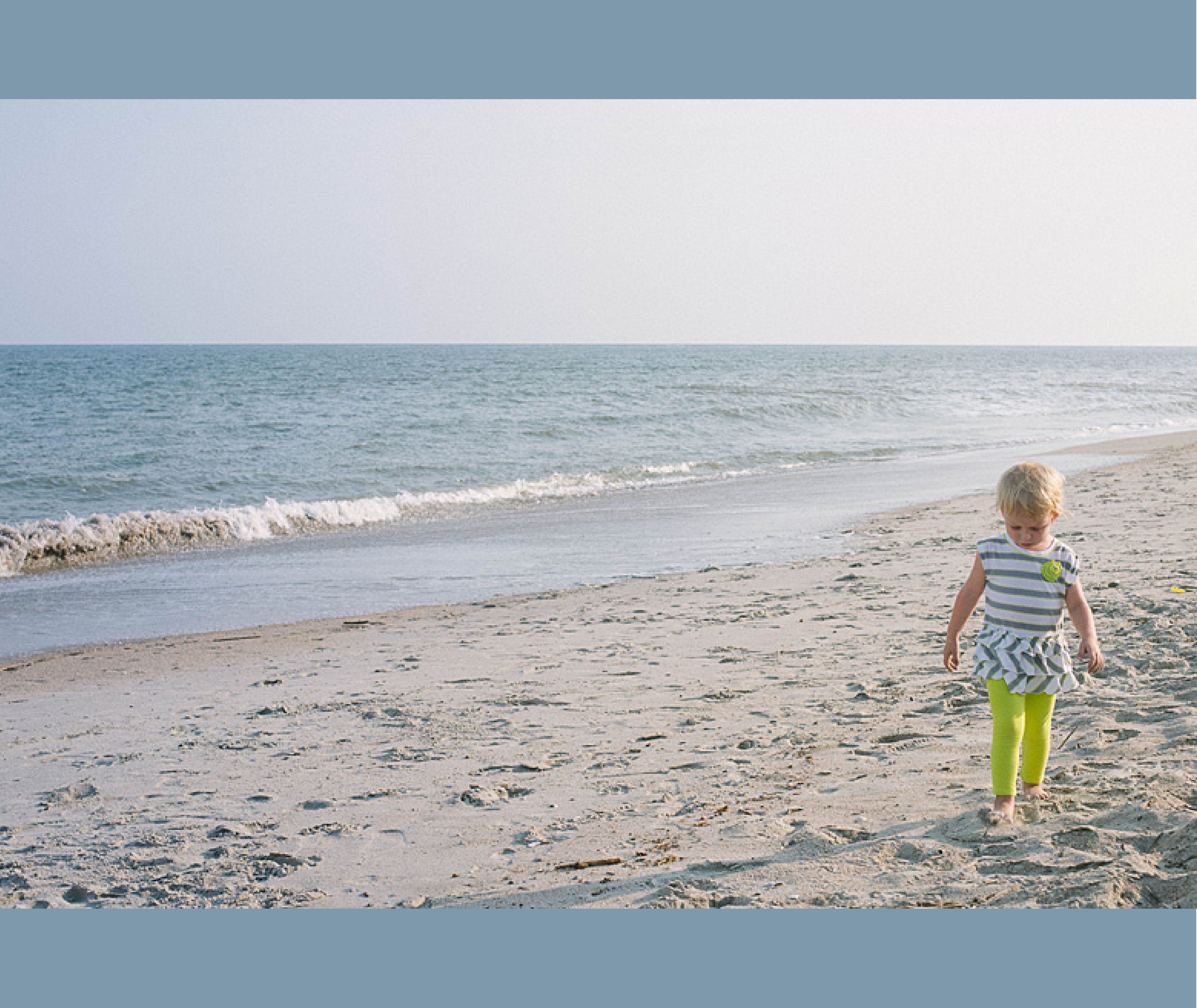
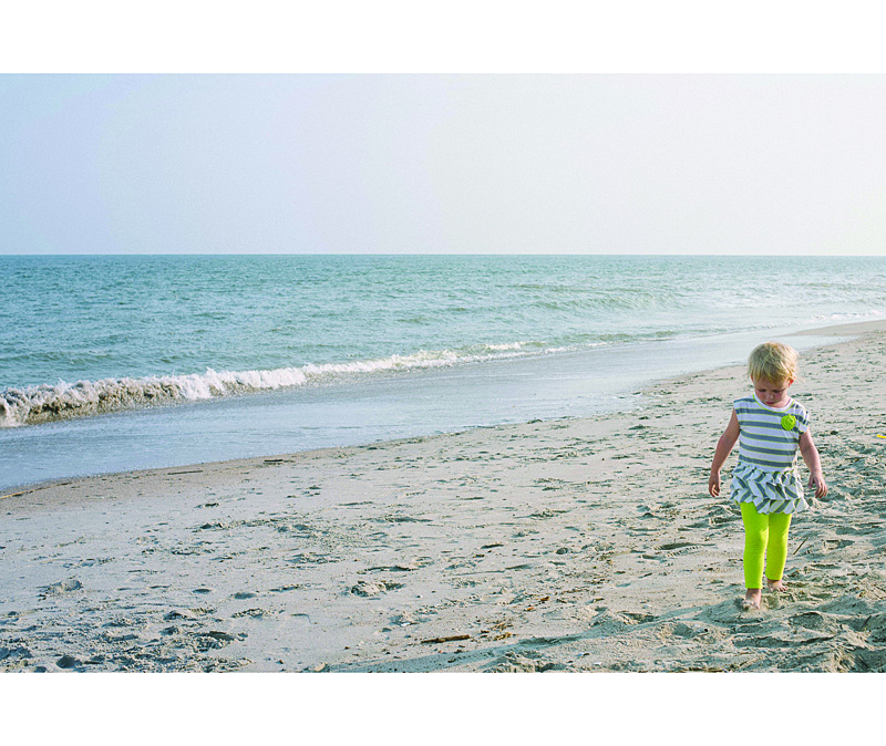
2. Background Color
In this example, the color of the ocean is a subtle background color. Since this is a two bleed layout option, there is minimal space on the top and bottom of the photo. This color adds a nice touch to fill some of the void, while still keeping it a simple one-photo layout.
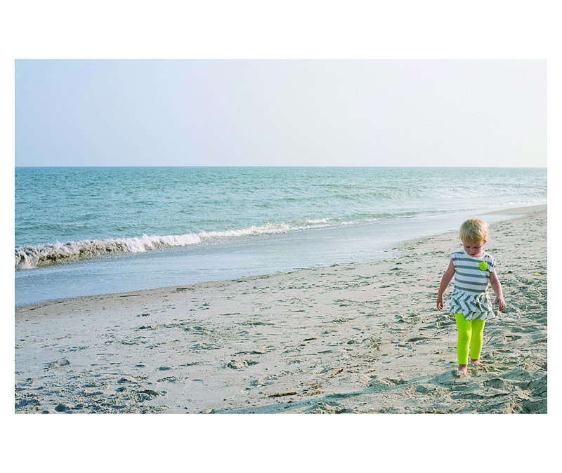
3. Background with a Border.
In this example, I used a neutral color of the sand (just above her head) to create a background color. Then I used a thicker white border to get the photo to stand out a little more on the page. This is a way to keep the color palette simple, yet in tones from the photo.
4. Color Block.
For some pages, you may want to include a small touch of color without it extending the entire page. You can easily add photo caption in this color space or leave it blank. In this example, I used a more blue-gray tone from her shirt that I think picks up nicely to the ocean, without it being ‘ocean blue.’
Leave a comment below letting me know your favorite way to add color to your layouts!
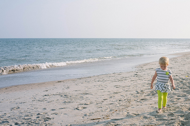
[divider] One key for a simple, elegant photo book is to have a few images – even just one photo – per page. Not every page has to have just one photo per page, but it is a great way to highlight photos and break up the monotony of page after page full of photos. I like to think of it as adding a deep breath to your photo book.
Even though it sounds really simple, one photo on a page – done, I wanted to prepare a design tutorial for you to explain there are actually quite a bit of options when it comes to having just one photo per page. Take a look at my examples below. Determine what you like and try them out in your photo book!
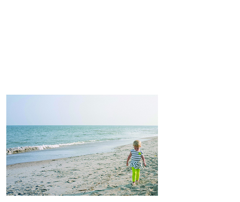
Let’s start with the photo!
[divider] Now the layouts!
1 – Full Page Bleed
If you want your photo to extend off the page on all sides, this is called a bleed. The photo will have to be slightly larger than the page size to ensure when they cut the page, there is no white page at any part of the edge.
One thing to notice, this photo is a 2:3 crop but the page size is a 4:5. This means a portion of the photo will be cut off.
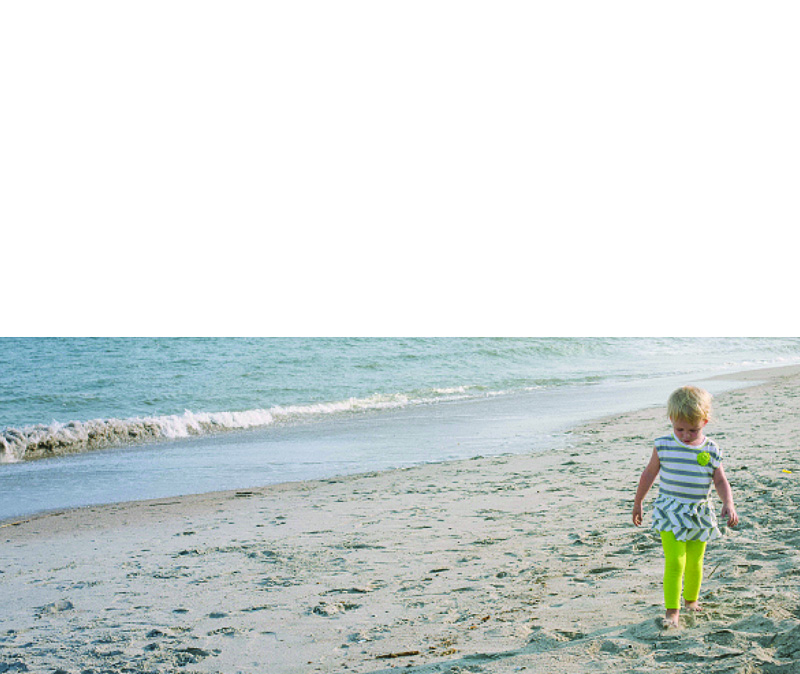
2 – Two Edge Bleed
Another option you have is to bleed the photo on one or two sides. With this option, you will be able to see the entire photo and you will have some white space on the top and bottom. If this was a vertical photo, you would have white space on either side of the photo.
3 – Three Edge Bleed
In this example, I pushed the photo all the way to the bottom of the page so there is a three edge bleed. I also forced the top edge of the photo down to cut off the sky. I did this because the top edge is in center of the page.
4 – Large Photo
This option is great if you want the photo to be large but not extend off the page, I recommend maintaining the 2:3 proportion as large as it will fill on the page with at least a 1/2″ margin. Center the image or if you have a designed margin, place the photo to this line.
5 – Designed Margin
If you have a designed margin, place the photo to this line. In this example, there is larger white space to the top of the image. This may look a little odd with one page, but if you are consistent and use this margin on a large number of pages, it defines the particular look you have for your book.
6 – Negative Space
You can make a large impact by reducing the photo and having a lot negative space on the page. This option may look best with particular photos but don’t be afraid to a single photo on the page small. Embrace negative space!
I hope you enjoyed these examples. Next month, I’ll show you how to add color to your single photo page layouts!
Getting in the frame is challenging to accomplish but can be so rewarding. Often times, we are so busy practicing our photography or documenting out kids’ lives that we forget to get in the frame so your kids’ have memories of you as well.
One of the reasons I love designing photo books is to step back and shoot with a purpose – take photographs specifically to go in your photo book.
And this is the perfect opportunity. Plan to photograph with the intention of this going in your photo book.
Here are some of my suggestions.
– 1 –
Set up the tripod.
Set up the tripod, the remote, the timer or get a friend/husband/relative to take the photographs for you. For this layout, my design was to feature several ‘outtakes’ so I was okay with multiplicity and imperfection.
I set up the timer with 10 consecutive shots to be taken every 2 seconds. My daughter would push the button and then run towards me.
– 2 –
Take the photos.
Take plenty of photos to make sure you get a few photos that will work for your book. The goal is to get at least one photo that you really love.
[divider] – 3 –
Select one.
Find your favorite photo, edit it as desired. Export to a larger size. For my photo book, I exported out at 9″ long by 6″ wide.
[divider] – 4 –
Select nine.
For this grouping, you don’t have to worry about perfect photos. This is mainly to get a sense of the fun that you were having with your little one. The key for editing this group is consistency. Export the photos at the same size. For my book, I exported with the short side set to 3″.
[divider] – 5 –
Design the layout.
Now it’s time to get the photos into your book. Select one layout with a grid of nine images and another layout with one photo box. If you had trouble narrowing your selection in step 4, create a grid with the appropriate number of photos. The key here is to create a grid of images. You decide if you want a margin or for it to bleed off the page. For the singular photo, decide if you want in the center or aligned to one side.
[divider] So make some time this week to get in the frame and design a spread for your photo book!
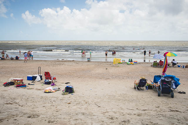
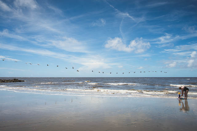
Over the Fourth of July weekend, we took a brief family vacation to the beach. Most of the time when you go to the beach you have to worry about the massive crowds…and trying to avoid the other beach go-ers from getting into your family photos.
In this tutorial, I want to show you that it is possible to capture photos without everyone and their brother in your shots.
The key is to time it just right…to find those moments when a group of people have gone back to the tent to get a drink or reapply suntan lotion.
Another helpful suggestion is to change your position to avoid people in the background. Sometimes that means, moving a little to the left or right. Or getting down low.
Finally, realizing that sometimes it is unavoidable, there are helpful tools in Lightroom and Photoshop to easily clone them out. I’m not the best cloner…so I try to get it close while I’m there.
Here are a couple before-and-after from our recent trip.
Just to prove it was Fourth of July and there were people on the beach…here is the view from our tent.
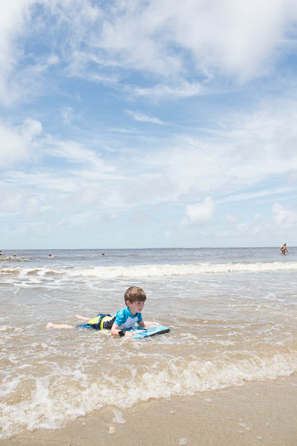
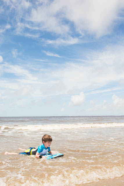
My son was trying a boogie board for the first time. I did take several of photographs as he was riding the wave in but I used the one where he had the most space in between the people to edit.
straight out of the camera (sooc):
edit:
[divider_flat] Here was a moment where my daughter and mother-in-law was building sandcastles.
You will see in this one…I happened to get lucky, there were fewer people on this side of the beach at the particular moment. There were probably more swimmers to the right, but I used my in-camera crop to minimize those…so I only had to crop out one other family.
sooc:
edited:
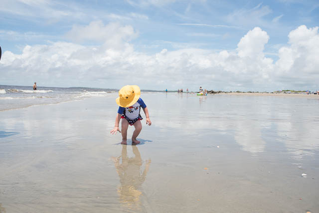
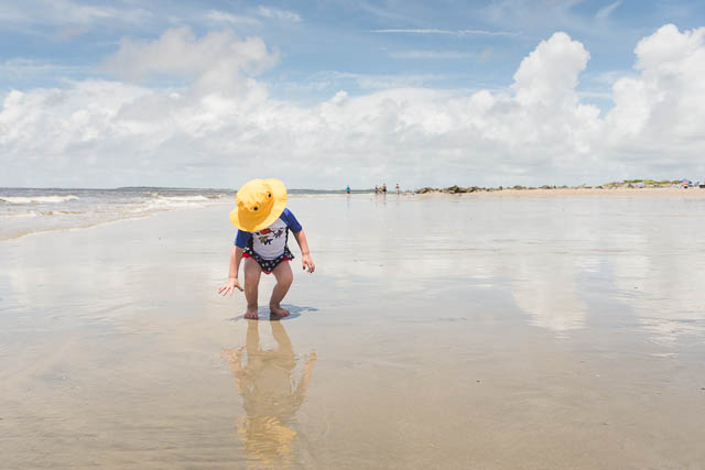
Finally, my daughter and her yellow hat. This one had the most cloning of people and I ended up leaving the people way off in the distance.
sooc:
edited:
[divider_flat] Stayed tuned…Tomorrow I’ll show you how I transformed some of my photos into layouts for my family photo book!
In 4-weeks, we will take your to-do list item and make it a reality. Perfect timing to have your photo book ready as a Christmas gift – or – end of year gift to yourself.
This Design Workshop is designed to help inspire and instruct you as you organize, prepare, and design your photo book.
Included in this purchase are:
pdf’s with narrative, photos, & examples of layouts
videos explaining how to implement the lessons
detailed action plans to develop your personal photo book
a private facebook group to ask questions and share examples
bonus materials
The course runs 4 weeks.
Each week there will be a different lesson with examples and videos.
The start date is October 15, 2012.
This course only runs this year and is limited to 20 participants.
[divider] Some, but definitely not all, of the material will include videos that have previously been posted to the blog. The advantage in this course, it presents the materials in an organized fashion, ideally suited for you to follow along as you design your book.
By the end of this four week course, you should have your book almost finished…all you will have to do is add your November & December photos!
To be clear, this is not a design service for me to design your book. You will be responsible for organizing, cropping, preparing, placing and designing your own unique vision for your book.
This course will:
instruct you on how to efficiently organize and design your book
inform you on how to use the free software program provided by companies
design principles to ensure a professional quality book
inspire you to create a stand-out, beautiful book
A summary of the lessons:
Week 1: Photos
Organizing Photos
Quantity of Photos
Editing Photos
Exporting Photos
Week 2: Photo Book Design
Organizing & Outlining a photo book
Consistency with Variety layout design
Placing Photos
Creating Master Layouts
Week 3: Professional Elements
Fonts/Text
Color
Sections/Table of Contents/Page Numbers
Ways to Customize
Week 4: Cover Design and Finalize
Cover Design
Final Review/Edits
Ordering
Sharing
The purchase of this design workshop is non-refundable.
Following up on my last inspiration post where I translated the cover of an Anthropologie catalog into a layout, this example features a cover of a non-fiction book. It is simple, elegant, and stately.[divider] Inspiration:
Have you ever tried to capture motion? Every step of an activity? These provide for really fun design layouts in a photo book. I want to show you a couple of examples of photographs in a series in order to document the movement and energy of a task.
First, the photographs.
Burst mode:
Be prepared to take several photographs in quick succession. Some cameras have a burst mode. You press and hold the shutter and the camera takes photographs in a row until you release. Although I typically recommend shooting in RAW, when I use my point and shoot, RAW photographs took too long for my camera to process. If you find this is the case, switch to jpeg in order to get several photos in a row.
Subject matter:
Subject matter is key. Make sure the activity documents the event in a series of steps. It could be a sport – kicking a soccer ball – or – it could be the expressions within a given moment. The point of the photographs shows a beginning, middle, end in a very succinct moment.
The frame:
Consider the frame. In a successful series, the subject in the frame should be consistent in order to keep the focus on the activity itself and not the subject moving around the frame.
Second, the layouts.
In a line:
The key to the photo book design layouts, in most cases, is linear. To fully appreciate the action, it is best to see the photographs in a line. My preference is to keep a simple layout with the photo boxes the same size and same orientation (vertical or horizontal).
In a square:
Even though a series looks fantastic in a line, don’t think it always has to follow this format. Consider arranging your photographs into a square format.
Above photographs copyright of Shumaker Family 2011.
Notice the spine:
Take note of the spine. The hardest part of arranging photos in a linear fashion across an entire book spread is the middle photograph; the photo on the spine of the book. A majority of the photograph in the center will be invisible in a book where the pages do not lay flat. In order to keep the subject matter visible in the book, increase the size of the photo book in order to position the subject within the visible guides. In the layout below, all photographs are the same size except for the photo in the middle. The width is increased in order to keep the subject visible on the page.
Above photographs copyright of Shumaker Family 2011.
Tell the story:
If your photographs tell a story but the subject is not consistent within the frame, make is apart of the layout. The example below illustrates my son waking up from his nap. His perfectly round face and puffy eyes are exhibited on the left. The unusual crop on the right focuses on his habit of twisting his hair when he wakes (or when he falls asleep)! This layout would not make sense as a line because it captures all different aspects of waking up. Preparing the layout in a square allows the viewer to pay attention to the moment, the story, rather than the sequence.
My original intention of these photographs was not to display in a line; however, I loved the raw documentation of sleep. The yawn! With consistent black and white processing, the photographs read as one to convey this moment. Even though the my daughter’s face occupies the frame at different scales, placing these photos in a line highlights the sense of time elapsing.
[divider]
Be unique:
This final example approaches a series in a slightly different way. First of all, only two photographs are included. A full bleed is utilized to maximize the content. This series played with scale more prominently than action. My daughter loves to lean completely over while sitting cross legged. The photo on the left informs the photo on the right.
[divider] What activities have you shot in a series?
If you have an example, I would love to see a link to your blog post!

")


")


