fbq('track', 'PageView');
Taking Design Risks (with a safety net)

Taking Design Risks (with a safety net)

I’m not a risk taker.

Approaching unfamiliar situations or trying something physically risky causes a bit of anxiety for me. Usually I like to stick within my comfort zone and it’s only when I’m able to fully observe the situation and figure out if it’s something I can really do, that I finally take the first step in doing something new.

And I’ve realized that this is how I’m raising my kids. Both of my kids are somewhat cautious. They never climbed out of their crib; or climbed on the furniture. They’ve never broken a bone or had to have stitches (knock on wood). And it was only a couple of weeks ago when my son fell during a game of tag and skinned both of his knees that I realized that this was the first time we had a major cut to clean and cover with a large band-aid.

While my kids embrace new or different situations, they always do it carefully and recognize their boundaries and limitations. At the same time, they have a curiosity that pushes them to make sure they don’t remain too complacent.

And I’m the same way. While we are not adventure seekers, we like to approach new situations on terms that feel comfortable to us.

Design can be the same way.

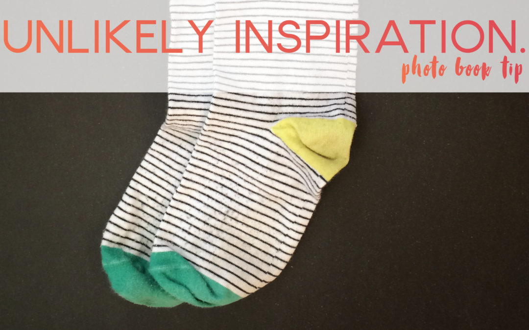
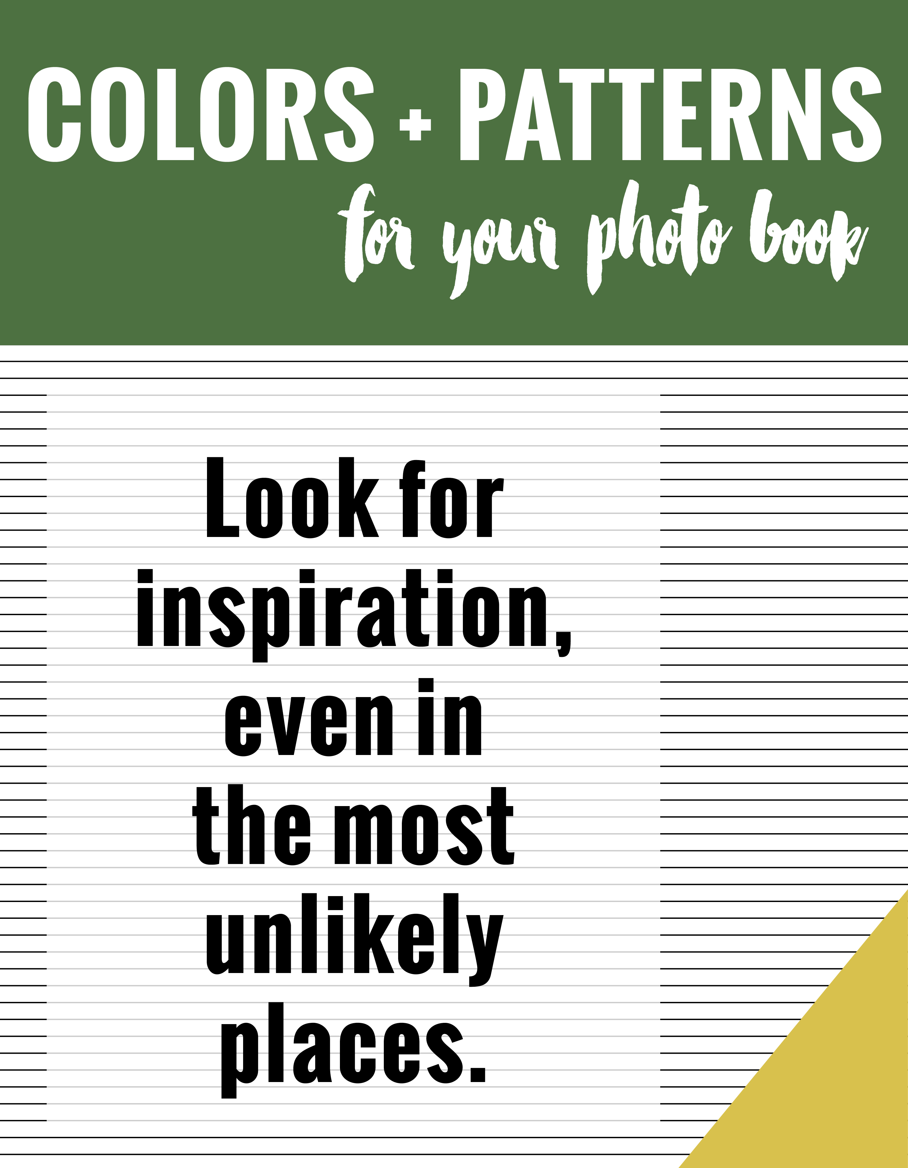
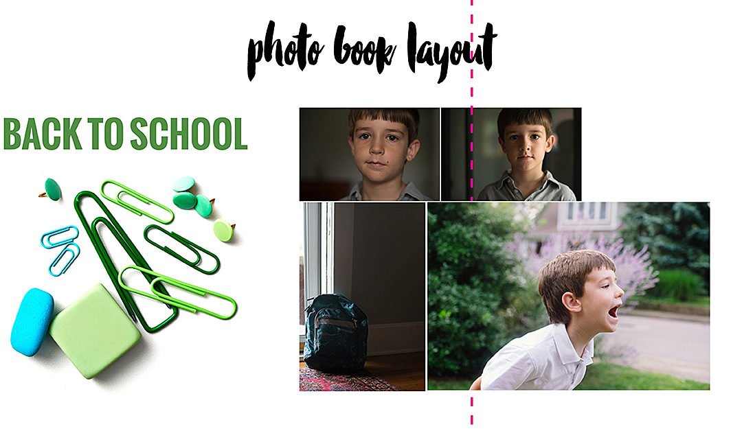
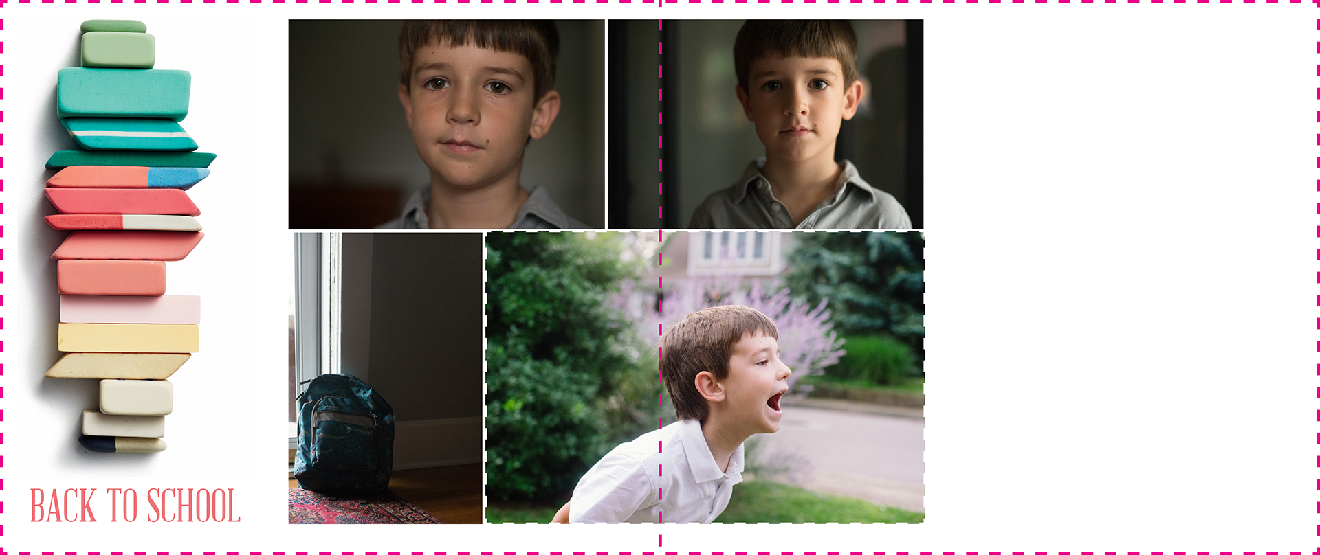
Sometimes you want to break the mold of placing all of your photos in the center of a photo book layout. You want to try something different, unique, extraordinary. Yet you feel stuck trying to reach outside your comfort zone.

I totally get it.

Trying new things with your photo book can be a little scary without a safety net. Sometimes it takes seeing how it can be done, to feel confident to try it with your own photos.

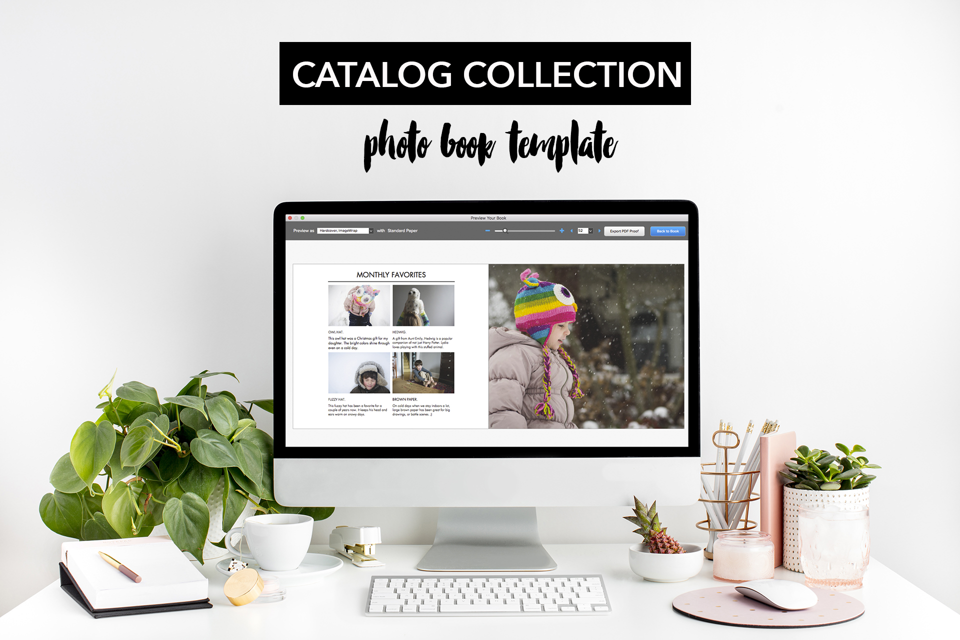
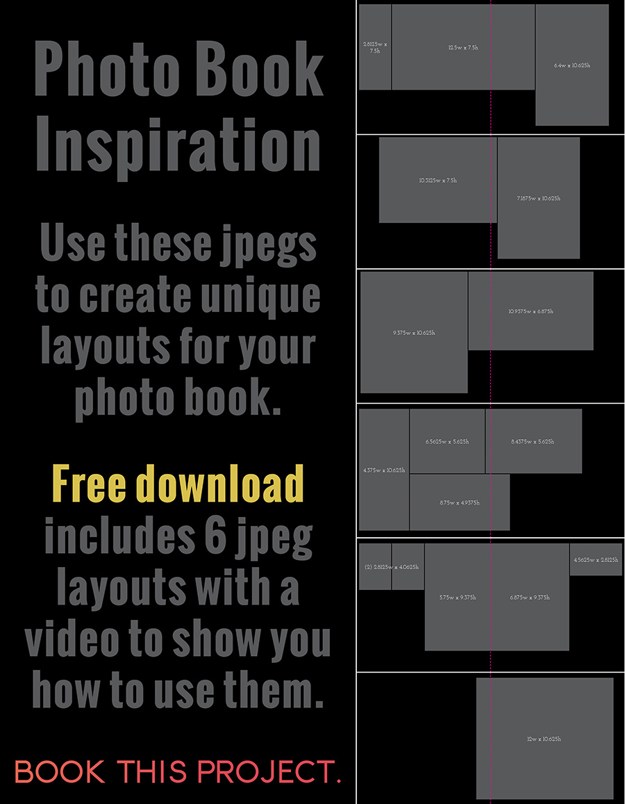
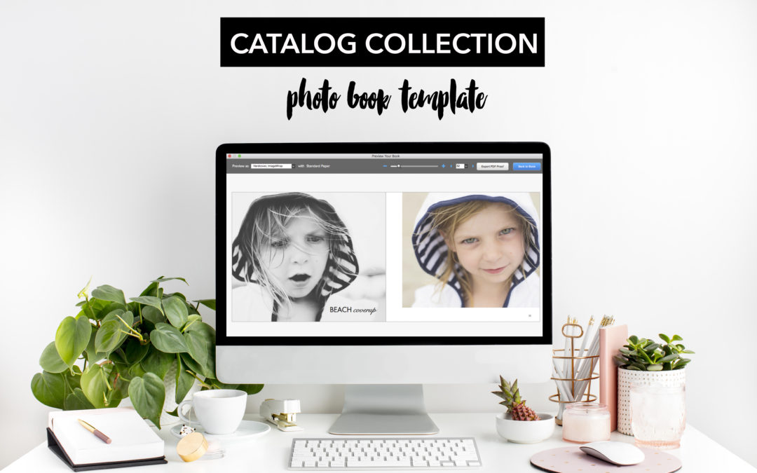
That is exactly what I’ve done with my new photo book template: Catalog Collection.

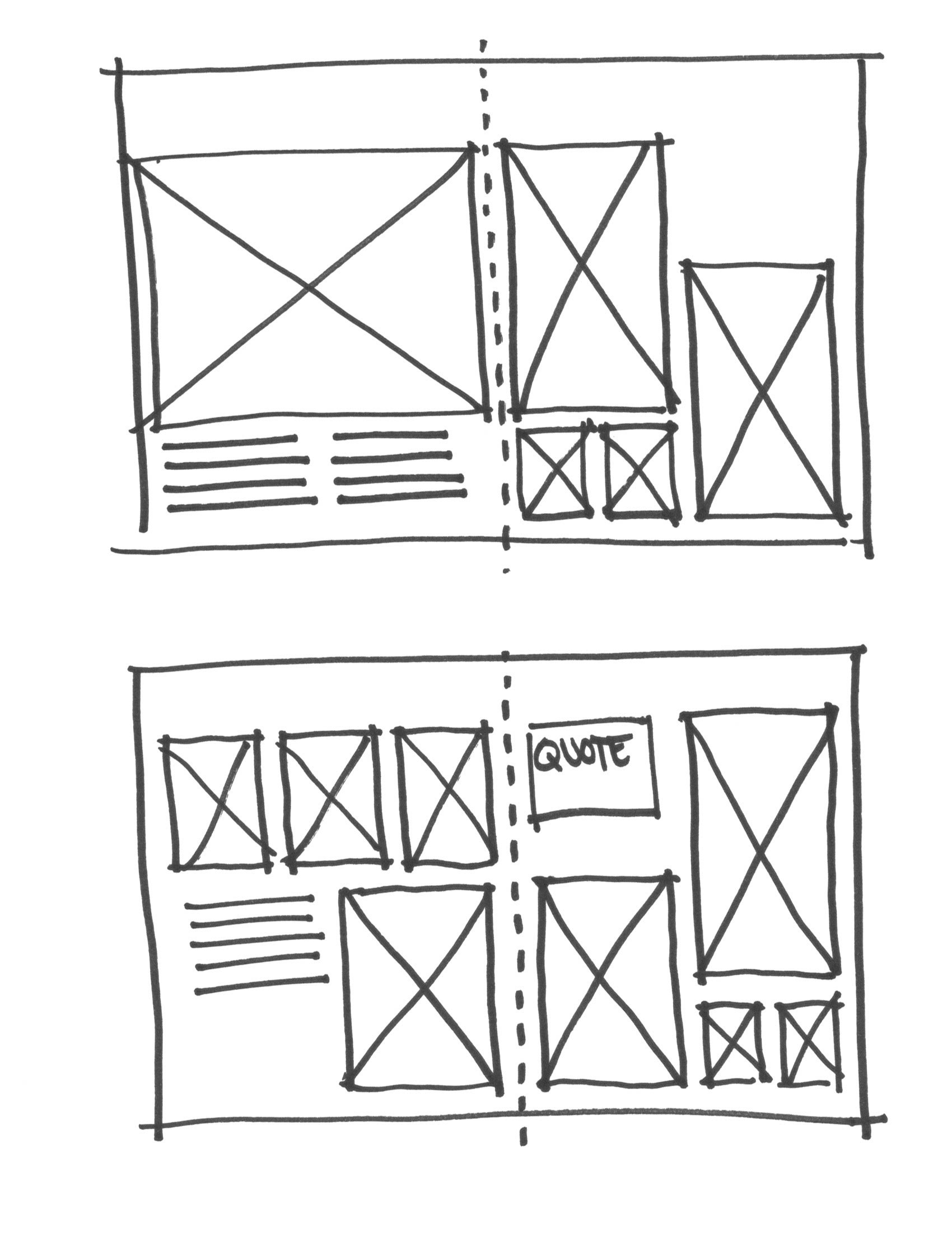
I observed and studied my favorite catalogs then practiced a couple of different layouts to see what I thought would work best for an annual photo book. I wanted to create a sleek, modern look that feels refreshing to flip through.

Consider this template your safety net to try something new when it comes to design.

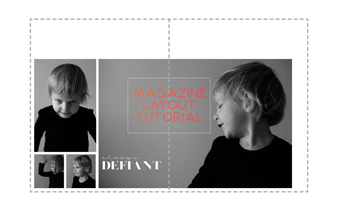
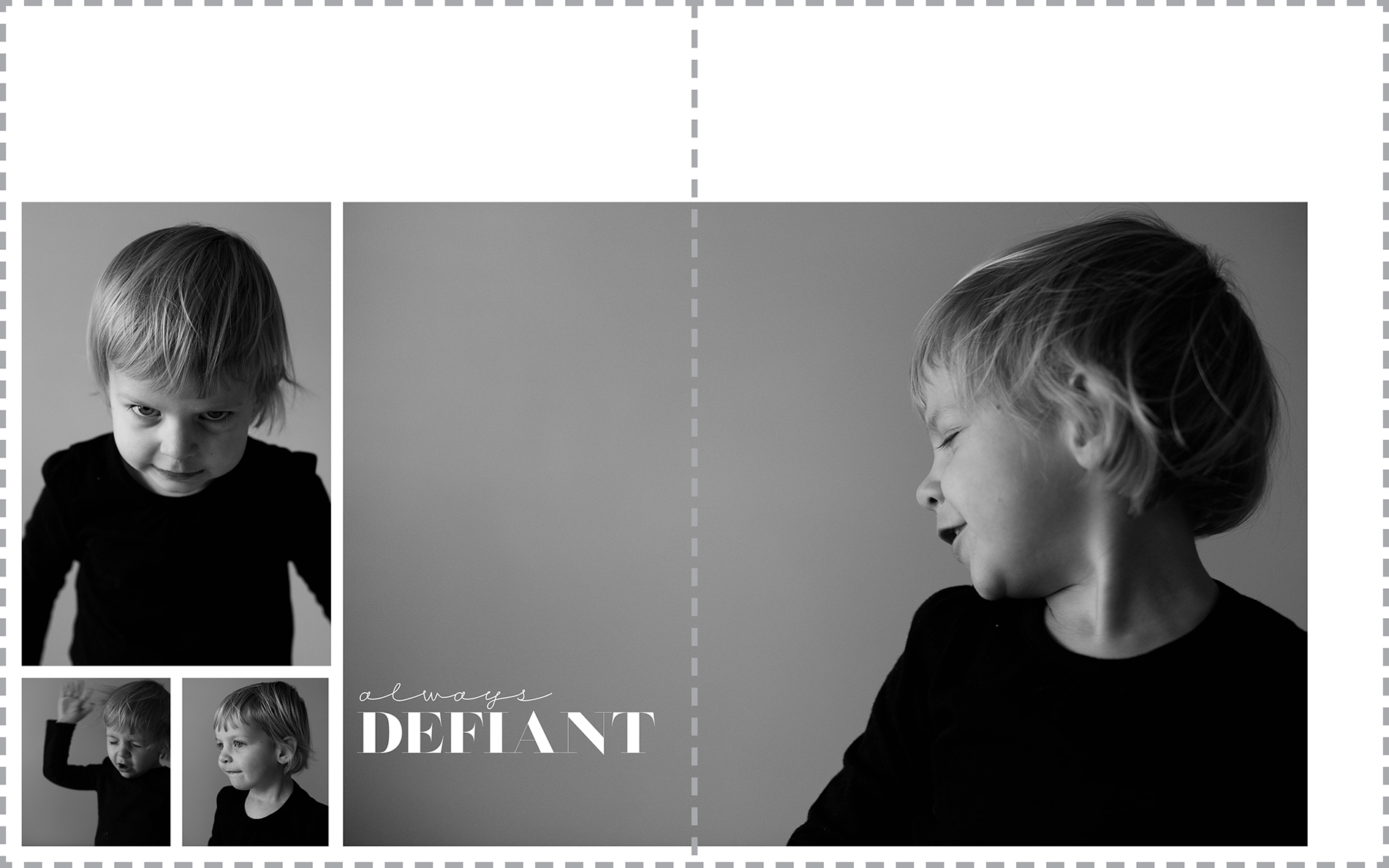
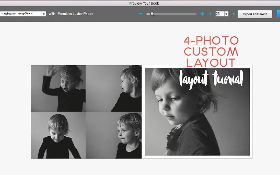
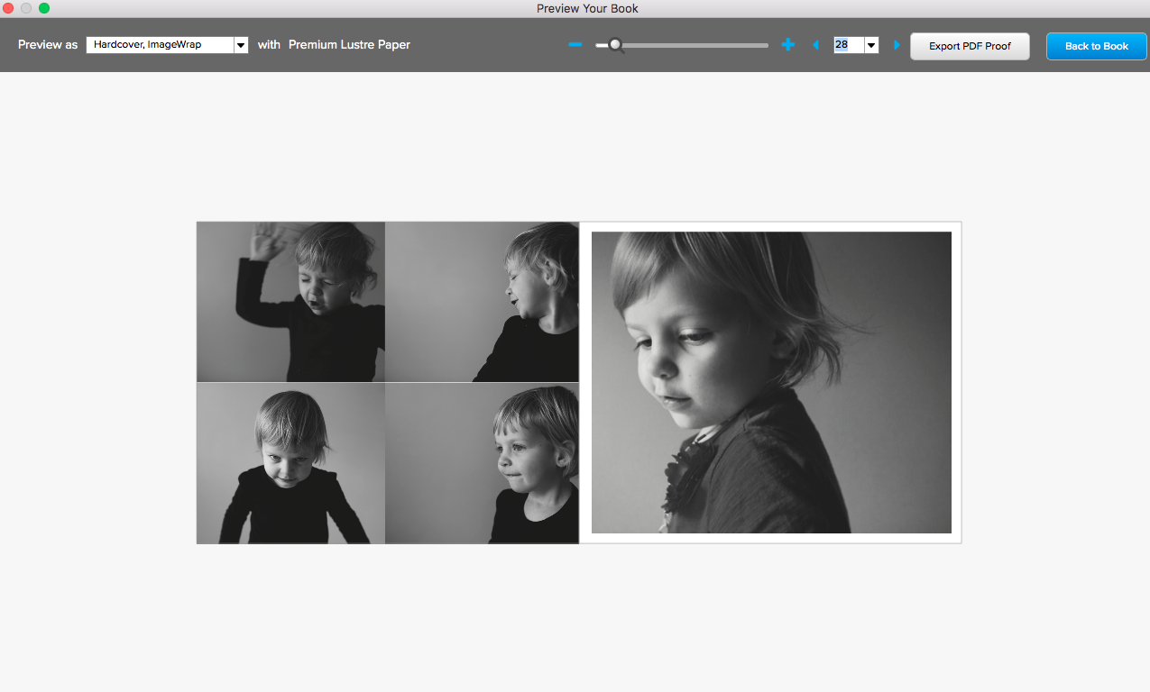
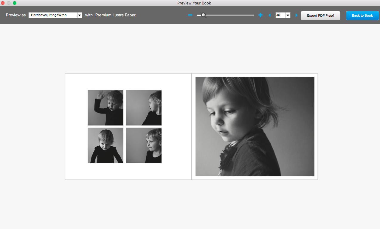
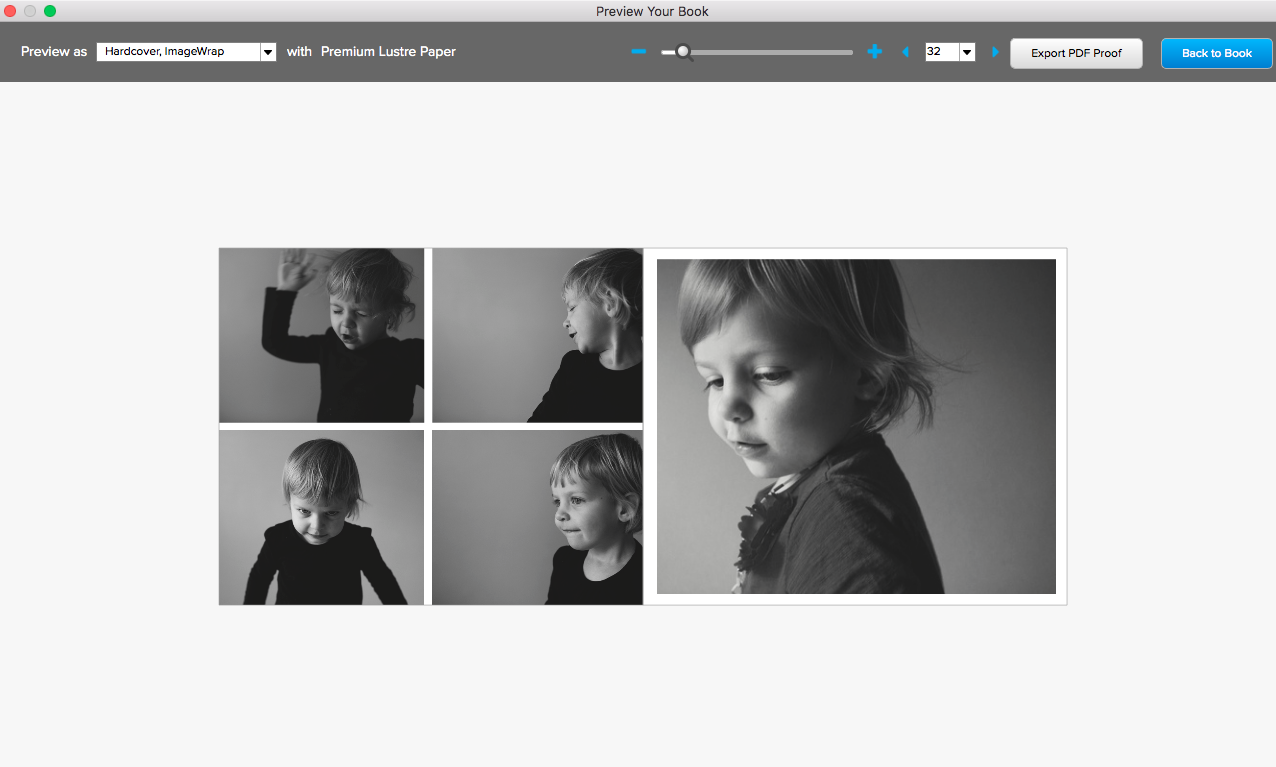
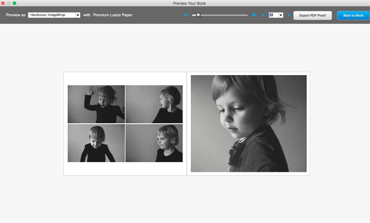
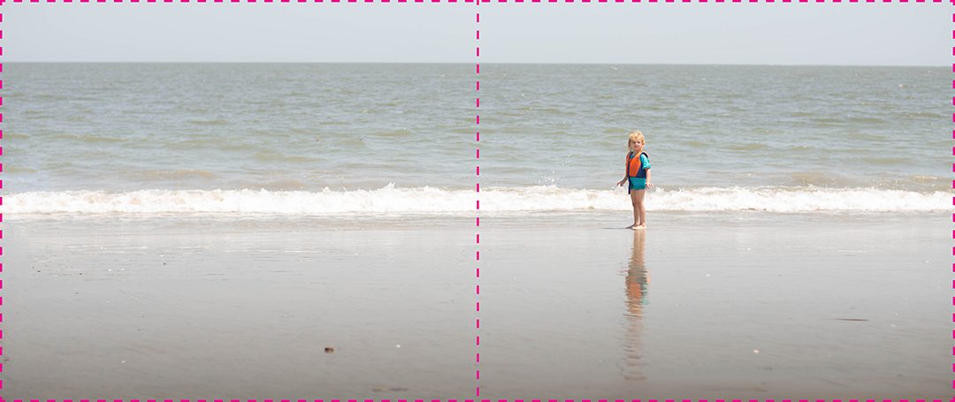
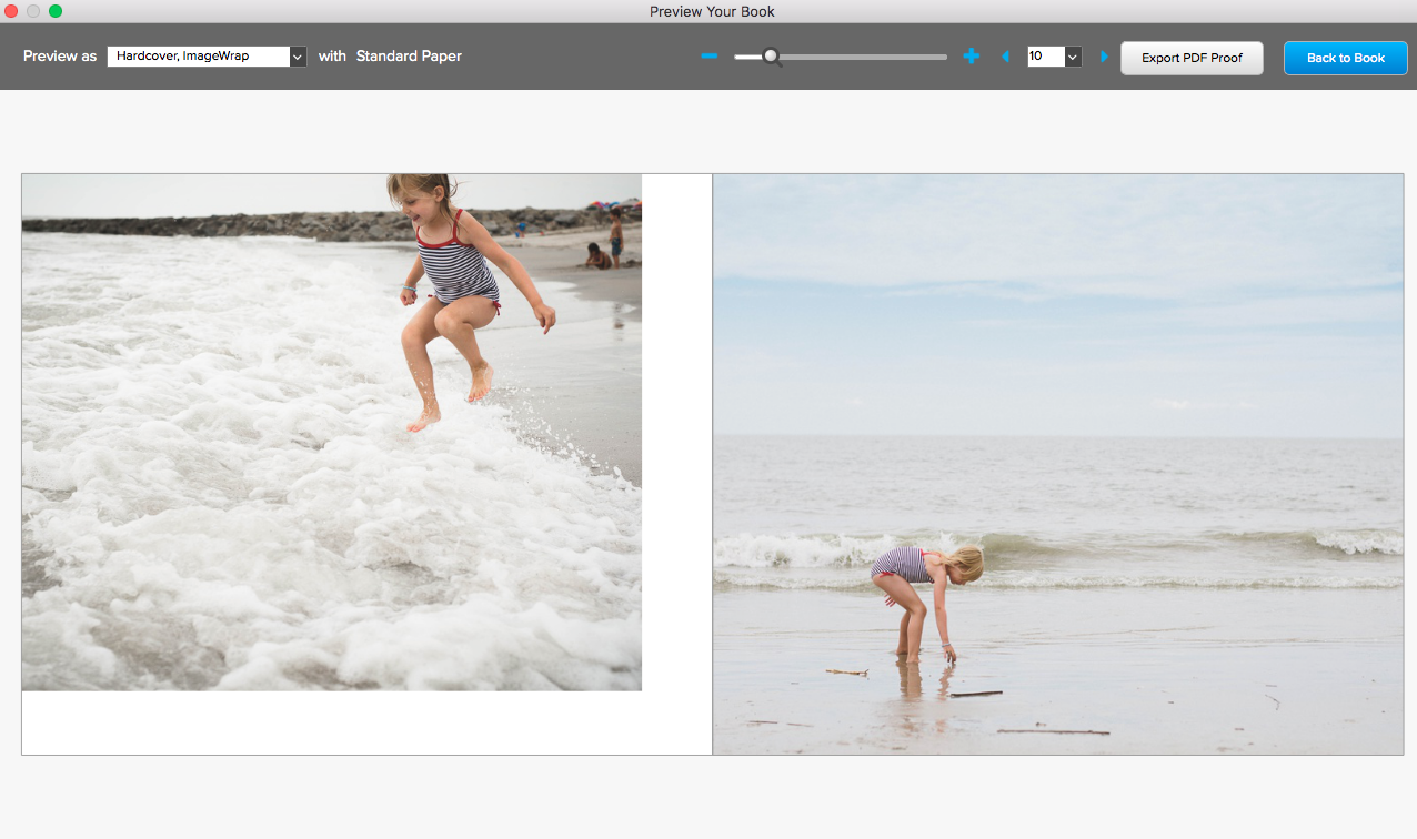
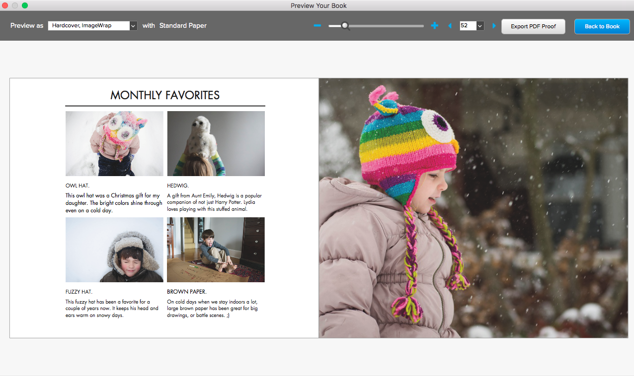
Here’s an example of a layout and how it looks with photos placed in it.

Plus, the template comes with unique layouts to share tell your family story in a fun way. The photo book template comes with a 36-page PDF instructions to help you customize the template to fit your vision.

If you’re hoping to work on your family annual book this summer, start with this template to save you time and design a photo book with unique layouts that push design boundaries in a careful, thoughtful way.

Want to get this photo book template to save you time in creating a beautiful photo book for your family photos?

Purchase the template today to access my template file, favorite layouts and PDF guide on customizing the layouts to fit your photos.
Tips for Creating a Magazine-Style Layout

Tips for Creating a Magazine-Style Layout

As I recently wrote, in my Photo Book Club, we are working on a special photo book project in 2017. I’m planning to document 2 weekends spaced over 6 months in 1 photo book.


With this project, the goal is to reduce the amount of photos – only use photos from a particular time period – in order to focus on the design. Fewer photos means less to select, edit, and decide how to incorporate in layouts. This opens up some time and energy to exploring design concepts you wouldn’t normally try.


When it comes to photo books, I tend to be more engaged and finish a project if I’m able to try something new that excites me.


As I’ve been working with my photo book club members, a lot of the students are interested in trying a magazine-style layout. I wanted to share a few key points with you. If you want to go deeper, all photo book club members get access a PDF with more detail and my analysis of existing magazine layouts. And bonus – you’ll get a new inspiring PDF every month.


1: Orientation

Most of my workshop participants prefer to use the landscape orientation for their photo books. Either the standard size (similar to a size of paper) or the oversize version. This makes sense, particularly if you normally shoot in a landscape orientation.  However, magazine are almost always portrait (vertical) orientation. So the first easy step to achieving a magazine-style photo book is to flip the orientation and make a portrait book.


2: Text

I know, I know….adding text  to a photo book is another layer of work that people just don’t get it. I completely get it!  I’m the same way. After I get through the photos, and layout the pages, it’s hard for me to go back in and add a caption to the photos. However, if you’re looking to make a layout more magazine-like, it helps to have some amount of text on the spread. Whether it’s a title, a quote or a caption, find small ways you can add text.


3: Negative Space

While this may not be true for all magazines, I tend to notice negative space – either in the photos or the layouts. Having negative space gives a little extra room so the layouts don’t feel too overwhelming. For me, if I’m looking through a photo book or magazine crammed with a lot of photos, page after page, I start to get overwhelmed. Plus, incorporating negative space adds space for text, as I discussed in tip #2.


Here’s a sample of the first three tips in one layout:

4: Sketches

One of the best pieces of advice I can share to understanding a layout you love is to sketch it out. As silly as it sounds, I firmly believe that translating something from eye to hand provides a better knowledge of why something works. Next time you see a layout you really like, take out a piece of paper and sketch out the photo boxes and how the positioned on the spread. It may take several tries – but this all helps in the absorbing the mechanics of the layout.

If you want to sketch inspiring layouts, download my free sketch template that is proportional to 3 standard Blurb photo book sizes: Magazine, Portrait and Landscape. 

5: Photo Selection

It’s important to take and select photos that have your design vision in mind. In my latest Photo Book Club PDF, I share how to analyze photos used in magazines and examples on pinterest to help you align your photos with a concept. 

Here’s one page from my April Photo Book Club PDF.

The full lesson is included in my Photo Book Club Guide which you can check out here

Going from BookSmart to BookWright

Going from BookSmart to BookWright

A while ago, I wrote about how Blurb is no longer offering BookSmart in their program offering. You may still be able to open and upload a book you’ve already started….but I’m not sure that will always be an option in the future. And I recommend testing out the upload process within BookSmart at the beginning before investing time in a photo book that can no longer be uploaded for printing.

But all is not lost! There’s a way to import your BookSmart photo book into BookWright – either to keep working on a book-in-progress or to use your favorite layouts for your next BookWright photo book.

I don’t have insider knowledge but BookWright definitely seems to be the direction Blurb is heading. It’s missing a few features I love (text styles and setting an aspect ratio to photo boxes) but there are great things about BookWright that were missing in BookSmart (ability to work in a spread format, auto alignment, and custom margin guides).

If you’re ready to take the plunge but don’t want to start completely from scratch, this tutorial will show you how to transfer your finished BookSmart photo book into BookWright.

01

First, you want to make sure you’ve downloaded the BookWright software from Blurb. It’s free and you can get the download from their website.

Once you’ve downloaded BookWright, launch the program.

You’ll want to select “BookSmart / Bookify Users Import”.

02

Next, you’ll need to sign in with your Blurb account. Since you are importing from an already completed and uploaded photo book created in BookSmart, you should already have an account.

03

A window will pop up with all of the books you’ve made with BookSmart or Bookify. If you only want to select from the books you’ve made in BookSmart, there is a pull down menu to narrow your choices.

Keep in mind, these are books that have already been uploaded from BookSmart to your online Blurb dashboard for print.

04

Next, your photo book is converting into a format that you can open from BookWright. Check your email (associated with your Blurb account) to find out when the conversion is ready.

05

The first photo book I tried, it did not work. You’ll notice in the email, the project is titled “null” not the name of the book I selected. And when I downloaded it, the file was a text file, not a BookWright file. If this happens to you and you really need this particular book, I recommend you contact Blurb customer support. In my example, I selected another photo book with my favorite layouts to convert.

06

The second book project downloaded perfectly. In this email, there is the appropriate book name and when I clicked the link, a BookWright file downloaded. Once the file has fully downloaded, all you have to do is double click and it will open within BookWright.

07

First, it has to update to get ready for BookWright.

08

Then it finally opens!

09

This warning lets you know that there might be slight adjustments to the layouts based on updated photo book sizes. This could be a very minimal (read: unnoticeable) changes. My guess is that it may affect the centering of layouts but is most likely not anything you need to worry about. To be safe, I recommend flipping through the layouts before you save or print just to make sure.

10

All of the photos that were included in BookSmart project automatically carry over into the BookWright program. This is great if you had a few adjustments to make and wanted to finish a book in BookWright.

11

One thing that did not carry over was the text style. The font switches to a standard font within BookWright. This is an easy adjustment….if you don’t have a lot of text in your photo book project.

12

In this example, I simply changed the title in the text box and updated the font style to something I wanted.

13

One of the best reasons to open up a BookSmart project into BookWright is to save your favorite layouts and structure for your next photo book. To accomplish this, simply delete the photos from the boxes to create a blank layout. Then click “Save Layout”.

14

Finally, select if you want to save the left page, right page or the entire layout as a spread. This will place this layout into your “My Layouts” pull down menu. Go through the entire book and save your favorite layouts that  you’ll want to use again.

After you have saved your layouts, delete the pages you no longer need and delete the photos from from the Photos tab.

Now you are ready to start your next book project, in BookWright, with your favorite layouts at the ready!

Learn how to be more creative with your BookWright layouts. Get 5 ideas to go from blah to exciting with your photo book layouts.

Photo Book Design Workshop: Student Perspective

Photo Book Design Workshop: Student Perspective

Being completely honest here…I’m not always the best at describing what I love to do….or how intensely I love helping you print your photos.

Sometimes…..it takes hearing it from others.

A while ago, one of my former PBDW students contacted me that she finally received her photo book and loved it!

Overjoyed could not explain my emotion well enough. I’m absolutely giddy whenever one of my students reports back with photos of their actual book.

Shannon is no exception. And I wanted to share Shannon’s story with you. But first, my Intro Photo Book Design & Advanced Photo Book Design Workshops starts on Monday, March 20, 2017. This is the only time to work directly with me in a workshop setting on your photo book this year.

Now – Here’s what Shannon had to say:

So I took Stacey’s Intro to Photo Book Design Workshop on a whim.

I am a true believer in documenting daily life through photographs and have been a scrapbooker since before my first child was born (I have a 7 year old and 2 year old twins). And even though my life was extremely busy – life in general never seems to slow down – I was determined to take pictures and document our story.

And that’s what I did.

I took several online photography courses to better my skills and was happy with my results. The only thing, I wasn’t printing anything. And what I did end up printing got shoved in a drawer somewhere, a place no one was going to go looking for them.

So when I saw Stacey’s book pop up online one day, I started researching, looked at all her books she had posted on her website and fell in love with the idea of designing my own photo book.

And I’m happy to report hat I have just received my first family yearbook and IT IS AWESOME!

The little details that Stacey teaches makes all the difference in the world (for example Table of Contents, aligning photos from one page to the next, monthly title pages, and I could go on and on).

The things I LOVE about my book are the pages that spread across the entire book…so much impact! I didn’t add much text but what I decided to do was pick a random day out of the month and give a little summary of what was happening.

I couldn’t be happier with the way it came out. I cannot recommend a project like this and Stacey’s PBDW class enough. It is such a great way to see your photos come to life…your story laid out for you in a professional looking book.

Thank you again Stacey for all your great tips and instruction. You were so hands-on and available. You really made the process so interesting and fun. Totally inspired by you and your work. #photobookerforlife

Shannon Belanger

Want to learn more? Sign up for my Photo Book Design Workshops. Registration is open now and workshop starts on March 20, 2017.

Creating a 4-Photo Custom Photo Book Layout

Creating a 4-Photo Custom Photo Book Layout

You may have noticed that Blurb no longer offers BookSmart as part of the free software options. It’s now officially been replaced by BookWright.

While I’ll miss being able to create text styles and having a grid to help with design, there are a few aspects that I love about BookWright:

  • being able to design as a spread (instead of customizing a single page at a time)
  • setting up grid lines to create a custom margins for a photo book
  • a more user-friendly interface

In this month’s tutorial, I’m explaining how you can make a small adjustment to Blurb’s 4-photo layouts to customize it to your photos.

Plus, if you’re starting to get a little frustrated with BookWright and ready to go all in with designing photo books, I’ll share how easy it is to design a 4-photo layout with InDesign.

Out of the box, here are the 4-photo grid layouts included in Blurb’s standard layouts:

It’s true, these layouts are centered and will work for a photo book, however, it’s important to recognize that these boxes don’t fit the standard proportions of a photo – creating more work for you later. You’ll have to adjust your photos if you don’t want them perfectly centered in the photo box.

And for some layouts, you may want more space around the photos without using a square box.

Here’s the finished layout I created in BookWright. It’s still centered but in this layout there is extra space at the top and bottom and the entire photo is shown on the page.

To see how I skipped the standard layouts and created my own 4-photo layout, watch this video:

Want to learn more? Sign up for my Photo Book Design Workshops. Registration is open now and workshop starts on March 20, 2017.

Photo Book Layout Ideas: Zaha Hadid

Photo Book Layout Ideas: Zaha Hadid

It’s been over a week since the announcement of Zaha Hadid’s unexpected death and I wanted to take some time to share how Zaha’s work has inspired me, both as an architect and a designer. In 1997, I visited her first built work, Vitra Fire Station soon after it was built. Then in 2003, while I was living in New York, I made a special trip down to Cincinnati, my hometown (big) city, for the opening of the Cincinnati Art Museum.

As the first female architect to ever win the famed architectural award, Pritzker Architecture Prize as well as the RIBA Gold Medal earlier this year. Since it took 25 years since the inception of Pritzker Prize before a female was awarded, it shows how difficult it is to receive recognition as a female architect. I was always drawn to her visionary, painterly approach. And while there was criticism surrounding her work, she made a significant impact on architecture – in her built and unbuilt work – by creating striking new forms and pushing the boundaries of how we conceive of architecture.

Each art progresses at its own speed, and Hadid accelerated her development by taking architecture to what appeared to be unbuildable extremes in drawing and painting.

Joseph Giovanni on Zaha Hadid’s work in “In the Nature of Deign Materials: The Instruments of Zaha Hadid’s Vision”

Just two weeks ago, I shared one of my favorite books for design inspiration in my recent Intro to Photo Book Design Workshop: Zaha Hadid. This book features Zaha’s work in a compelling way. To mark Zaha Hadid’s legendary impact on creative thought, architecture and design, I wanted to share my insights on this book. While it doesn’t get into her work, the book design is a compelling nod to her work: simple, stark contrast and visionary.


As I mentioned in the introduction to this workshop, I’m educated and registered as an architect. So, I have lots of architecture books lying around the house.  As you can imagine, they are heavy on the photographs (and drawings), so their layouts can be easily applied to photo books as well.

I received the Zaha Hadid book as a Christmas gift one year.  It is a compilation of the work (built, drawings, models, etc.) of Zaha Hadid, a female architect based in London.  This is a beautiful book and one I want to feature to you because a) it is a square format and b) it features a black background.  I’m trying to cover all the bases with my photo book inspirations!

A simple cover conveys the form and heavy reliance on the black color throughout the book.  The cover is very indicative of the look and feel of the entire book.  The content of the book is organized into 3 basic parts: a text description of the firm and the project (printed on white paper), projects (black paper) and credits (back to white paper).

A unique feature of this book is that each page is actually a folded-over page, so there are no images on the backside of the paper.  Obviously this is a custom feature, but one I wanted to point out!

I love how the captions are handled in this book.  It may not be appropriate for your family book but it is a sophisticated way to give more information about the photos.  Each photograph is numbered 01, 02, etc., above, and at the bottom of the page is a more detailed explanation of the photo.

The specs:

  • Square Size (9.5″w x 9.5″h)
  • Soft cover
  • 197 pages

The layouts below are inspired by a few of the layouts from this book. Even though this book is 9.5″ x 9.5″, I adjusted the layouts to fit a 12″x12″ square size book.

Want to get jpegs to help you re-create these layouts for your own photo book? I’ve got a great free download for you!

Unlikely Inspiration for Color in your Photo Book

Unlikely Inspiration for Color in your Photo Book

Last week was Dr. Seuss’s birthday and both of my kids had to dress up all week. It involved pajamas, stripes, hats and wockets. One day my son had to wear crazy socks and I realized, he didn’t have much to pick from.


While I have some colorful, fun socks, he only has black and white socks. Boring! To remedy the situation, I had him pick out a pair of my socks to wear. (And surprisingly they fit!)
This whole exchange was a strange coincidence because fun socks happen to be the theme of my video tutorial for you. Finding inspiration in the most unlikely places: Socks. Yep, it’s true. I’ve found inspiration in socks (mine….not my sons).
I’ve started to notice how socks have become more of a designed accessory lately; so I decided to channel this influence into my book design.

Want to see exactly how socks transformed my design process? Check out this video:

For a free download of these colors plus two patterns to use in your photo book, sign up below.

The Biggest Mistake you’re Making with your Photo Book

The Biggest Mistake you’re Making with your Photo Book

All too often, I hear people who want to make a photo book. They know it’s important to print their photos and set a goal to make this year – the year – they actually make one. Yet, most people don’t follow through.

Why?

Their goal isn’t stated in a way to set them up for success. It’s not specific or action-oriented. Instead it’s a generic, bland statement without any steps. If you want to make a photo book this year, my recommendation is to define a SMART goal. In a recent post, I explained the core principles but if you want to hear how I reverse engineer my goal into action steps watch this video:

I share the full video, including my specific design vision, in my mastermind program.

Set Your Photo Book Goals in this FREE Workshop.

Creative Layout Idea for Back-to-School Photos

Creative Layout Idea for Back-to-School Photos

It’s Back-To-School Time!!!!!

Of course, you’re well aware if you have a kid starting school….or have opened up your facebook feed lately.

My oldest started first grade last week. And since I’ve already given advice to moms with their oldest heading off to kindergarten, I thought I’d share how moms with kids of any age can turn those back-to-school photos into a really fun layout for their annual photo book.

When the most recent issue of Martha Stewart Magazine landed in my mailbox, I noticed a really fun “Good Thing”. The magazine featured clip art of familiar and retro back to school items, like paper clips, erasers, and pins. They recommended downloading their free graphic to use them for school book covers.

Since my mind is always thinking about photo books….I wondered how it would look to use these in my personal photo book alongside my son’s obligatory Back-to-School photo.

To be honest, these photos are never my favorite. They always feel forced and my son always has really, really puffy eyes in the morning. I liked the idea of using a graphic to liven up the page and make this milestone event a little more fun in its presentation.

Instructions:

If you like my layout examples below, follow my simple instructions to add a little extra somethin’ to your photo book!

1| First, buy a copy of Martha Stewart Living and turn to page 27 for the free download link.

I highly recommend this magazine, not only for the great advice and the free downloadable items they provide each month….but it’s also beautifully laid out and a source of design inspiration. If you don’t already have a subscription, pick up a copy during your next grocery store trip.

2| Go to the website to access the free downloadable graphics.

3| Once you’ve downloaded the graphic, determine which one you would like to use. Open up that particular PDF page in photoshop. Use the rectangle tool to select the area you want to include.

A simple {open apple} +C, {open apple} +N, and {open apple} +V is all it takes to copy and paste into a new file.

4| Save the file as a jpeg into the folder where you keep all of your annual photo book photos. If you don’t have one yet….create one now. You may find other items you want to include in your book that are not from your camera.


5| Finally, insert this photo into your photo book as you would any other photo. Add your kids’ back-to-school photo plus any title or text you want to include and you’re finished!


Here are my examples:

Enjoy!

Selecting Vacation Photos for your Photo Book

Selecting Vacation Photos for your Photo Book

When you go on vacation, chances are you take your camera and capture a lot of photos.

Although I spend quite a bit of time enjoying the activities with my family (without the camera in my hand), it’s true that I end up taking more photos over the course of the week than when I’m home.

Primarily, this is because most of the things we do on vacation are momentous, out-of-the-ordinary activities that I want to document. I want to capture the building of a fragile sand castle and finding the perfect seashell as it’s the most likely the only time it will happen this year.

Recently, we returned from a fun and relaxing trip from the beach. Over the course of the week, I took over 900 photos. And I’ll have to find a way to narrow these 900 down and select about 20-25 for my annual photo book.

How do I select vacation photos for a photo book?

Selecting photos is often the hardest part of making a photo book.

The first step in selecting photos is to pay attention to the context. Notice how I said “…for my annual book” above? Already, I’m defining the context in which I’m selecting photos. If I was selecting for a vacation book, the number of photos and the criteria of photos would be different.

Once I know the parameter, I can then start the specific selection process. I’m sharing my main strategy for selecting photos in my next video tutorial. (Access is for my email subscribers. Sign up or check your emails for your access code.)

In Part Two of my free video tutorial series, I show the rule I followed to narrow these photos:

…into this layout:

Cart

my favorite resources

blurb

artifact uprising

shutterfly

Shutterfly 50 Free Prints 300x250

clickinmoms

creativelive

Sign Up at CreativeLive

To see my free video tutorial on how – and why – I selected only 1 photo

from 180 photos for a layout, sign up for my free video tutorials below.