by Stacey Wiseman | Sep 25, 2012 | Family Photographs, Photography Tip
I thought you would be interested to see how I edit a photograph for my photo book! I use Lightroom for most of my edits. And although I prefer to keep my edits simple, straightforward and quick, there are very few photographs that I don’t edit…even if it is just a little tweak.
Stay tuned for an upcoming post about specific tips for editing photos that are going to go in your photo book.
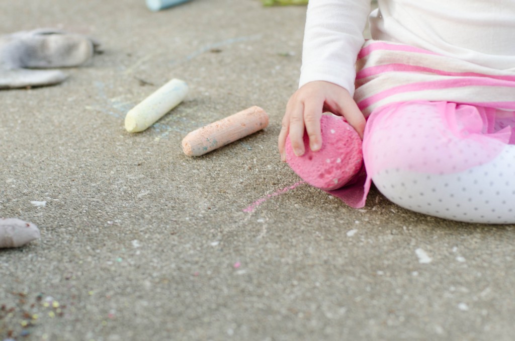
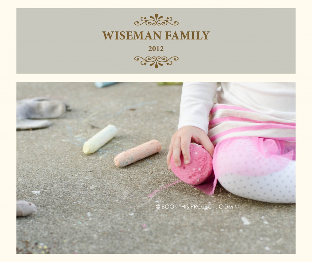
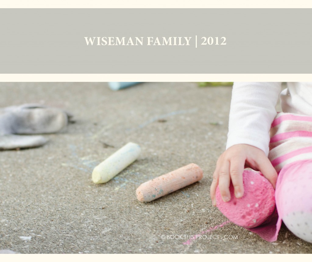
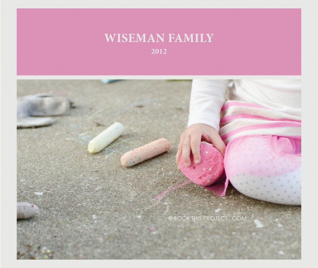
On to the edit! You may remember this photo from my August “How I view…” series. It took a couple of edits to get the version captured with my camera to the version I am going to use in my photo book.
Before
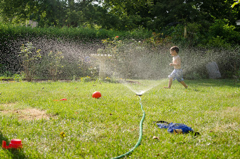
[divider] After
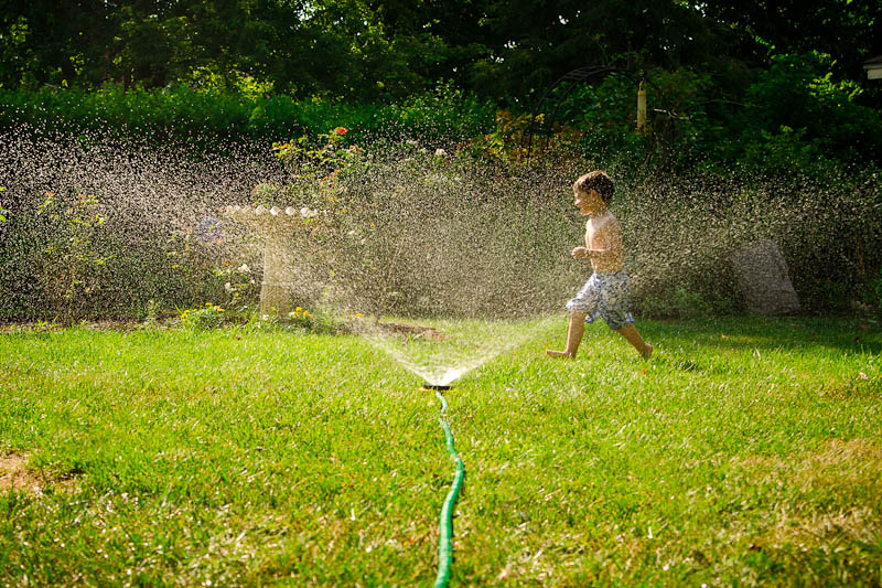
[divider] And here is how I got there!
[divider]I want to hear from you! Leave a comment below letting me know if you typically edit your photos and what program do you use?
And if you enjoyed this post, make sure you sign up for my Thursday email!!!
[divider]
by Stacey Wiseman | Sep 21, 2012 | Cover Series, Photo Book Design Layout
This cover is serious and silly at the same time. A silly black and white photo is paired with a stark black background and a thin gray text. The font happily takes a backset in this design…and that is the point. Nothing over-done. It is very simple…and in its simplicity, it makes you want to pick it up and view the pages inside.
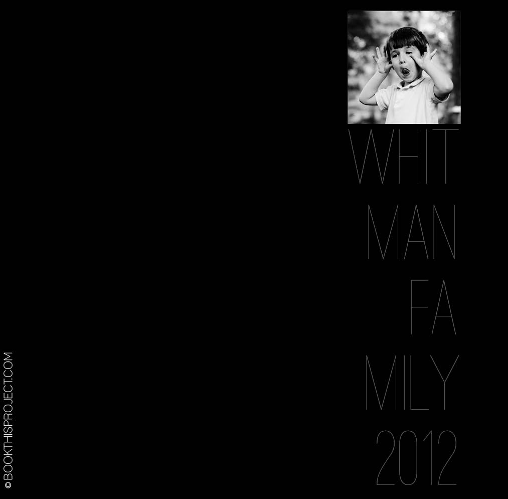 The inspiration for this cover is on my pinterest board “Layouts.” Are you following me yet?
If you love this example or if it gives you some ideas for your photo book, pin it!
[divider]Make sure you sign up for the Book This Project weekly newsletter. I have a free download when you sign up!
by Stacey Wiseman | Sep 18, 2012 | Photo Book Design Layout
Two weeks ago, I had a post about my daughter’s new (and slightly too big) dress (here). In this post, I am going to share with you how proportion factor into photo book layout design. If you have ever had to print the same photo as a 4″x6″ and a 5″x7″ or 8″x10″, you realize that each of those show a little bit different crop of the photograph.
What works as a 4″x6″ does not always work (or work as great) as an 8″x10″ photograph. This is true for photo book design as well. You may love an image and want to feature it large in your book, but it may not work.
The concept of proportions is most easily described through photographs, so let me demonstrate.
I loved this photograph of my daughter.
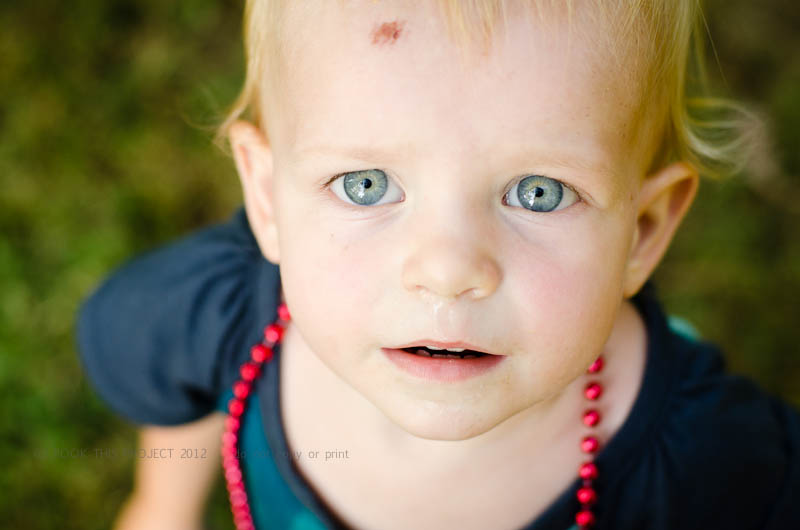
And as you know, I also love to feature my favorite photographs as a full spread (image on both the left and right hand side of the page). But this photograph is not the right size for a full spread.
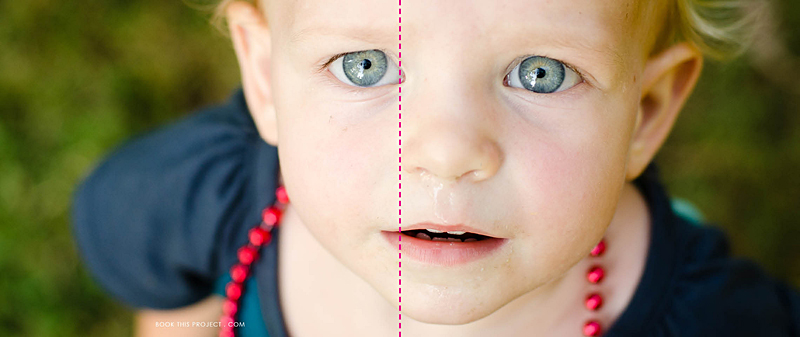
The pink dashed line indicates the center of the book, or spine. See how the pink line goes right through her eye. Not good! The layout design is taking away from the best part of the photo.
Plus, do you notice how her boo boo is now missing? This is because the proportion (the width in relation to the height) of the photograph is different as a 4″x6″ photo than when it is put in a photo book which is 8″x20″.
To clarify a little more, we doubled the height (from 4″ to 8″) but we more than tripled the width (from 6″ to 20″). If you wanted to keep everything in the 4″x6″ photo, you would need a 8″x12″ photo box in your layout. Does that make sense?
Here is a an improved example.
Photo:
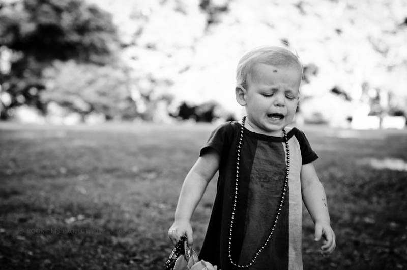
Layout:
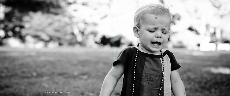
In this example, the action, or main focus of the image is occurring primarily on the right side. It is true that her arm is located in the spine of the book, but this does not take away from the purpose of the image…which happens to be her frustration!
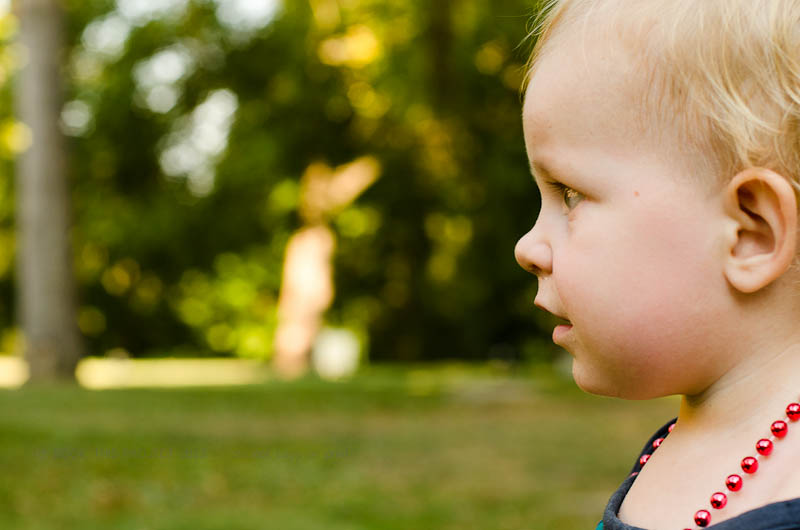
For the final example, I think this photograph lends itself really well to a full spread layout.
Photo:
Layout:
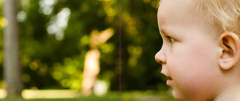
As you can see, selecting each photo and how it is shown on the page takes more than just selecting your favorite photograph. Key to any great photo book design is knowing how to design the layout that best suits the photos.
Let me know in the comments below, did this inspire how you will design your personal photo book?
by Stacey Wiseman | Jun 1, 2012 | Description, Family Photographs, Inspiration, Photo Book Design Layout, Photograph
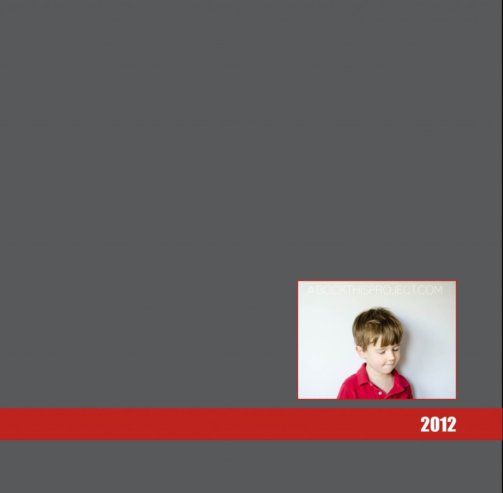
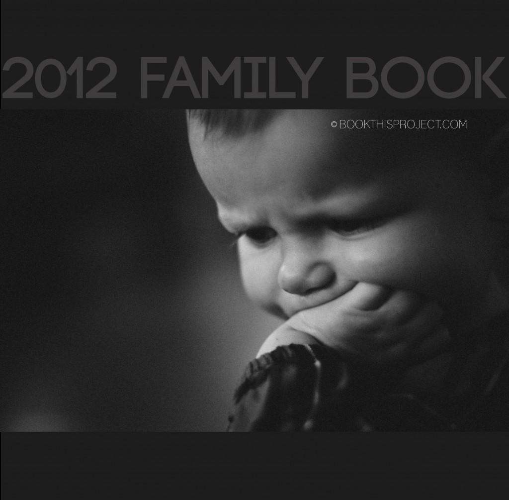
For this photo book cover, I am incorporating the two shades of dark gray with a black and white photograph. This gives the cover a stately simplicity that would perfectly set up a modern photo book. For the interior of the book, the same dark gray with light gray font could act as the section pages, dividing the custom photo book into months, seasons, or events!
[divider]Make sure you pin it!
[divider]
by Stacey Wiseman | May 18, 2012 | Family Photographs, Photo Book Design Layout
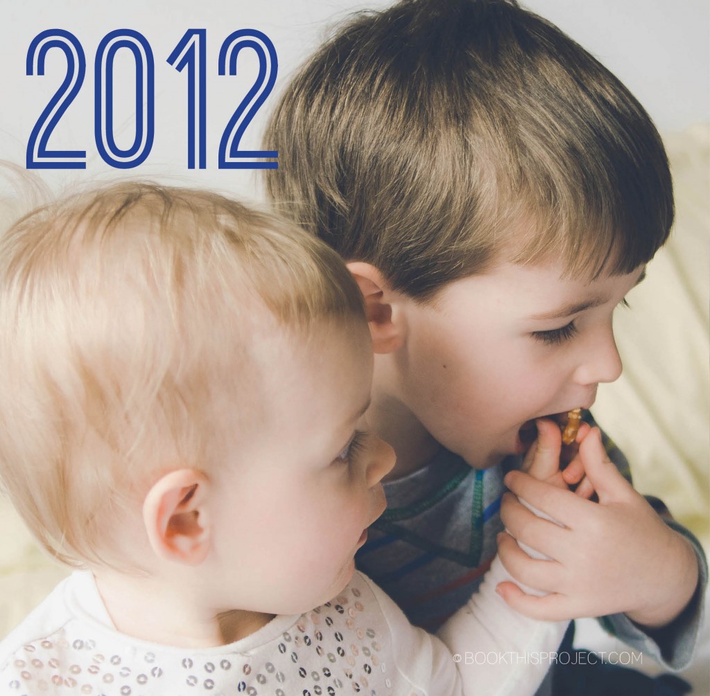
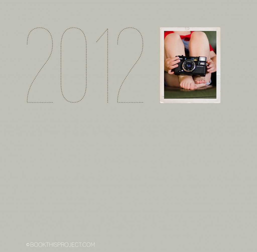
Here is the next entry in the Book This Project 2012 cover design series.
 [divider] Make sure you pin it!
[divider]
by Stacey Wiseman | May 11, 2012 | Family Photographs, Photo Book Design Layout
2012 cover design series: make sure you pin it!

[divider]
by Stacey Wiseman | May 4, 2012 | Description, Photo Book Design Layout, Photograph
Here is another entry in the 2012 cover design series. Make sure you pin it!

by Stacey Wiseman | Apr 30, 2012 | Family Photographs, Inspiration, Motivation, Photo Book Design Layout
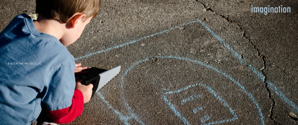
The following is an example of my April page for the One Word Challenge. For this layout, the photo is a full book spread bleed. In order to do this, I had to crop the image but I think it still works and will have a big impact in my family book.

by Stacey Wiseman | Apr 24, 2012 | Inspiration, Photo Book Design Layout, Photograph, Tutorial
Following up on my last inspiration post where I translated the cover of an Anthropologie catalog into a layout, this example features a cover of a non-fiction book. It is simple, elegant, and stately.[divider] Inspiration:
Eating Architecture edited by Jamie Horwitz and Paulette Singley

[divider]Photograph:

[divider] Iterations:
And here are five iterations.


[divider] Do you have a favorite?
All of these are on my pinboard “Inspiration and Iterations.” Pin your favorite now!
by Stacey Wiseman | Apr 13, 2012 | Description, Family Photographs, Photo Book Design Layout, Photograph, Podcast
The March/April podcast is finally here! It took me a while but I was finally able to pull it all together!
In this podcast, I take a simple photo book concept from beginning to end. There is a FREE companion download to this podcast. I hope you check it out and I would love to hear how it helped your photo book. Also, I would love to see any photographs or layouts you come up with! Add a comment with a link below!
Thanks and Enjoy!!!





 [divider]
