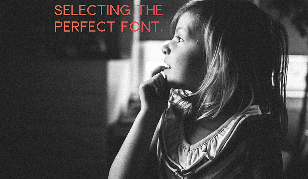
Selecting a Font to Match your Photo Book Vision
Last week was the season premiere of Game of Thrones on HBO. Whenever I heard people talk about the show, I was not that interested in it. Didn’t seem like my type of show. But….last year when my husband and I had watched all of our shows in our queue and looking for something new, we thought we’d give it a try. I wasn’t expecting much. Just a show to have on while I worked in the evening.
Turned out, I got sucked in. While I don’t follow all of the details, I’ve been surprisingly gripped by the storylines and beyond gorgeous scenery. To celebrate the start of Season 6, I wanted to examine how this show, and others on HBO, align the font characteristics in the title to the vision and style of the show.
Let’s look at the following shows:
- Game of Thrones
- This Week with John Oliver
- Veep
- Girls
- Togetherness
- The Jinx
They all have a very different style and way of showing the title at the beginning of the show.
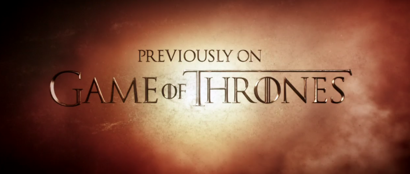
1) The Game of Thrones title appears after the long initial sequence. The font itself is a relatively simple serif font. The “G” and “T” are slightly larger and the “T” is asymmetrical top bar, as the right side extends the entire length of the word. The “O” adds the uniqueness to the font style and gives the font a more historical feel.
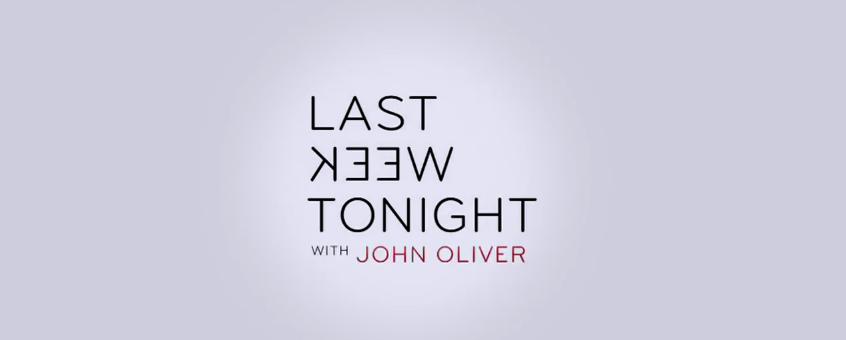
2) Last Week Tonight with John Oliver is a perfect example of a clean and modern font. The sans serif, centered font has all of the letters in black against a white background except for his name which is in a muted yet bright red color. To make the title a little more interesting, “Week” is written backwards to express a little bit of attitude and the desire to flip the news stories of the week by telling it from a different perspective – with humor from a Brit.
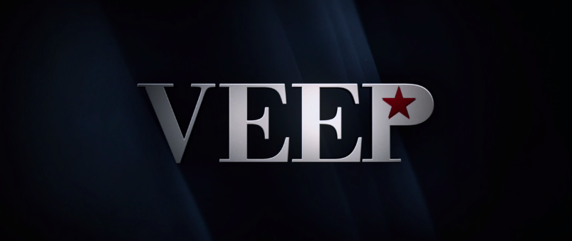
3) The hilarious show Veep uses a traditional serif font very similar to Times New Roman. The designer used a star instead of the space in the middle of the “P” to provide a nod to the political nature of the show without it being too bombastic.
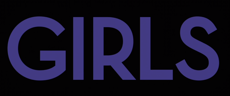
4) With the show Girls, the title always appears after a couple of scenes in the beginning and then full screen a black background with the title all in caps and displaying a different color every week. I love the typeface of the title. It has a early to mid-century modern feel to it. The fact that it’s all caps, a bold color and takes up most of the screen mimics the show’s ability to unabashedly portray twenty-somethings in New York City as they sort through employment, relationships, and trying to find themselves.
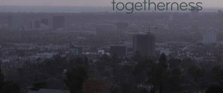
5) The vibe of Togetherness is more understated than a lot of other dramatic shows which is evident by how the title is displayed over a scene. In this particular example, the color of the font is so similar to those in the scene there is complete unity. Here’s another example of a sans serif font but the letters are more rounded than the letters found in “Last Week” or “Girls”.
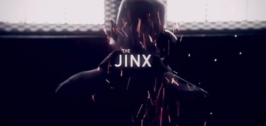
6) Oh, The Jinx! What a show. As seen in this electrifying still, the title of the show is featured prominently over a scene in the opening sequence. The title design features a common element to make “The” smaller and set in from the main word of the title. Also, the two words appear to have a slight transparency to them. This design tweak adds to the sense of confusion ever present throughout this documentary.
Now, how does this translate to your photo book design? Well, as you probably already know, defining your vision is super important for me and a huge first step in making a photo book. It helps you stay focused in your photo selection and gives you a direction for establishing design parameters for your book. This is also true of the graphics, color and fonts you decide to implement. In this blog post, I’m sharing how to select a font style to match your design vision.
First, you should already have a clearly articulated vision. To help keep you focused, decide on three essential words to define your vision.
Second, find examples on pinterest or in magazines the align your vision. Make sure you pay attention to the particular font style used. You are looking for examples where the font matches the overall feel or vibe of the image/graphic. Ask yourself, why?
- Is it a traditional or modern typeface?
- Is it bold or understated?
- Does it involve color?
- What about the text makes it feel cohesive?
Third, search through your font directory (for example, on apple computers use the Font Book application) and use the arrow keys to find a style that suits your vision.
If none of the font styles seem to fit, try looking at font directory sites like font squirrel or dafont for more ideas. They usually have categories that make it easier to narrow your selection.
Finally, determine if there is a small element or graphic twist you can use in your text. This can either be assigning a color to a specific letter or word in your text, adding a glyph (special character), or inserting your text in an unusual way.
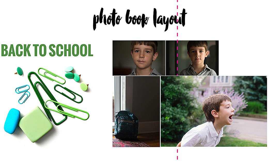
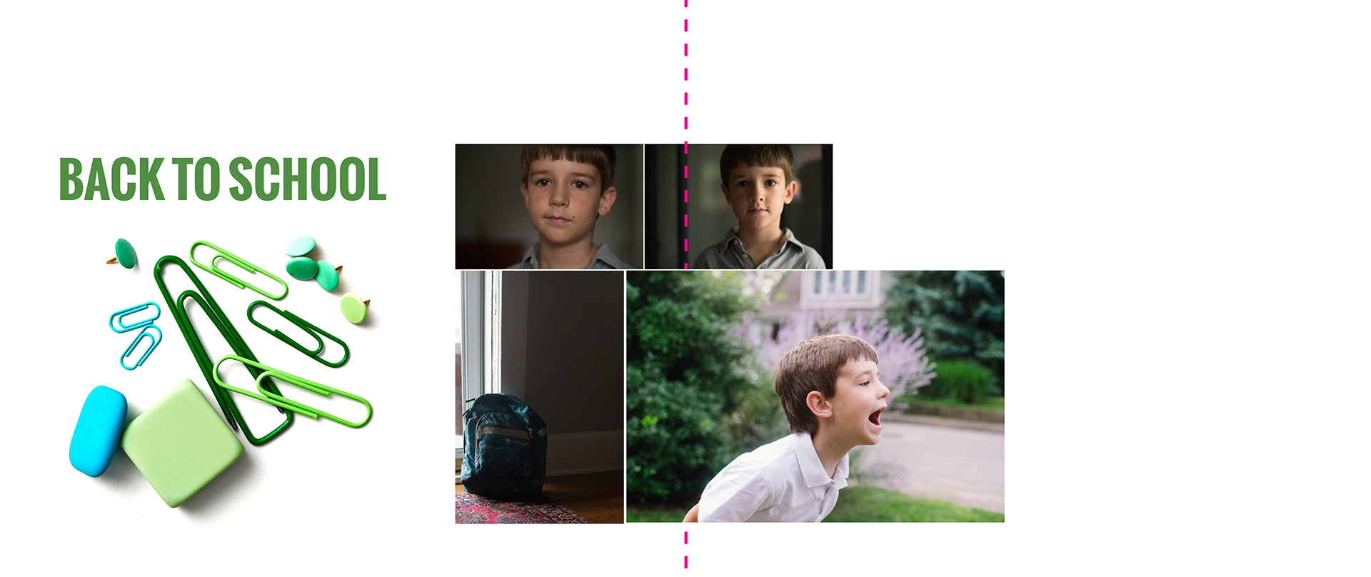
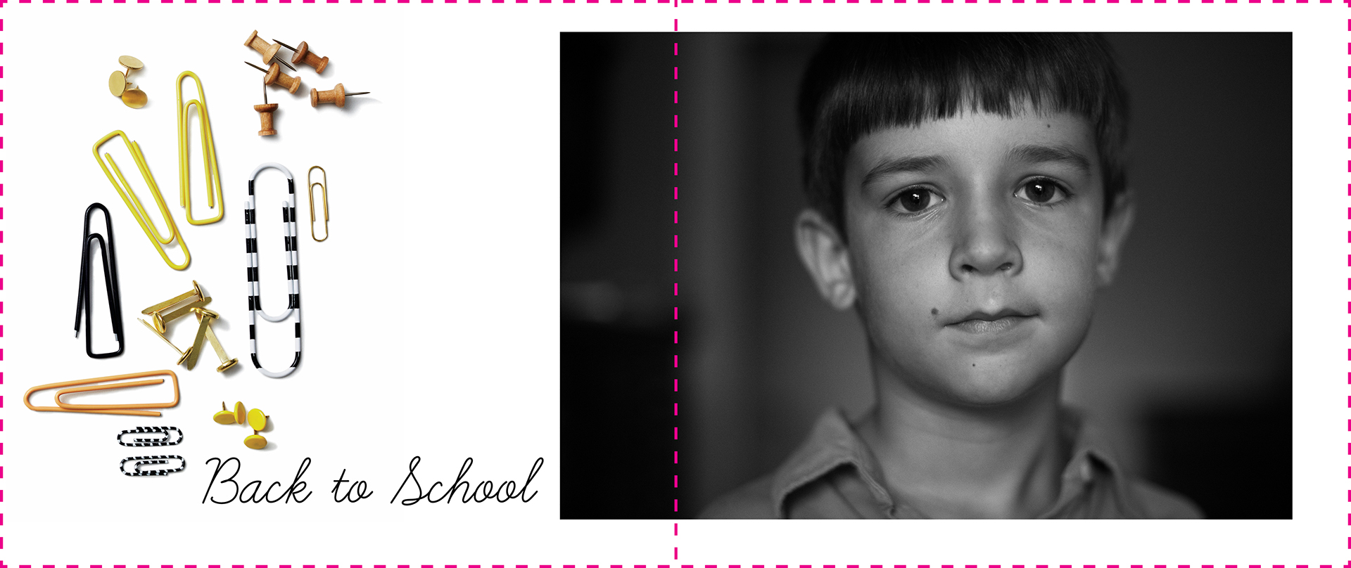
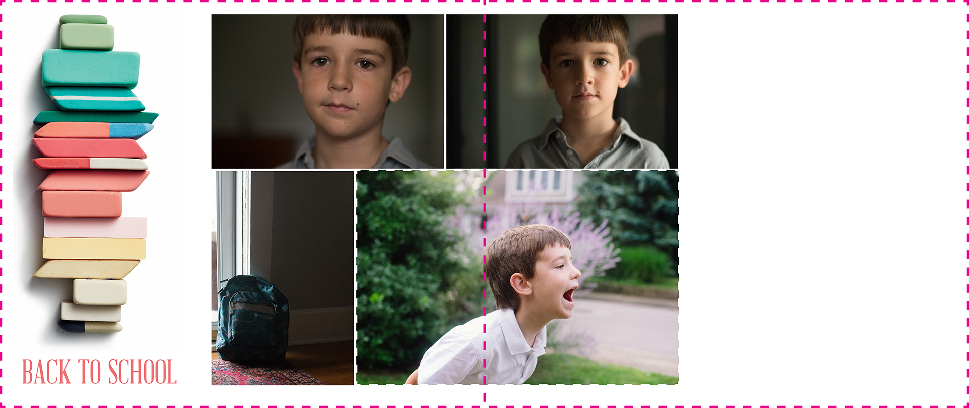
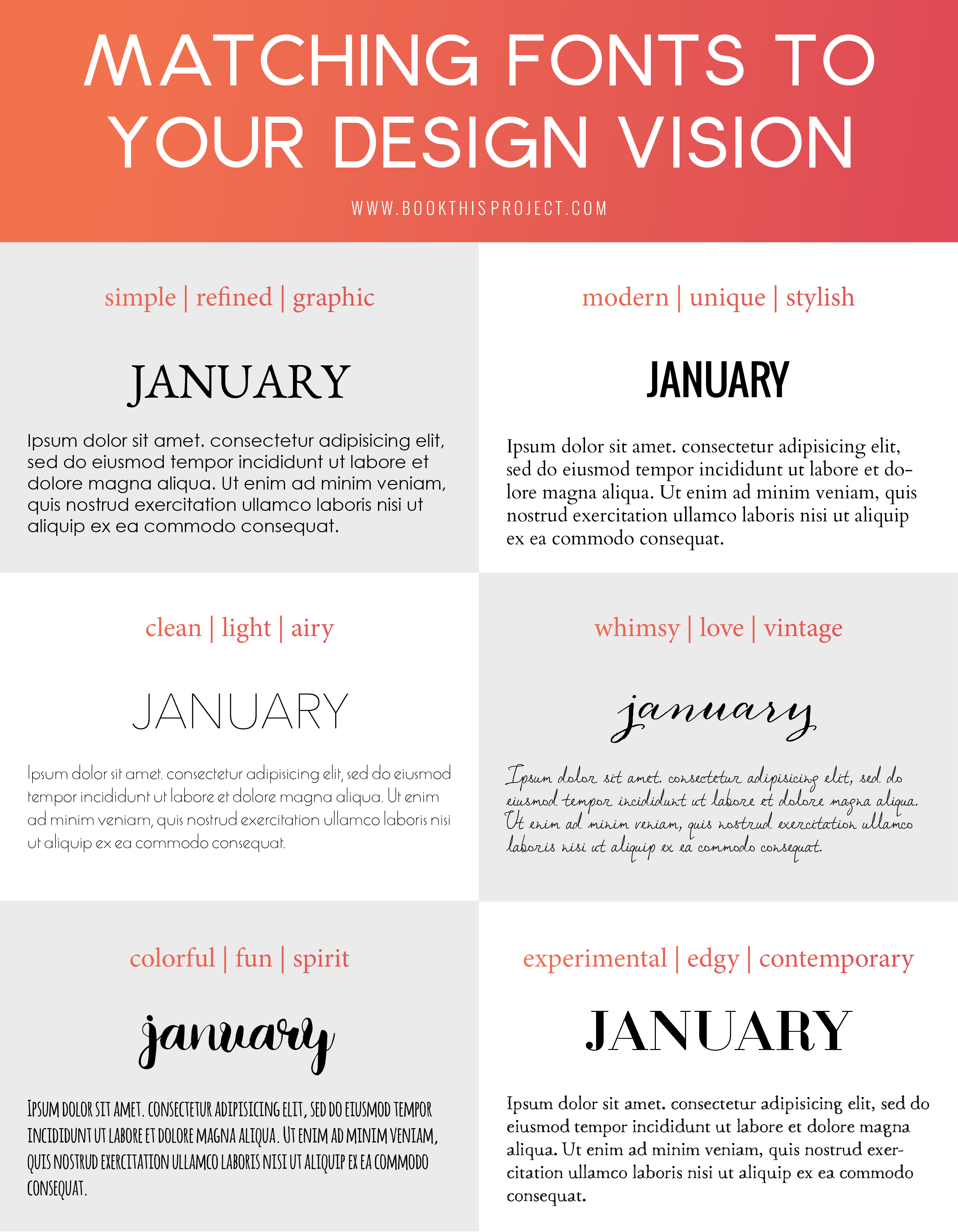
To get you started, I’ve assemble some common photo book design themes and paired a title and body font style to match. Of course, there are many different directions you could go, but hopefully this helps you see how I begin to pair fonts with a particular vision.
Get a PDF download with the links to the fonts shown above + find out my go-to favorite serif, sans serif and handwritten fonts: Simply add your name and email here:
And of course, I’d love to hear from you! What three words define your vision for a recent book design and what is the font style you selected? Leave a comment below.