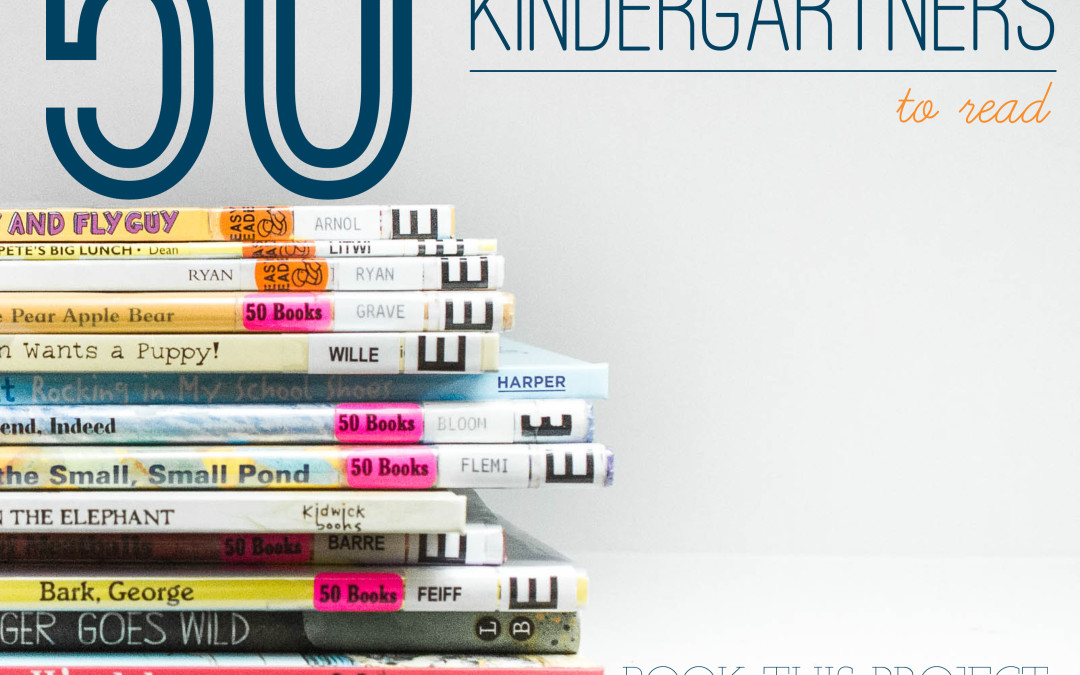
by Stacey Wiseman | Oct 22, 2014 | 50 Children's Book Design Tips, Design Series


This adorable book illustrates what farm animals do once the kids head back to school.
In this book, you’ll see a captioned a group of photos, which is a great way to incorporate a small amount of text under your photos.
Plus, it has a great play on words with a joke at the very end! I’d love to hear if you got a chuckle from your kids on this one.
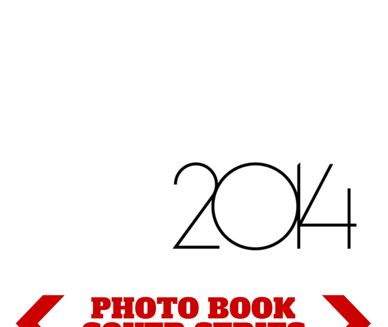
by Stacey Wiseman | Oct 17, 2014 | Design Series, Photo Book Design Layout
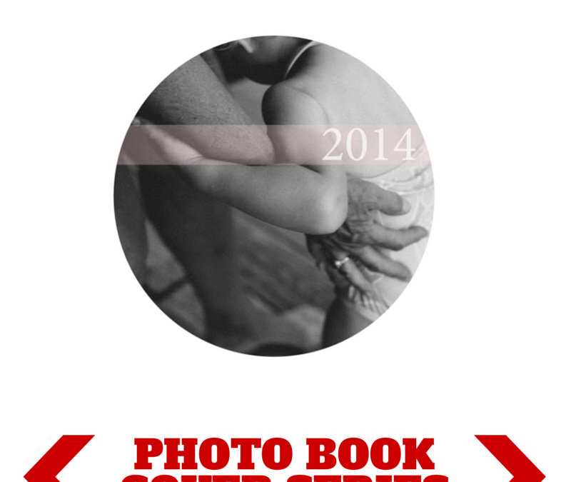
This photo book cover is so simple yet so powerful. If you decide to use a text only cover, you want to make sure you study font options and select the right style that goes with your photo book.
For this photo book cover example, I used the font Marlowe which is thin and modern. But it’s a little more great gatsby than bauhuas.
Each number in the year is a separate text box so I could control the spacing of the numbers and overlap them exactly as I wanted. The numbers are all connected and that satisfies my vision.

by Stacey Wiseman | Oct 13, 2014 | 50 Children's Book Design Tips, Design Series
I love books that build up with each page. Mr. Grumpy goes out for a boat ride and children + animals ask to join along one by one. Then as the boat fills up (spoiler alert), it topples over and all of the animals and children fall out. Oh…and Mr. Grumpy too. 😉
I love the illustrations. Ink inspired, it’s not as cartoon-y as some other illustrations.
As for the tip, the double page spread was really the climax of the book and the only double page spread on the book. As the only one, it shows the importance of the scene. Check it out and let me know what you think.
by Stacey Wiseman | Oct 6, 2014 | 50 Children's Book Design Tips, Design Series
Being totally honest here…this was not one of my favorite books so far…but my daughter loved it. She had so much fun going through each page and assessing the happy, sad, angry, grumpy faces. It’s a clever, if not a little odd, concept to shape fruit and vegetables into personalities.
Check it out and let me know what you ( or your child) think!
How are you Peeling? by Saxton Freymann and Joost Elffers.


by Stacey Wiseman | Sep 29, 2014 | 50 Children's Book Design Tips, Design Series
Oh Olivia. Olivia!
Olivia books are a definite favorite in our house. We have the original, losing a toy, goes to Venice, etc. It goes on and on yet they never disappoint. And have you seen they have an Olivia show on Amazon Prime. You can watch for free!!! It is a hoot.
The Olivia books are marvelously crafted, from the writing, wit, and illustration. If you don’t have one of these books in your library…start today!
Today’s Photo Book Design Tip comes from:
Olivia by Ian Falconer.


by Stacey Wiseman | Sep 22, 2014 | 50 Children's Book Design Tips, Design Series, Photo Book Design Layout
Oh, this was a great one!


Miss Nelson Is Missing! Written by Harry G Allard Jr and illustrated by James Marshall.
My son understood the trick Ms. Nelson played on her class before the end of the book. I just love seeing little kids’ minds work as a book is being read. This part-detective, part-mind-the-rules book was a definitely a favorite. We’ll be reading more in this series!

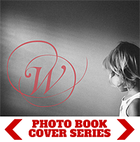
by Stacey Wiseman | Sep 19, 2014 | Cover Series, Design Series, Family Photographs, Photo Book Design Layout
There is something so seductive in a form, shape, color, or font that makes a suggestion. In this cover design, I left a lot of white space on the page. I used a circle photo box, which I find becomes a dominant shape on the page, and then I used the subtle, translucent suggestion of a pale color bar with a white font to indicate the title of the book.

by Stacey Wiseman | Sep 15, 2014 | 50 Children's Book Design Tips, Design Series
In the adorable children’s book, Hurry! Hurry! by Eve Bunting and illustrated by Jeff Mack, a rooster calls all farm animals to join to greet a new friend to the farm.
And my design tip for you is an easy one if you have a children who love to tell stories…or better yet…jokes!


by Stacey Wiseman | Sep 12, 2014 | Cover Series, Design Series
I’ve got a simple cover for you. The premise: an initial. One letter. Symbolizing your last name….your family.
I like the fact that this photograph is a slightly more obscure photograph.
But I think what really works is using a somewhat abstract photo with negative space.
In order to customize it, select a decorative font that speaks to you and specify the color.

by Stacey Wiseman | Sep 9, 2014 | Design Series, Inspiration, Photo Book Design Layout
We are four steps into my photo book design process and – finally – I’m placing the photos on the page!
I’ve taken the photos, selected which photos to use, edited the photos and now is the time to figure out how they will work together on the page.
Often times, when I’m selecting photos I have a pretty good idea of a layout arrangement but not exactly sure on the specific layout.
This perfectly describes the photos I’ve selected for this particular photo book.
During my selection process, I had an idea to include a solitary portrait of my son and daughter on one page plus a collage of them together on the opposite page. But…I’m not really sure how that will look on the page.
So I test. I try different layouts. I see how the photos look on the page and then determine which one looks the best. What makes the most sense on the page? What scale, spacing, and positioning works the best for the photos.
You should know, there is no wrong answer and what may look best to me, may not be the same for you. And that’s ok. It’s what defines our personal style and vision. That being said, I do think your skills are refined, the longer you design.
Watch this video to see how I test my page layouts.
Next month, I’ll finalize the layout with some text and color!


