by Stacey Wiseman | Jun 14, 2014 | Cover Series, Photo Book Design Layout
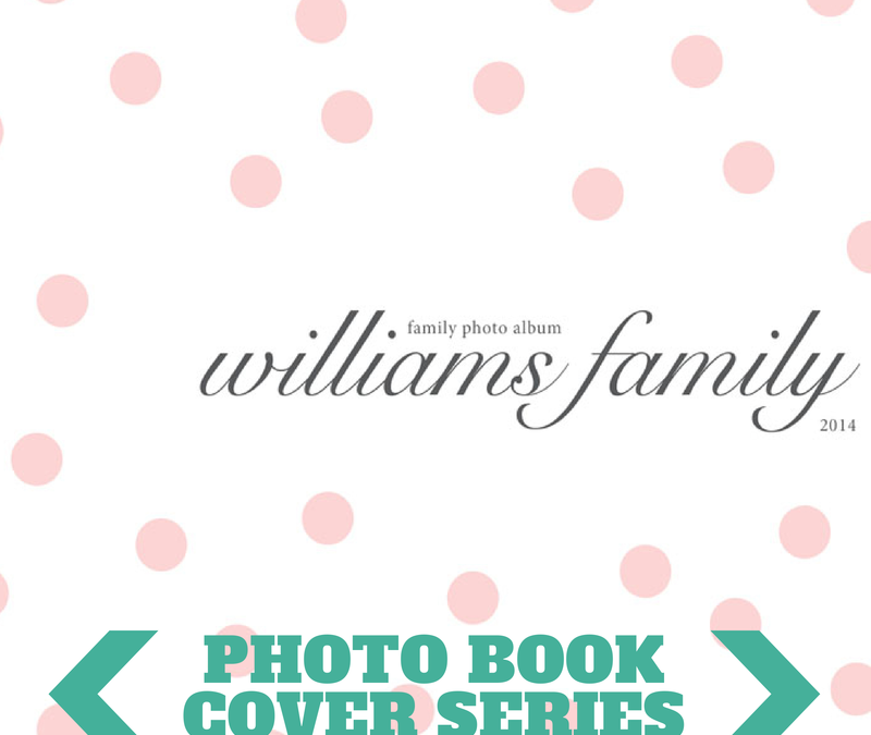
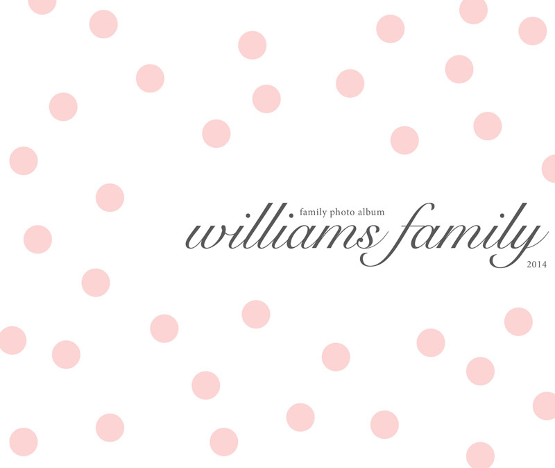
Here is a very fun and simple text-only photo book cover design. I love this cover idea because you can easily see how this can translate into month section dividers.
I chose a soft pink color for the dots and a dark gray for the text but you could easily switch this out for colors that match your book design or favorite colors!
Another great feature to this photo book cover is the pairing of fonts. I used a decorative Snell Roundhand for the name and a classic serif font for the family album and year text. I increased the kerning of these subtitles to provide a bit more space.
Love this? Make sure you pin it!

by Stacey Wiseman | Jun 7, 2014 | Cover Series, Design Series
Earlier I announced on this blog Blurb’s contest for people to design a photo book for their favorite person. There were several different categories plus several ways to win.
I could not let this contest pass without submitting an entry. Soon, I’ll be sharing more insights, pages, and takeaways from this really fun and very specific book. But until then, I want to share my photo book cover.
This book is in honor of my favorite sweetheart: my husband. I knew I wanted a cover that is simple, very modern, lots of white space and geometric. Here’s the result!
Full cover:

Front cover:

by Stacey Wiseman | May 24, 2014 | Cover Series, Inspiration, Photo Book Design Layout
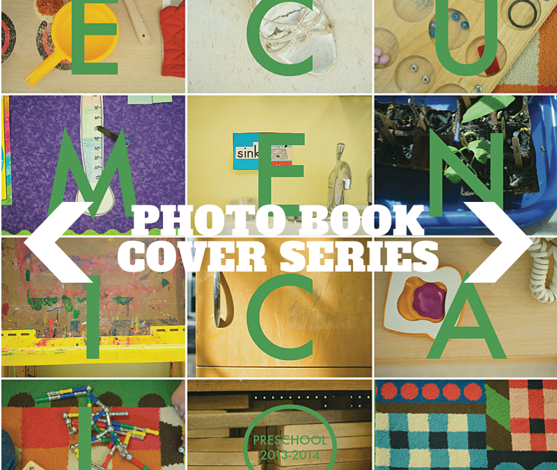
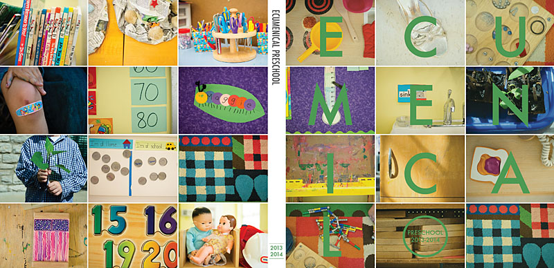
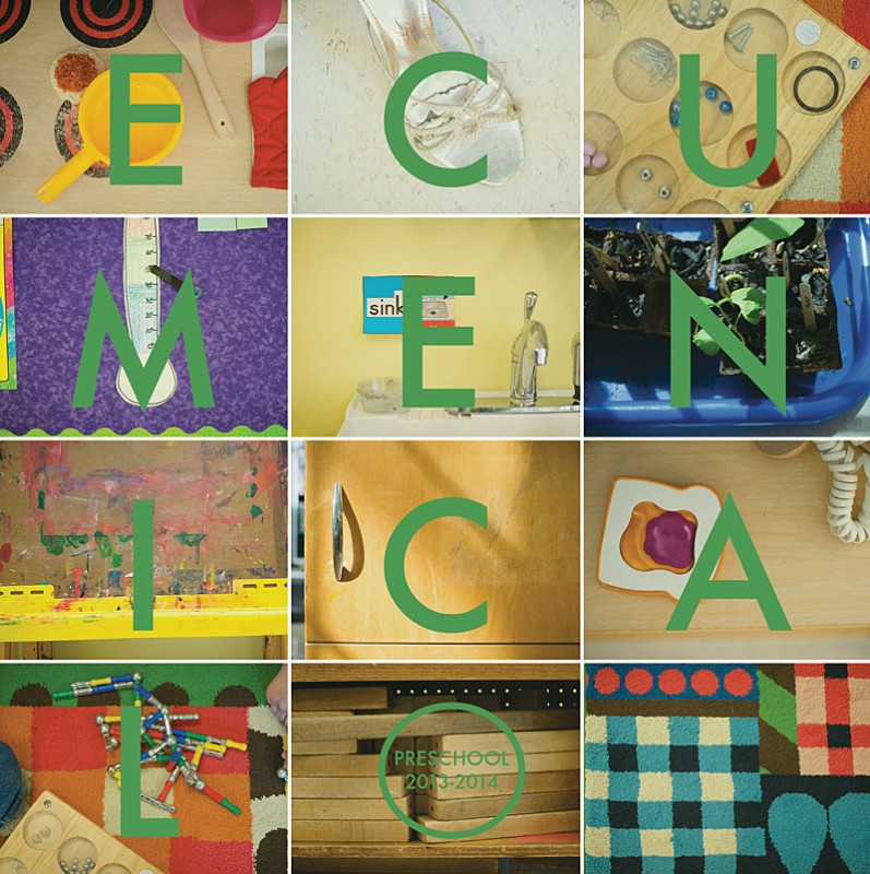
Over the last month, I’ve been working on a special book documenting my son’s preschool friends and activities. Inspired by a current issue of Bon Appetit magazine, I immediately knew that I wanted to capture small details – toys, art supplies, and objects – to make a vibrant and colorful cover. I used a grid of photos with a letter over each one spelling out the name of his school.
For my upcoming Photo Book Design Workshop, I’m going to reveal my entire process on making this photo book. I’ll show you:
- my inspiration
- my pre-book planning
- my photography set-up
- my photo selection
- my photo editing
- my book design
- my final book order
- the final book!
I’m holding an hour group call where you can ask me questions including how my process relates to your book project. It’s going to be so much fun, I can’t wait. Here’s a sample page from the photo book.
To sign up for this amazing opportunity, register at The Photographer Within.
Want more details, check out my FAQs.
Workshop starts June 9th so don’t delay!!! I look forward to seeing you in the workshop!
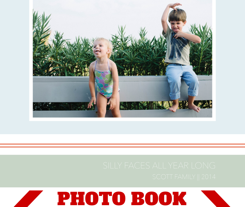
by Stacey Wiseman | May 11, 2014 | Cover Series, Family Photographs
This weekend, I was buying summer clothes for the kids and all of the colorful stripes definitely inspired this cover design.
Focusing on bands of color, one photo, a thin typography, a fun group kid photo, and a clever title defines this photo book cover. The colors for this cover are inspired by the tones in the photograph as well as the beach where we were staying. Adjust the color profile to fit your photo and/or content of your book!
If you love this photo book cover, please pin it to your pinboard!
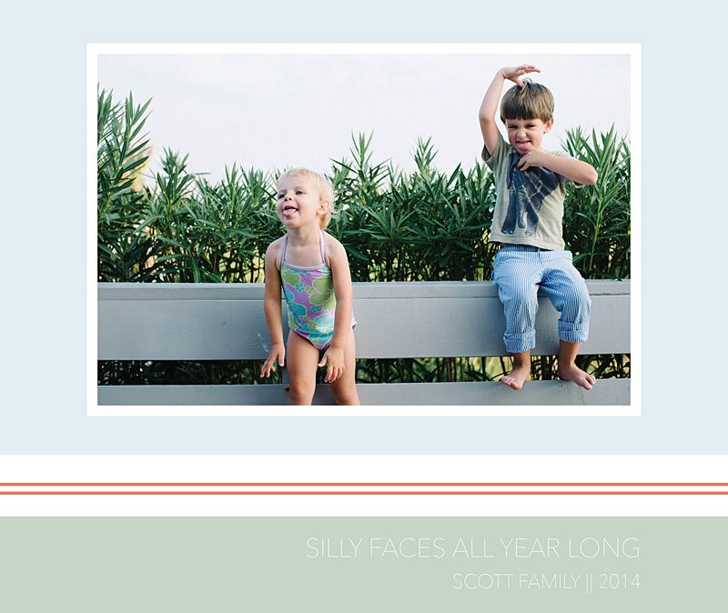
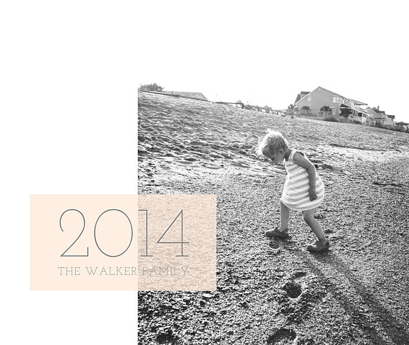
by Stacey Wiseman | May 3, 2014 | Cover Series, Family Photographs
For this photo book cover design, I wanted to try a vertical photo with a landscape orientation cover. In this case, you’ll either have negative space (to fill with color, text, or leave it blank) or you’ll cut off a large part of the image at the top and/or bottom.
In this case, I went with the white space. I added a soft color box overlapping the photo in order to add the title.
Make sure you pin it and I’d love for you to follow bookthisproject!
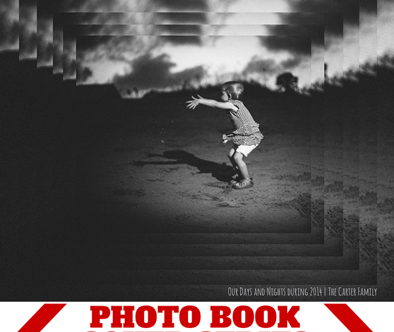
by Stacey Wiseman | Apr 26, 2014 | Cover Series, Design Series, Family Photographs
Inspired by a graphic design pin on pinterest, I created this photo book cover design. It features the same image repeated at 90% until I got the final size I wanted to display the entire photo. This cascading pattern stays vertically and horizontally centered as it scales down providing a very dramatic cover.
The key to this photo book cover design is to select a dramatic photo.
Finally, use a small title for your book that doesn’t compete with the photo. In this case, the title is a clever play on the photo – “Our Days and Nights during 2014.”
Make sure you pin this graphic if it inspires your cover or a page in your book!


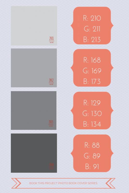
by Stacey Wiseman | Apr 11, 2014 | Cover Series, Design Series
I hear from so many people who are a little behind on making their family photo books. Like….several years behind. And that’s okay. Any time is a good time to start.
It can actually be a luxury.
And here’s why. You have the opportunity to think about your photo books as a set. Designing the cover is the perfect way to execute a shared vision over several books – or several years.
Now there are many ways to approach this. For this example, I’m using various shades of gray to signify the different years. The text is very simple and remains the same for all of the covers.
The key here is to think about how many years you want to design photo books and adjust your shades accordingly. Of course, you could always keep the shades in groups of 3 or 4. But if you are looking for subtle changes, variations of gray over 4 years is very different than variations over 18 years.
So think ahead and decide if this could work for you!


Here is a great graphic for you to pin!

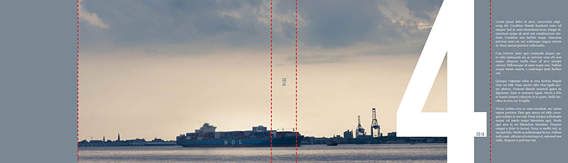
by Stacey Wiseman | Apr 4, 2014 | Cover Series
Today is a fun photo book cover design. This example would be great if you saw your photo books as volumes. It takes a really large number – 880 point font size in my example below – and sneaks a photo behind it. This photo book cover is a great way to envision your book cover front and back as a seamless design.
In this case, I went with the number 4 to signify 2014.
To see a behind the scenes on how I created this cover from start to finish, make sure you stay tuned for my April Video Tutorial next week. To make sure you don’t miss it, sign up for my newsletter!


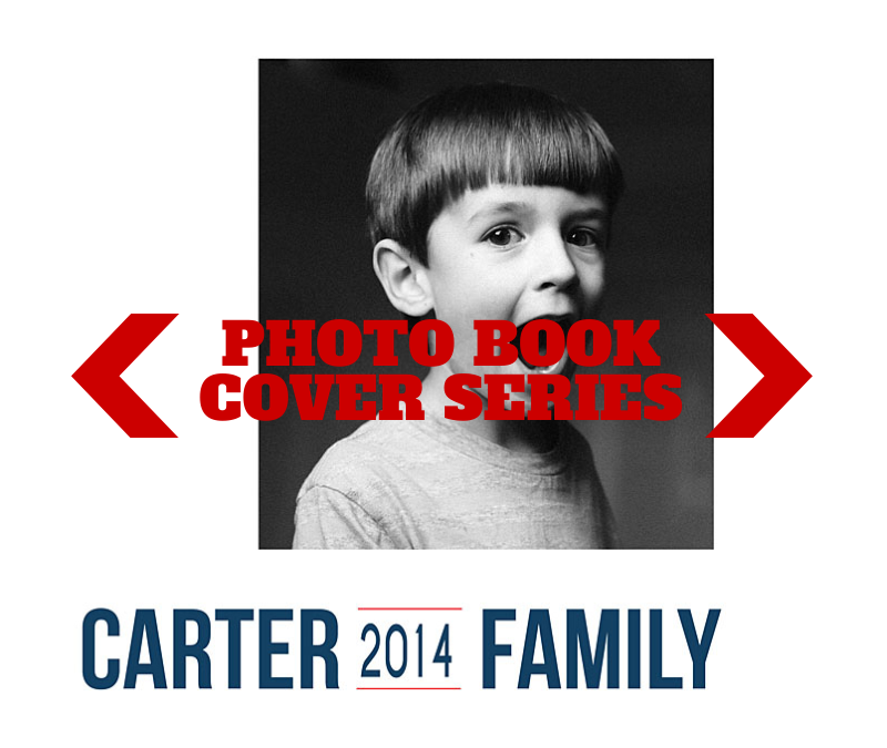
by Stacey Wiseman | Mar 28, 2014 | Cover Series, Design Series, Family Photographs
Sometimes it takes an unusual perspective in a portrait to turn a photo book cover into something a little abstract and very interesting.
Try out an unexpected yet defining portrait for your photo book cover. Pair it with a simple title and a straight line graphic – or a circle graphic as shown below.
This is an elegant way to achieve an cover that doesn’t put the focus on the face, the smile, the eyes.
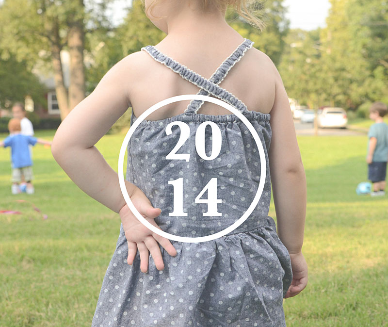
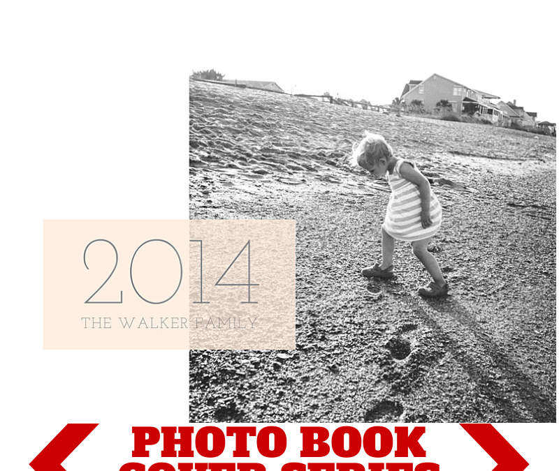
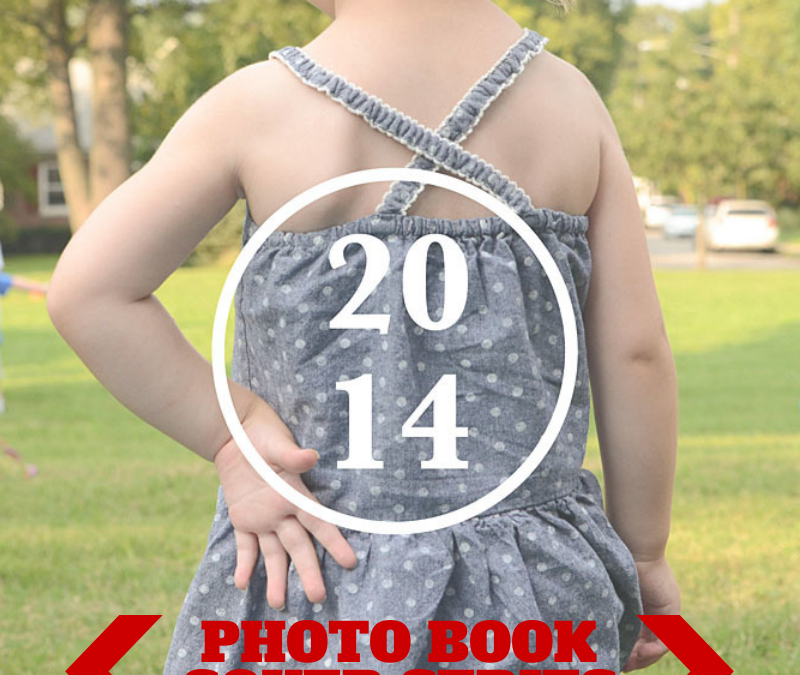
by Stacey Wiseman | Mar 14, 2014 | Cover Series, Photo Book Design Layout
Here is a very simple yet effective cover for your photo book. It features one photo – not a bleed – on the front. It’s slightly off-center but you could definitely adjust the alignment to fit your taste.
For the title below it lists the name of the family but in between the surname and the word ‘Family’ is the introduction of the year. This font is slightly smaller and set in with a line graphic to set it apart.
So imagine using your favorite fonts and colors to customize this cover for your book. If you like this cover, pin it to your photo book pin board so you can save the idea for later!