by Stacey Wiseman | Apr 8, 2018 | Photo Book Organization
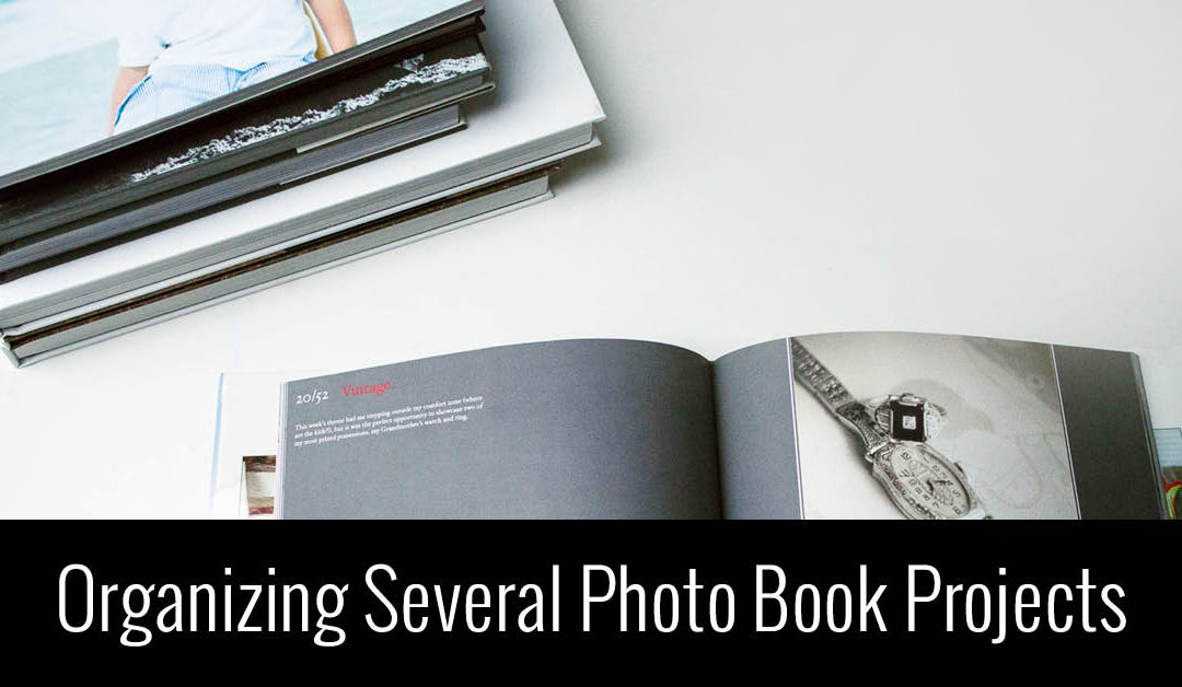
Keep All of Your Photo Book Project Ideas Organized
Tell me if you can relate to either of these?
You have a lot of motivation for a particular photo book. You get started by organizing your photos, editing and exporting a few, and find a few evenings to work on the design. But then….life starts to get in the way. You can’t find the time to make progress on your photo book. Fast forward a few weeks, you have some time to get back to your book…..but you can’t remember where you left off.
Did you edit all of the photos? Where did you stop exporting photos? You can’t seem to remember how many pages you designed or if you started to implement some of the design features you wanted. You lose motivation to work on your project because you can’t easily jump back into the process.
-or-
You have the motivation to work on a photo book. But…..which one??? You have so many ideas swirling around in your head. Do you work on your annual book? Or your vacation book from last summer? Or finally get around to your oldest’s baby book, who now happens to be 10 years old?
You have project idea paralysis. You don’t know where to start because you’re not sure how much time you will have to finish it. Or you don’t fully want to commit to one project because you have the desire to work on a few projects at the same time yet have no way to keep yourself organized.
Either way, this video tutorial is for you! In this video, I’m sharing a free tool to keep all of your photo book projects organized. It allows you to list out all of the projects in your head and keep track of the progress so you always know where you left off when you have time to pick back up again.
Watch this video and create your own Photo Book Project Board today!
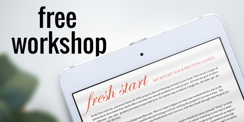
If you loved this idea and haven’t yet taken my free workshop, fresh start – a kickstart to starting your photo book project, sign up below.

by Stacey Wiseman | Oct 11, 2016 | Motivation, Uncategorized
by Stacey Wiseman | Mar 5, 2014 | Family Photographs, Photograph, Photography Tip
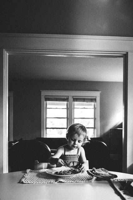
One of my photography goals in 2014 was to get in the frame with my kids more. At least once a month!
While this seems easy to do, it actually is quite difficult when you have two small children. To get out the tripod, set everything up, clear the clutter and get them to cooperate…suddenly the task seems impossible.
Following some advice from great blog posts, here’s what I do:
1 : Set up tripod
2 : Put my camera on timer
3 : Give us 10 seconds before the first photo is taken
4 : Program my camera to take 10 photos with a 2 second interval with one click of the shutter
5 : Bribe my kids with a sucker if they cooperate
6 : Let them push the shutter (taking turns) so it is fun and interactive for them
Recipe for success? With me, not quite.
Out of 150 photos (yes – a lot of clicking going on!), I had 0 good photos, 20 “bad” photos and 130 automatic deletes. The elusive photo I wanted of all three of us looking lovingly into the camera didn’t happen.
Some are out of focus. In some I’m talking. In some I’m grabbing them to get back in the photo. Some have closed eyes. Some have grimaces. Some have limb chops.
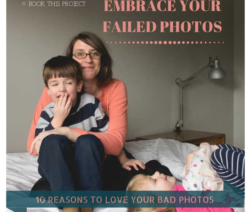
But you know what? I don’t care. Of my 20 ‘bad’ ones, I still love them. In fact, I cherish them.
Here are 10 reasons why I love my bad photos.
1 : I love my daughter’s smile.

2 : I love my son’s tender heart.

3 : I love that my daughter has a lovey that barely leaves her side.

4 : I love my son’s love of legos.

5 : I love the giggles.

6 : I love my smile.

7 : I love the sibling almost-fights. (He didn’t actually knee her…but it sure looks inevitable in this photo.)

8 : I love Saturday afternoons with my kids.

9 : I love the kisses.

10 : I love my kids.

Of course, on this particular Saturday I don’t need 130 bad photos in my Lightroom catalog to love. About 12 will suffice. And they’ll look great in my annual photo book!
Now I want to see your bad photos! Let me know in the comments below, how have you embraced your bad photos? No need to be shy. Be proud! Blog about your love of bad photos and share a link below. I really want to leave some blog love for your bad photos too! <3
by Stacey Wiseman | Jan 3, 2014 | Cover Series, Family Photographs
It’s time to bring back the weekly photo book cover designs!!!
In 2014, every Friday I’ll be featuring a cover design for a photo book. Some may have a tutorial associated with it…sometimes it will just be the cover. Always feel free to pin it and share it on Facebook.
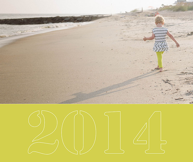
I’m starting the year off with a simple cover. In this example the photo occupies the top two-thirds of the cover and then a bold color forms the base. I use a stencil-type font style to write out ‘2014.’ In this case, I wanted the font to be light because the photos and the color are so bold. To achieve this, I created an outline for the text.
by Stacey Wiseman | May 15, 2013 | wordless wednesday
by Stacey Wiseman | Nov 15, 2012 | Photo Book Design Layout, Podcast
Are you planning on designing and ordering a family photo book before the Christmas holidays? If so, the dates are quickly approaching to when you need to finalize your design and place your order. Even though the ordering process can seem straightforward, reviewing before you order is critical to ensure a gorgeous book.
 Here are 7 simple steps to follow before you press “Order.”
1. Fix warnings
Most free online programs alert you of potential errors to your design. A common error is the image resolution being too low. You need to reduce the size of image or re-save the image at a higher resolution. Another example involves text that does not fit the text box. In this instance, you need to lower the size of the font or increase the size of the text box.
2. Ensure photos extend to edge of photo boxes and bleed edges
For any photos you want to bleed off the page, make sure they extend to the bleed line.
3. Review consistent elements (text, borders, page numbers)
If you established consistent elements at the beginning of the design process, check every page to ensure all elements have been consistently applied. This includes all text styles, borders, headers and / or footers.
4. Read through all captions
Read through all captions for any grammatical or spelling errors. A great tip is to read all text aloud. I tend to catch more mistakes this way!
5. Preform a spell check
Most programs will also have a spell check. Check the entire document before you order.
6. Print a proof, if desired
This step takes the extra measure to verify proper grammatical and design elements. Sometimes we fall into the illusion that we can catch everything on screen. Printing out your draft and reviewing the proof is visual proof you have got the book exactly the way you want it. Get out that red pen of yours and mark up your proof.
7. One Final check
After you have gone through the six steps above, I go through each page in preview mode one last time to see if I notice anything else. If I have no additional edits, I’m ready to hit that order button!
As some of you may know, my family recently returned from our yearly beach vacation. I prepared a photo book documenting our vacation. Here are a couple of pages of my book.
[divider_flat] I went through all of the 7 tips listed above and pressed “Order.” Want to see what happens next?
Watch this quick video below to de-mystify the ordering process!
Leave a comment below to let me know when you plan to order your photo book!
by Stacey Wiseman | Oct 26, 2012 | Cover Series, Photo Book Design Layout
Description

If you love this example or if it gives you some ideas for your photo book, pin it!
[divider]Make sure you sign up for the Book This Project weekly newsletter. I have a free download when you sign up!
by Stacey Wiseman | Sep 28, 2012 | Cover Series, Photo Book Design Layout
This cover design is similar to last week’s design, yet in this case, the font is bold and bright. You don’t have to go with a black background to get a cover like this, but I suggest selecting two contrasting colors for the background and the font color. You want there to be a difference in order to make the font really stand out.

If you love this example or if it gives you some ideas for your photo book, pin it!
[divider]Make sure you sign up for the Book This Project weekly newsletter. I have a free download when you sign up!
by Stacey Wiseman | Sep 21, 2012 | Cover Series, Photo Book Design Layout
This cover is serious and silly at the same time. A silly black and white photo is paired with a stark black background and a thin gray text. The font happily takes a backset in this design…and that is the point. Nothing over-done. It is very simple…and in its simplicity, it makes you want to pick it up and view the pages inside.
 The inspiration for this cover is on my pinterest board “Layouts.” Are you following me yet?
If you love this example or if it gives you some ideas for your photo book, pin it!
[divider]Make sure you sign up for the Book This Project weekly newsletter. I have a free download when you sign up!
by Stacey Wiseman | Sep 18, 2012 | Photo Book Design Layout
Two weeks ago, I had a post about my daughter’s new (and slightly too big) dress (here). In this post, I am going to share with you how proportion factor into photo book layout design. If you have ever had to print the same photo as a 4″x6″ and a 5″x7″ or 8″x10″, you realize that each of those show a little bit different crop of the photograph.
What works as a 4″x6″ does not always work (or work as great) as an 8″x10″ photograph. This is true for photo book design as well. You may love an image and want to feature it large in your book, but it may not work.
The concept of proportions is most easily described through photographs, so let me demonstrate.
I loved this photograph of my daughter.

And as you know, I also love to feature my favorite photographs as a full spread (image on both the left and right hand side of the page). But this photograph is not the right size for a full spread.

The pink dashed line indicates the center of the book, or spine. See how the pink line goes right through her eye. Not good! The layout design is taking away from the best part of the photo.
Plus, do you notice how her boo boo is now missing? This is because the proportion (the width in relation to the height) of the photograph is different as a 4″x6″ photo than when it is put in a photo book which is 8″x20″.
To clarify a little more, we doubled the height (from 4″ to 8″) but we more than tripled the width (from 6″ to 20″). If you wanted to keep everything in the 4″x6″ photo, you would need a 8″x12″ photo box in your layout. Does that make sense?
Here is a an improved example.
Photo:

Layout:

In this example, the action, or main focus of the image is occurring primarily on the right side. It is true that her arm is located in the spine of the book, but this does not take away from the purpose of the image…which happens to be her frustration!
For the final example, I think this photograph lends itself really well to a full spread layout.
Photo:

Layout:

As you can see, selecting each photo and how it is shown on the page takes more than just selecting your favorite photograph. Key to any great photo book design is knowing how to design the layout that best suits the photos.
Let me know in the comments below, did this inspire how you will design your personal photo book?