by Stacey Wiseman | Apr 8, 2016 | FREE!, Inspiration, Photo Book Design Layout
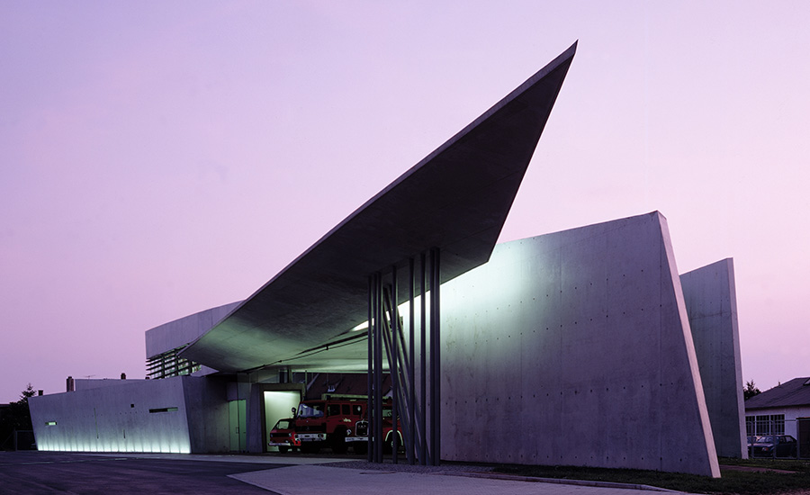
It’s been over a week since the announcement of Zaha Hadid’s unexpected death and I wanted to take some time to share how Zaha’s work has inspired me, both as an architect and a designer. In 1997, I visited her first built work, Vitra Fire Station soon after it was built. Then in 2003, while I was living in New York, I made a special trip down to Cincinnati, my hometown (big) city, for the opening of the Cincinnati Art Museum.
As the first female architect to ever win the famed architectural award, Pritzker Architecture Prize as well as the RIBA Gold Medal earlier this year. Since it took 25 years since the inception of Pritzker Prize before a female was awarded, it shows how difficult it is to receive recognition as a female architect. I was always drawn to her visionary, painterly approach. And while there was criticism surrounding her work, she made a significant impact on architecture – in her built and unbuilt work – by creating striking new forms and pushing the boundaries of how we conceive of architecture.
Each art progresses at its own speed, and Hadid accelerated her development by taking architecture to what appeared to be unbuildable extremes in drawing and painting.
Joseph Giovanni on Zaha Hadid’s work in “In the Nature of Deign Materials: The Instruments of Zaha Hadid’s Vision”
Just two weeks ago, I shared one of my favorite books for design inspiration in my recent Intro to Photo Book Design Workshop: Zaha Hadid. This book features Zaha’s work in a compelling way. To mark Zaha Hadid’s legendary impact on creative thought, architecture and design, I wanted to share my insights on this book. While it doesn’t get into her work, the book design is a compelling nod to her work: simple, stark contrast and visionary.
As I mentioned in the introduction to this workshop, I’m educated and registered as an architect. So, I have lots of architecture books lying around the house. As you can imagine, they are heavy on the photographs (and drawings), so their layouts can be easily applied to photo books as well.
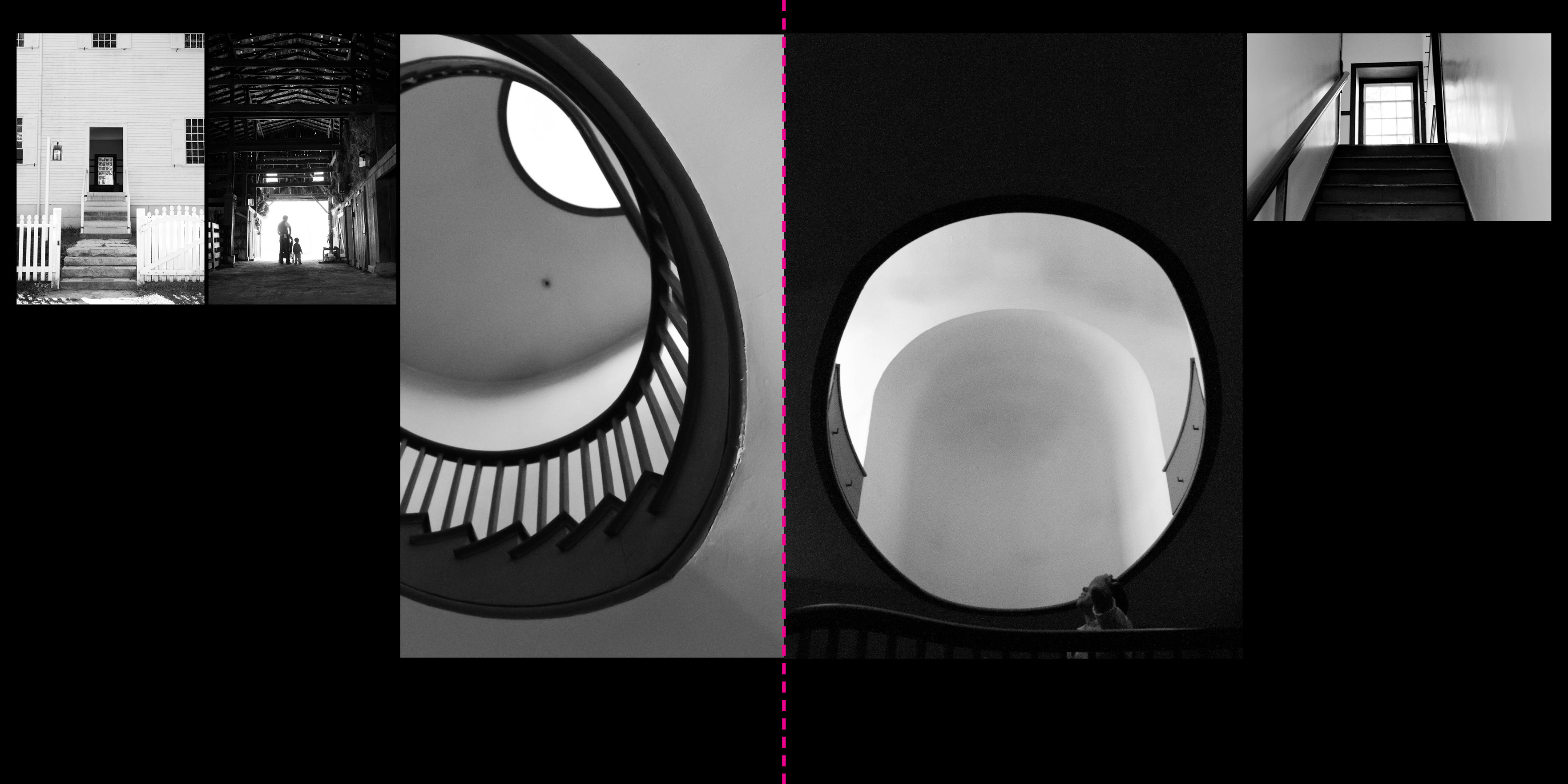
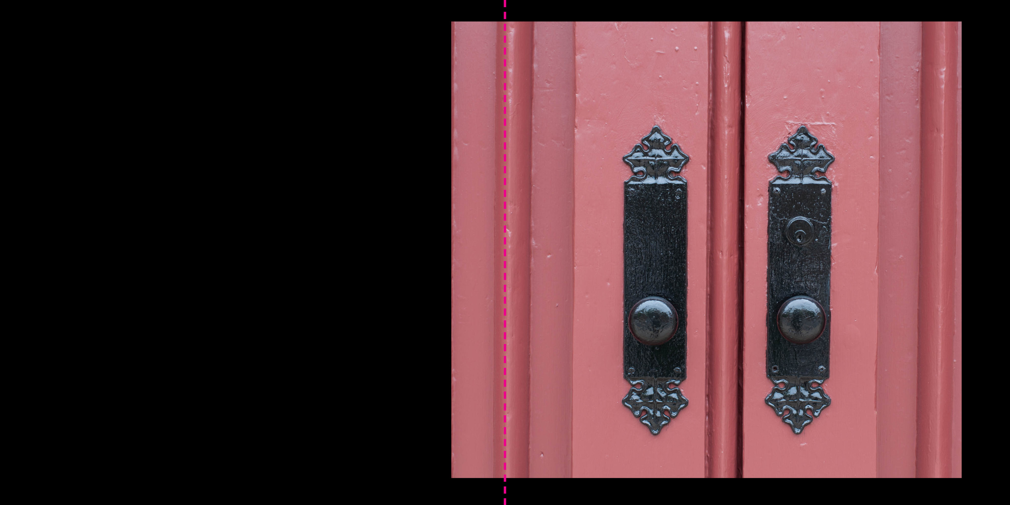
I received the Zaha Hadid book as a Christmas gift one year. It is a compilation of the work (built, drawings, models, etc.) of Zaha Hadid, a female architect based in London. This is a beautiful book and one I want to feature to you because a) it is a square format and b) it features a black background. I’m trying to cover all the bases with my photo book inspirations!
A simple cover conveys the form and heavy reliance on the black color throughout the book. The cover is very indicative of the look and feel of the entire book. The content of the book is organized into 3 basic parts: a text description of the firm and the project (printed on white paper), projects (black paper) and credits (back to white paper).

A unique feature of this book is that each page is actually a folded-over page, so there are no images on the backside of the paper. Obviously this is a custom feature, but one I wanted to point out!

I love how the captions are handled in this book. It may not be appropriate for your family book but it is a sophisticated way to give more information about the photos. Each photograph is numbered 01, 02, etc., above, and at the bottom of the page is a more detailed explanation of the photo.

The specs:
- Square Size (9.5″w x 9.5″h)
- Soft cover
- 197 pages
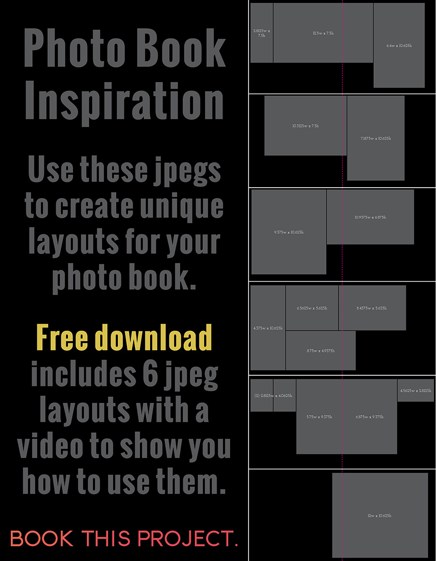
The layouts below are inspired by a few of the layouts from this book. Even though this book is 9.5″ x 9.5″, I adjusted the layouts to fit a 12″x12″ square size book.
Want to get jpegs to help you re-create these layouts for your own photo book? I’ve got a great free download for you!
by Stacey Wiseman | Apr 10, 2013 | Family Photographs, Photo Book Design Layout, Podcast
It’s time for another video podcast where I illustrate steps / tutorials / examples for photo books. If you remember last month’s podcast, I started to fill in my outline with my monthly photo project – 10 photos in 10 hours. In this month’s video podcast, I fill in my 2013 January photos. You will see how I select photos and how I varied my layouts. And I critique my layouts – so you will see what I hope to change.
My goal is to show you my thought process as I design a photo book. Whether I’m designing your photo book – or you’re designing your own – you will see how the pages begin to come together. I’ll reveal a little bit of the design process each month – so make sure you follow along! Did you know you can sign up for my podcast feed in iTunes!
I’m really excited about this video because I’ll explain why I passed on this image with my son’s locked focus:
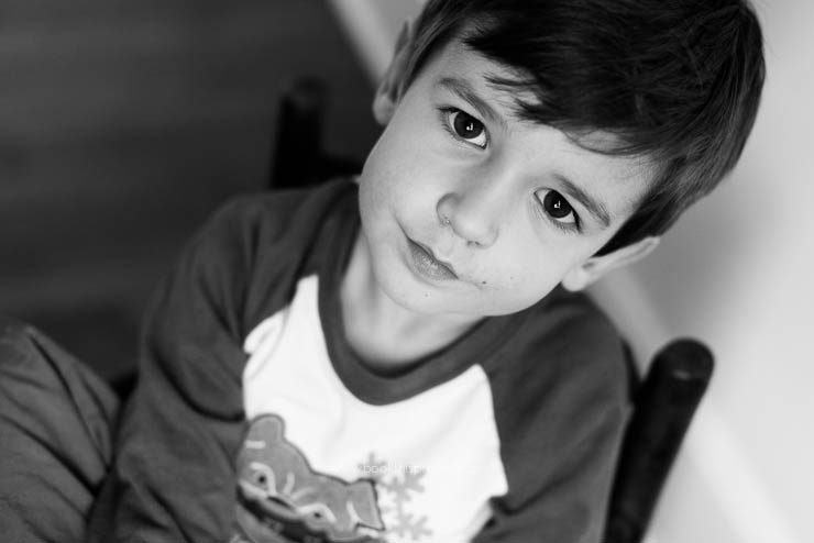
[divider] and instead selected this less than stellar image for my photo book.
[divider]
Make sure you leave a comment below with your favorite spread!
by Stacey Wiseman | Jun 8, 2012 | Description, Inspiration, Photo Book Design Layout
My previous cover examples all feature one photograph. In this cover design, I am featuring one photograph of each of my children. However to tie them together, the two photographs have something in common – sunglasses. They are wearing the same sunglasses and I thought it was really cute, not only of my little girl wearing her glasses…but also big brother! This is a great tip for you as you begin thinking about your cover. Perhaps it is a couple of photographs of your kids doing a similar activity. Or it could be a from a similar season – ie two photographs from the summer time.
Another thing to keep in mind when using two photographs on the cover is the scale of the subject. This particular example could be improved, my son’s face fills the frame a little more than my daughters, but you will notice they are both head shots. If you have a full body shot of one kid, it is a good idea to include a full body shot of the other. It ties them together. Of course there are exceptions, but starting out, it is a good idea to keep things similar!
Finally, for the title of the book, I decided to use a phrase or question. If there is something that really ties to the photograph on the cover or something that you or one of your kids likes to say, this would make a perfect cover title.

[divider] If you love this example or gives you some ideas for your photo book, pin it!
by Stacey Wiseman | May 25, 2012 | Family Photographs, Photo Book Design Layout
Here is a very simple cover idea for a photo book for your child. It pulls a dominant color from the photograph and creates a band at the bottom for the text. You can use your child’s name or nickname to personalize it even further. Selecting a font that you love or that really sums up the personality of your child really adds to the cover.

[divider] Do you love this cover idea? Make sure you pin it!
[divider]
[divider]
by Stacey Wiseman | May 11, 2012 | Family Photographs, Photo Book Design Layout
2012 cover design series: make sure you pin it!

[divider]
by Stacey Wiseman | May 4, 2012 | Description, Photo Book Design Layout, Photograph
Here is another entry in the 2012 cover design series. Make sure you pin it!

by Stacey Wiseman | Apr 30, 2012 | Family Photographs, Inspiration, Motivation, Photo Book Design Layout
The following is an example of my April page for the One Word Challenge. For this layout, the photo is a full book spread bleed. In order to do this, I had to crop the image but I think it still works and will have a big impact in my family book.

by Stacey Wiseman | Apr 24, 2012 | Inspiration, Photo Book Design Layout, Photograph, Tutorial
Following up on my last inspiration post where I translated the cover of an Anthropologie catalog into a layout, this example features a cover of a non-fiction book. It is simple, elegant, and stately.[divider] Inspiration:
Eating Architecture edited by Jamie Horwitz and Paulette Singley

[divider]Photograph:
")
[divider] Iterations:
And here are five iterations.


[divider] Do you have a favorite?
All of these are on my pinboard “Inspiration and Iterations.” Pin your favorite now!
by Stacey Wiseman | Apr 9, 2012 | Description, Family Photographs, Inspiration, Photo Book Design Layout, Photograph
I hope everyone had a great Easter! We kept extremely busy. Breakfast, egg hunt, convert crib into big boy bed, lunch, laundry, nap, clean up, Easter dinner at my in-laws and bed. My son is really starting to get the concept of holidays and gets so excited. I love seeing his smile on these days. And my girl had some fun too!
For my family photo book layout, I designed a spread with one large photo on the left and a photo collage on the right page. This is a great way to combine a lot of photos into only two pages. For inspiration, take ideas from collage boards. Samples are everywhere…but I pinned an example from a wedding inspiration board.
[divider] Left:

[divider] Right:

[divider] Spread:


")


