Often when I’m designing photo books, I prefer a clean, simple yet sophisticated design to let the photos (and the moments captured in the photos) standout. While this sounds good, I realize it can be difficult to understand what that truly means.
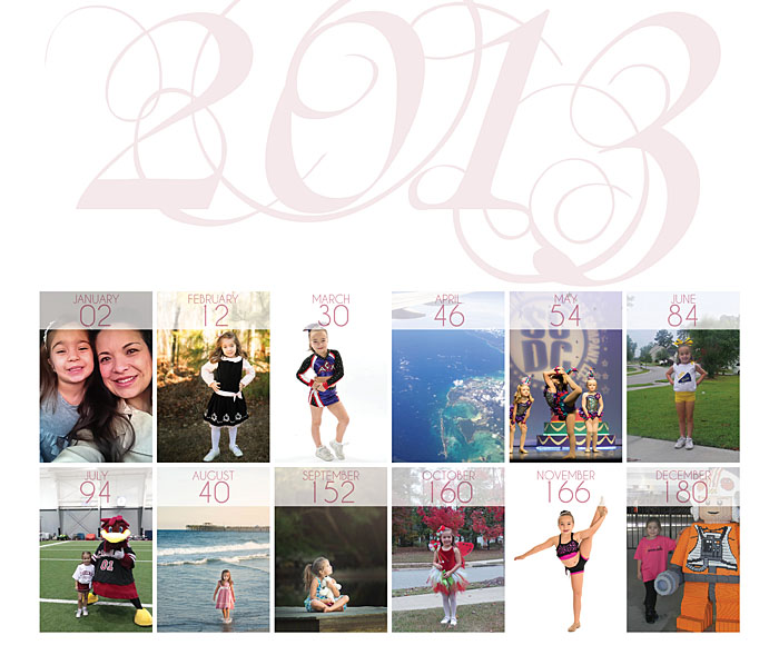
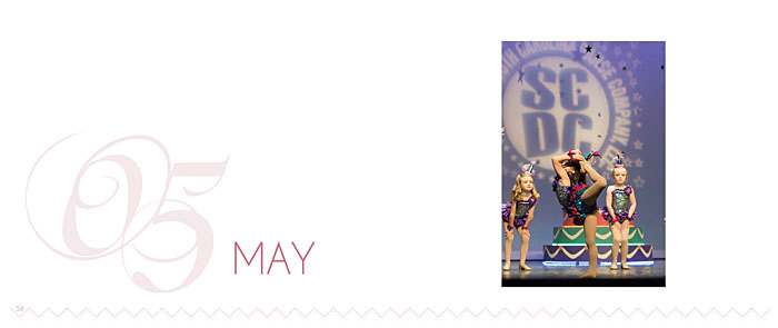
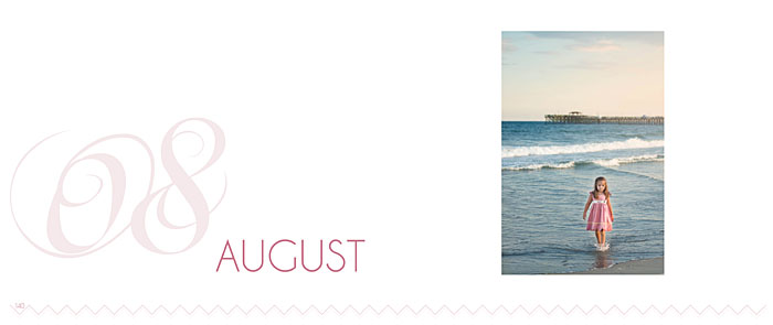
The best way I can explain it, is to show an example. My design for the T_Family, located in South Carolina, is a perfect example. There is simplicity to the layouts because there is order, alignment, and hierarchy. All of the photos are organized on the page in a logical way. The alignment, margins and spacing between photos are consistent throughout. White space is used to provide the eye breathing room to dwell on particular photos. Hierarchy is employed by placing larger images next to smaller ones.
All of these decisions are deliberate. It shows my ability to choose from the photos my client provided to show them in the best possible way on the page. It reveals how I can tell a story of a year, over the course of a book.
Having said that, it’s also important for me to show a design sophistication in the details. For this photo book, I selected an ornate font, soft color palette and graphic that appears on each month section page and page numbers. Since a majority of this photo book documents the life of their daughter, I wanted to present a sophisticated feminine approach. I used two shades of a muted pink as opposed to a brighter more vibrant pink to emphasize the daughter interest in dance.
I was elated to learn that my client absolutely loved her photo book. Currently, I’m designing her 2014 photo book – we’re going to change a few elements but the core concept of a sophisticated and modern book design will be the constant driving factor.
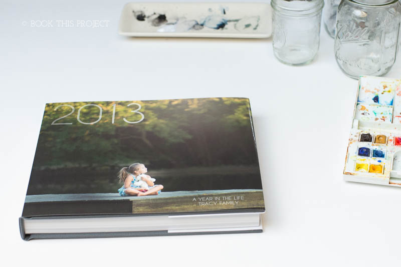
11×8
240 pages
Hardcover Linen with Dust Jacket