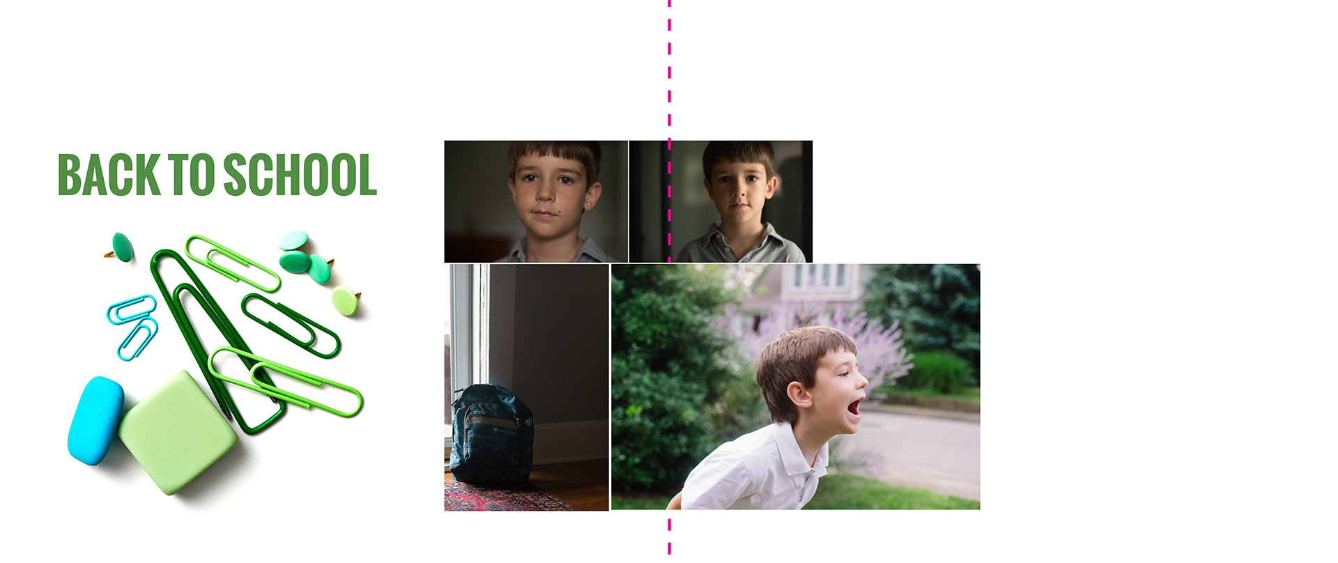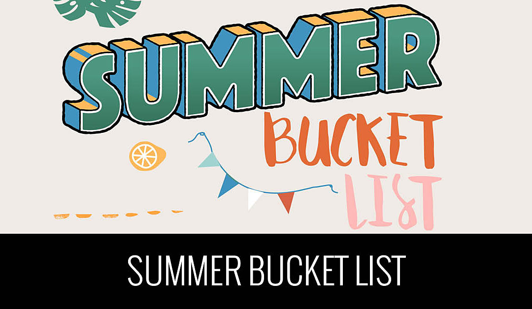
My Summer Bucket List
Oh my goodness, it’s already the end of June!!! While June flew by, I did find the time to sit down with my kids and figure out what we wanted to accomplish this summer. While I’ve seen some summer bucket lists on
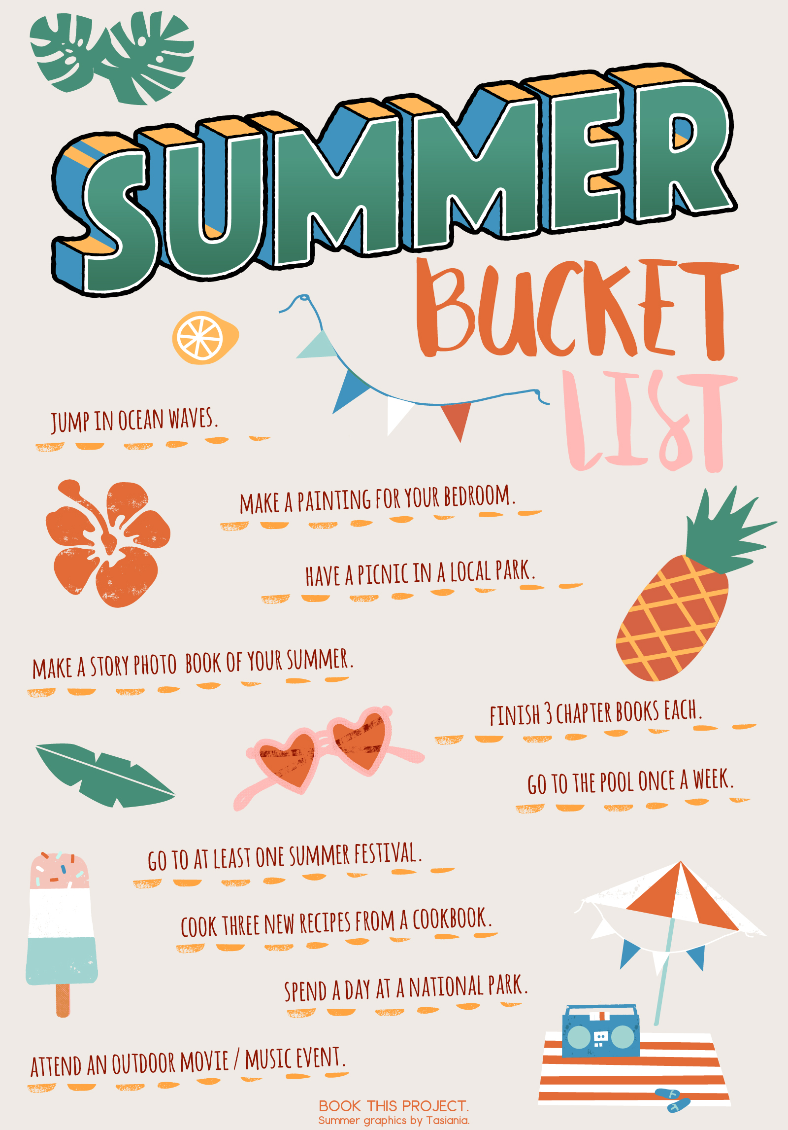
We could always do more this summer….but I’m a fan of keeping things simple and doable. On our list, we selected some creative activities (like a painting), typical activities (reading a book) and activities that will require a bit more effort than a common weekend (visiting a national park).
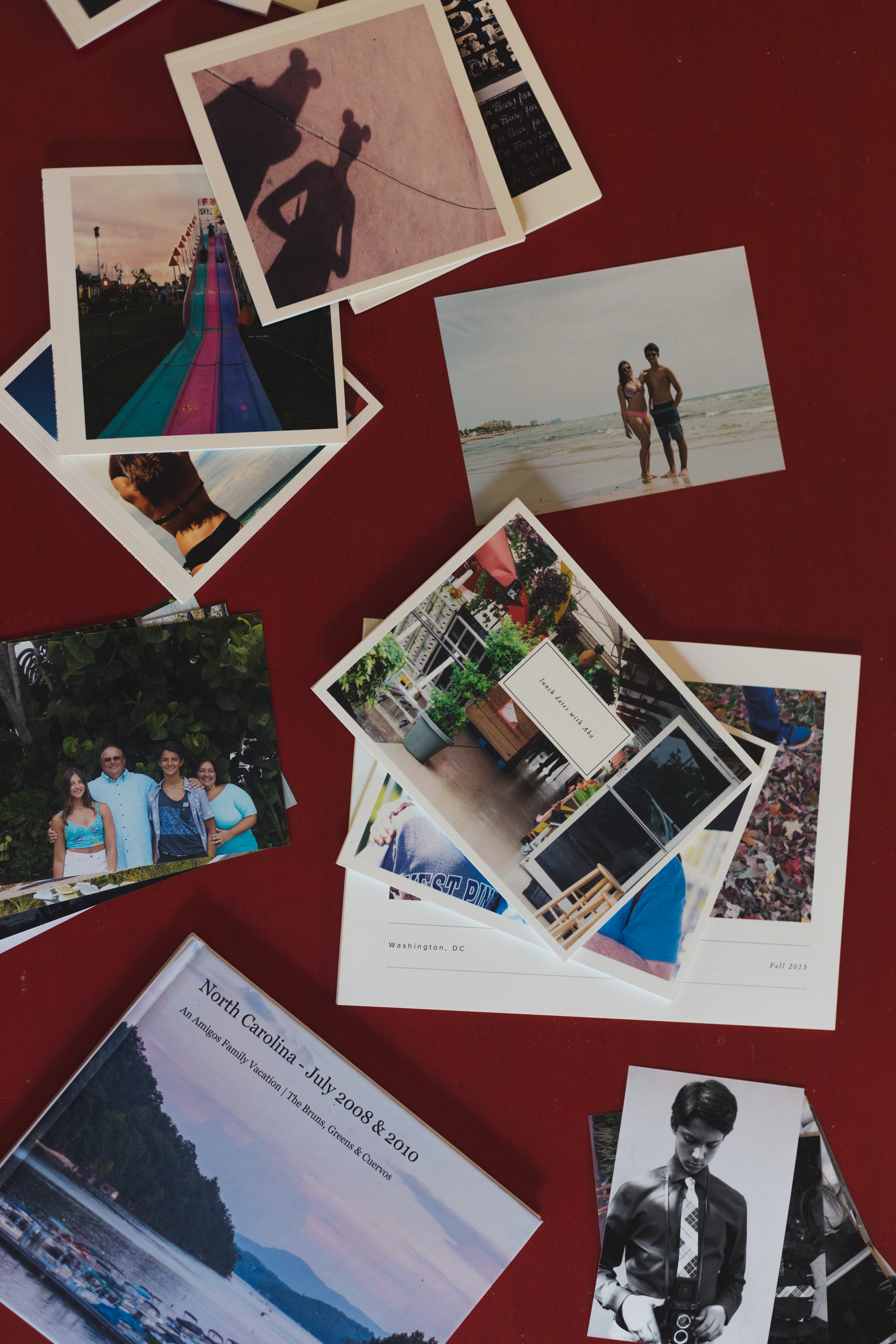
I love the idea of writing down how you and your family want to spend your time this summer. It makes the summer and weekends more intentional. And it provides a template of the photographs to take over the next few months which will ultimately make your photo book more interesting.
Here’s the list of ten things we want to accomplish in our household this summer:
What about you? Have you created a Summer Bucket List yet? If not, it’s not too late! Sit down with your kids and figure out at least ten things you want to accomplish this summer. At the very least, write them down and place it on your fridge (or in a visible place) and start marking them off.
Or you can download my blank Summer Bucket List to fill out yourself. I’ve got a digital and printable form you can fill out.
And don’t forget to share in the comments below one thing on your Summer Bucket List!