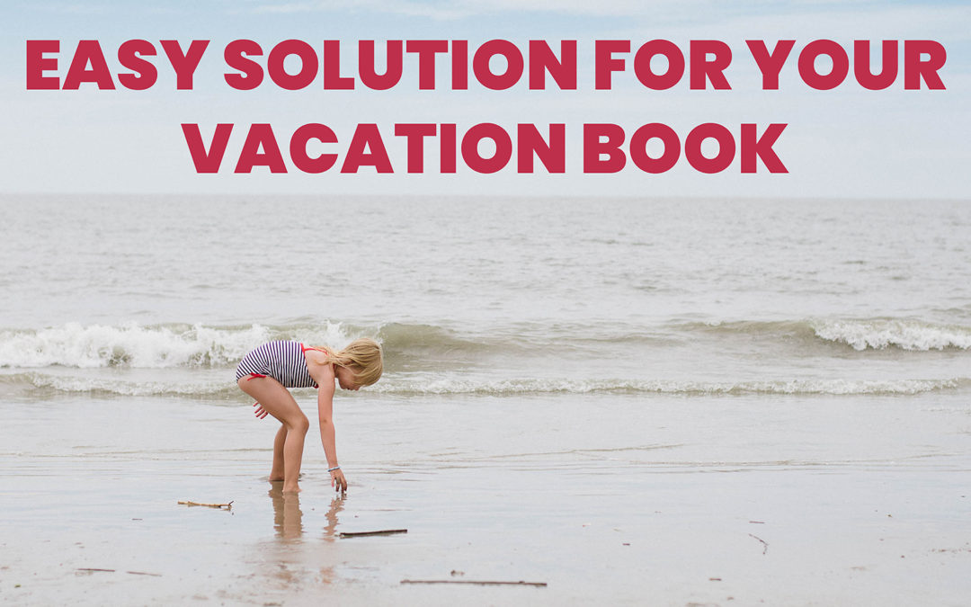
The Easiest Way to Make a Vacation Photo Book
Let’s say, you want to make a photo book of all of your favorite photos. But…..you’ve never had great luck at finishing a photo book.
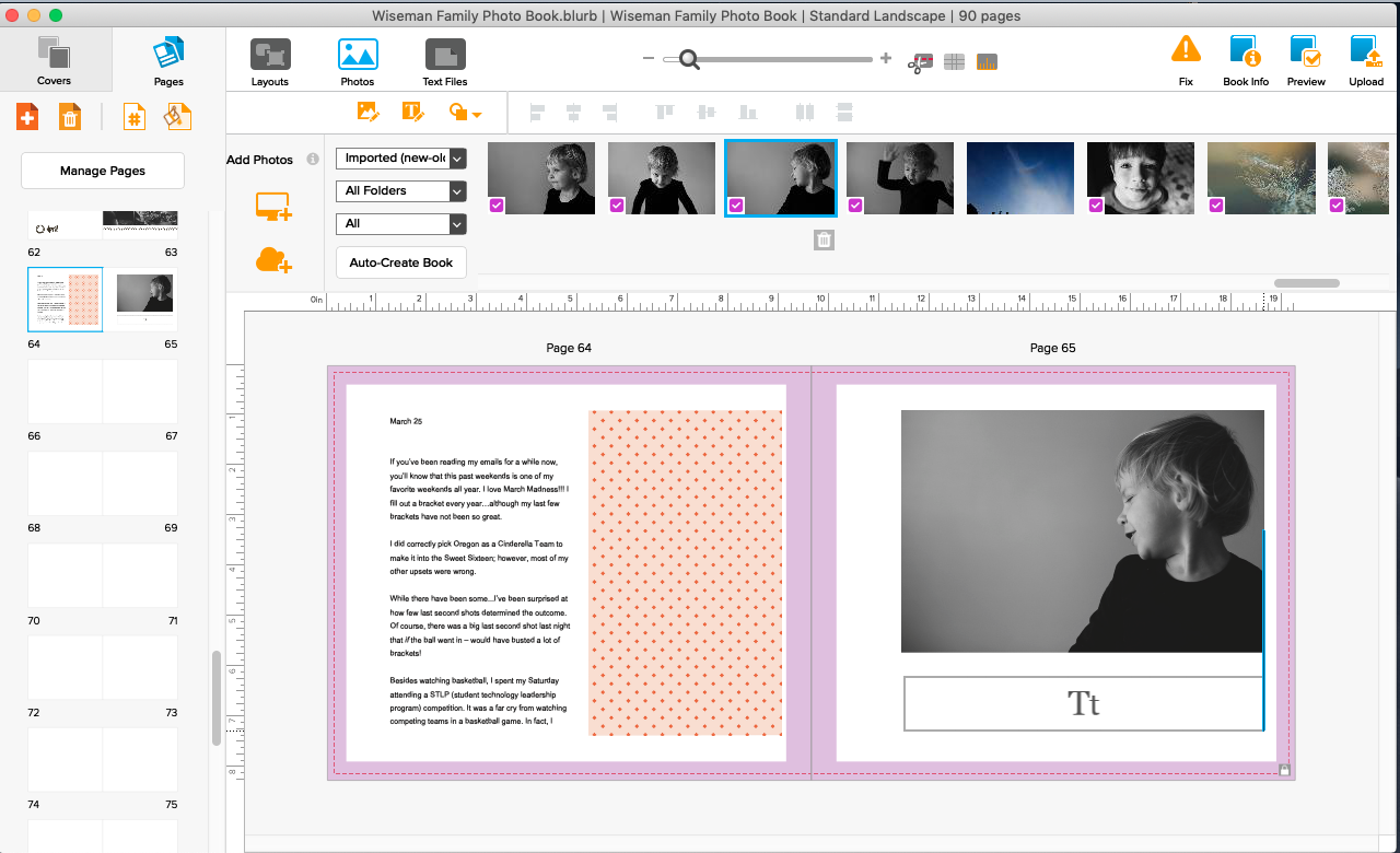
You start off really excited. Select some of the favorite photos from your vacation. Open up the design software but then you quickly become exhausted with creating the layouts for each spread. Or you get tired of using the typical layouts. It makes your photo book look more scattered than you want.
So you give up.
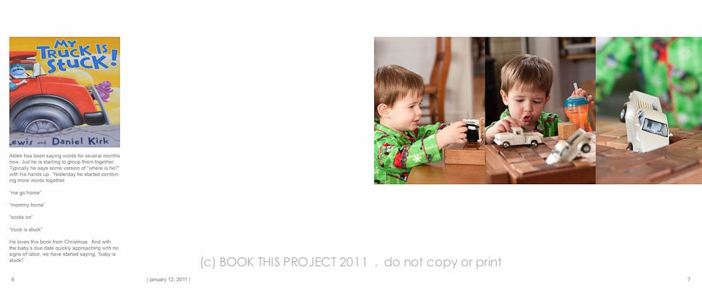
Which is so sad because these photos are documenting your vacation. And in my family, our summer vacation is the highlight of our year!
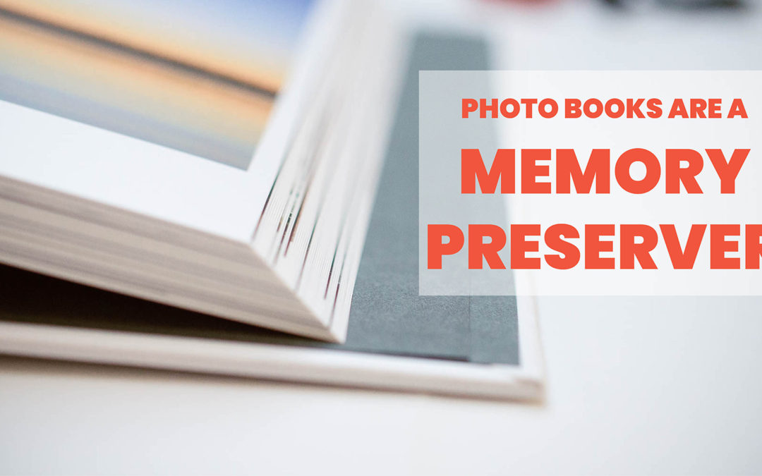
Your photos deserve to be printed. Once printed in a photo book, you’ll always have this document to refer back to, year after year. Imagine looking at all of your vacation photo books, ten years from now. It will be a blast to look back through the memories you had as a family every summer.
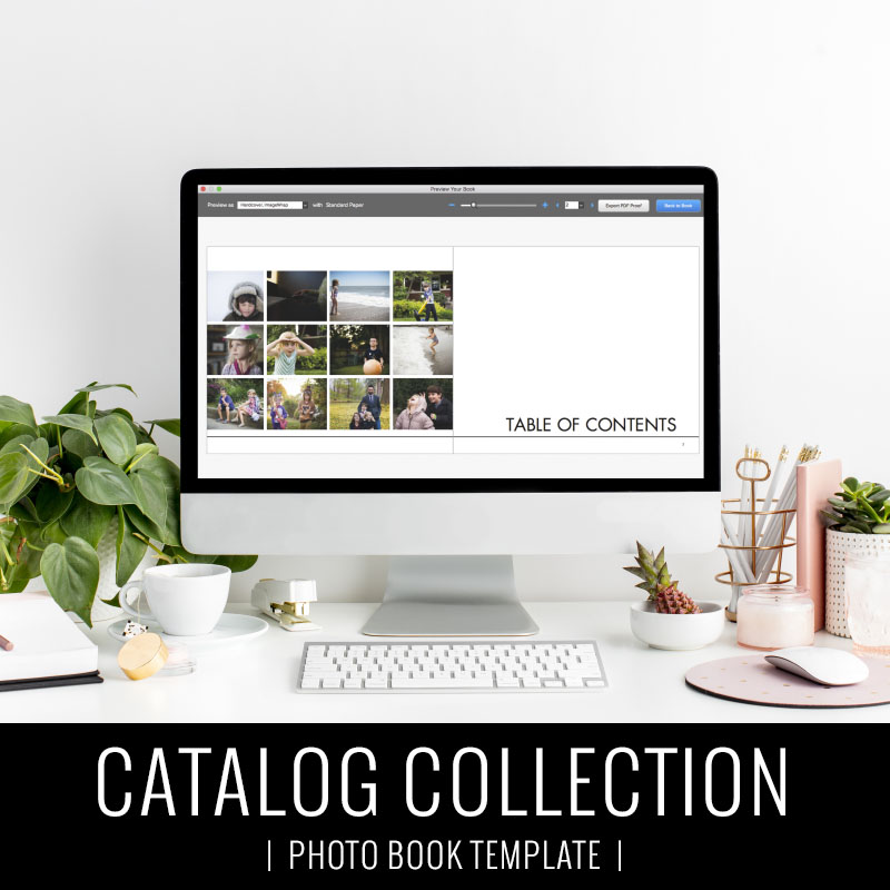
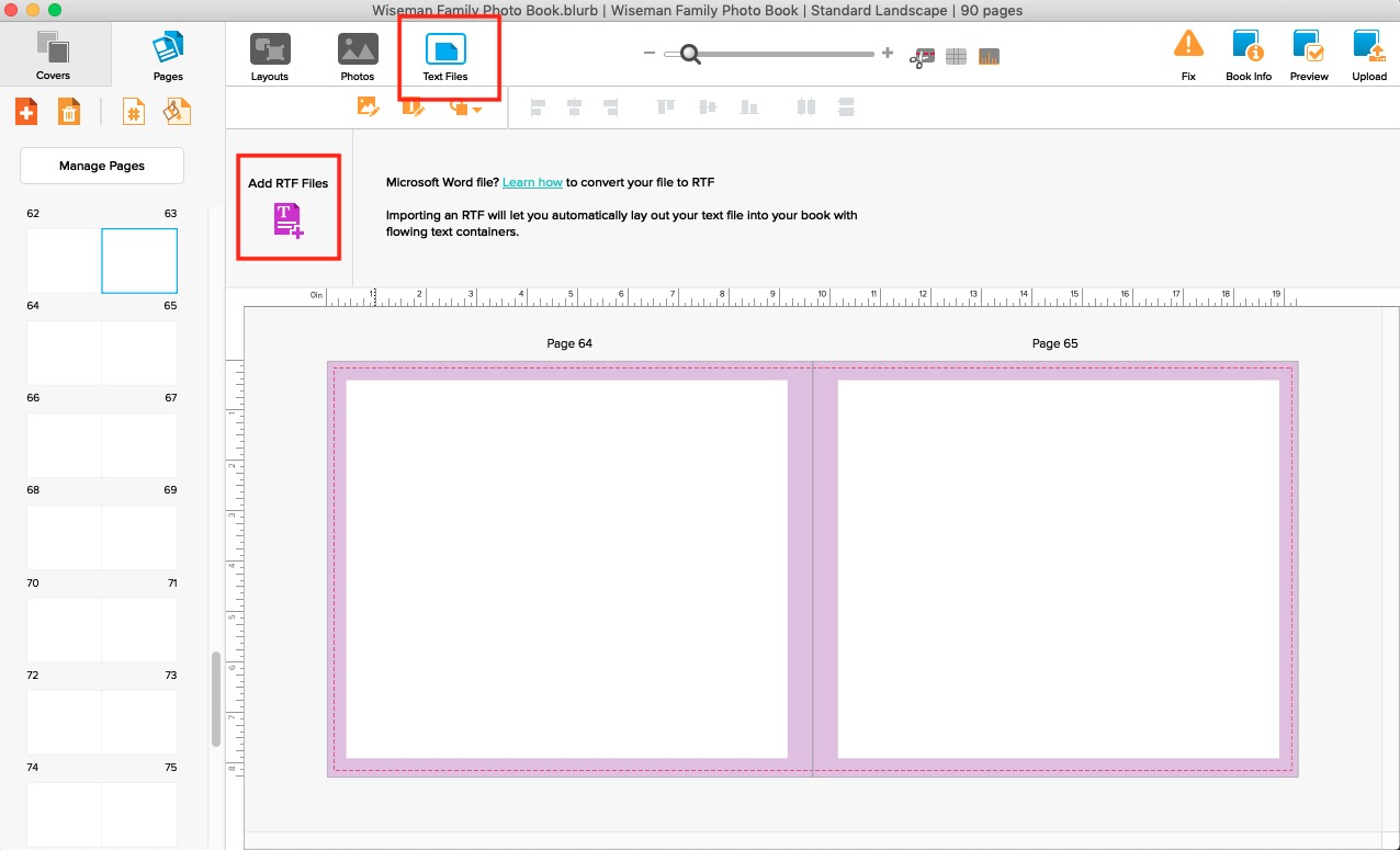
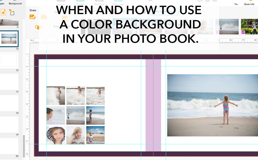
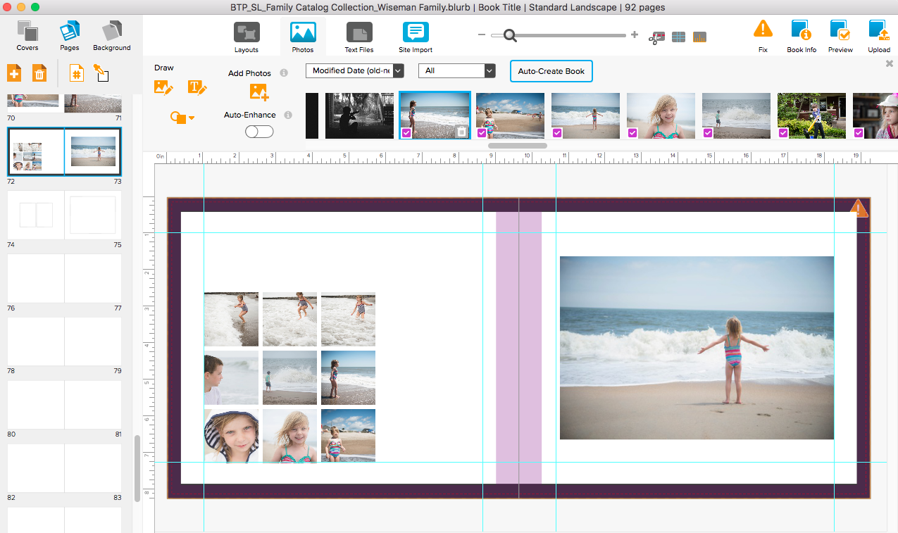
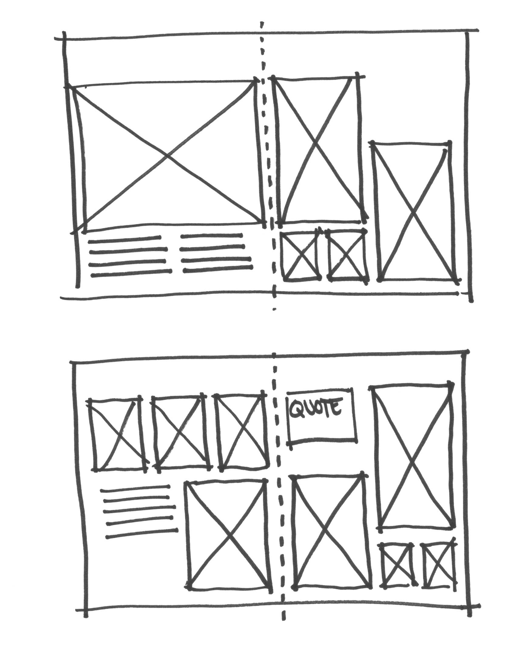
I want to show you that there is an easier way to compile your favorite vacation photos into a beautiful streamlined photo book. It starts with a template.
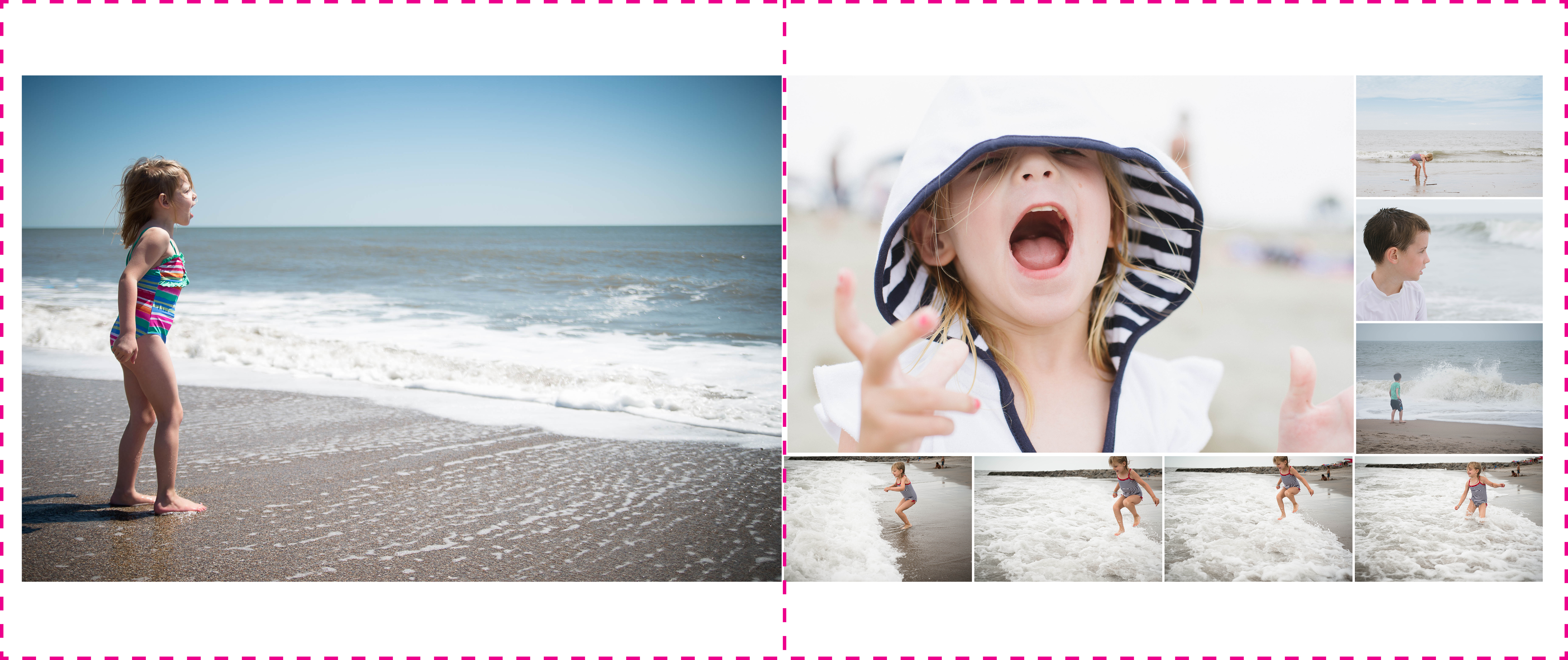
In particular, I want to show you how you can adapt one of my annual photo book templates to become a smaller, more focused vacation photo book. Take a look!
Ready to get started!?!? Export your favorite vacation photos to a folder on your desktop and purchase my annual photo book template here.