
by Stacey Wiseman | Nov 1, 2014 | Cover Series, Design Series
If you’re struggling to find that one perfect photo for your photo book cover, I get it! It can be pretty stressful to determine which one photo should define your entire book.
Here’s one example of how to incorporate a variety of photos for your cover. I’ve included one photo for each month, yet instead of composing it in a grid, the photos are in a line. The other distinguishing factor for this cover is the scale. The photos are at a smaller scale in order to emphasize white space. This is a good option if you design books with a lot of space on the page.
A side effect from the cover design, is how the text stands out. Even though the size is small, the color adds the punch it needs.

by Stacey Wiseman | Sep 19, 2014 | Cover Series, Design Series, Family Photographs, Photo Book Design Layout
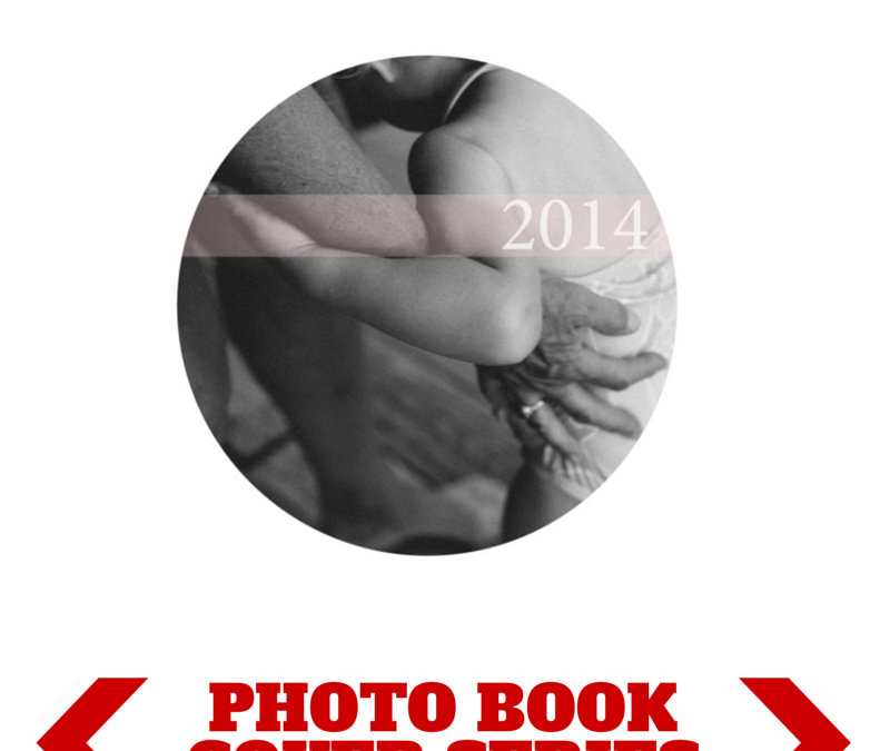
There is something so seductive in a form, shape, color, or font that makes a suggestion. In this cover design, I left a lot of white space on the page. I used a circle photo box, which I find becomes a dominant shape on the page, and then I used the subtle, translucent suggestion of a pale color bar with a white font to indicate the title of the book.

by Stacey Wiseman | Sep 12, 2014 | Cover Series, Design Series
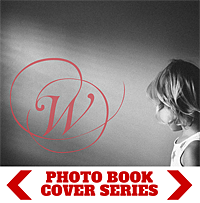
I’ve got a simple cover for you. The premise: an initial. One letter. Symbolizing your last name….your family.
I like the fact that this photograph is a slightly more obscure photograph.
But I think what really works is using a somewhat abstract photo with negative space.
In order to customize it, select a decorative font that speaks to you and specify the color.

by Stacey Wiseman | Aug 24, 2014 | Cover Series, Design Series, Family Photographs
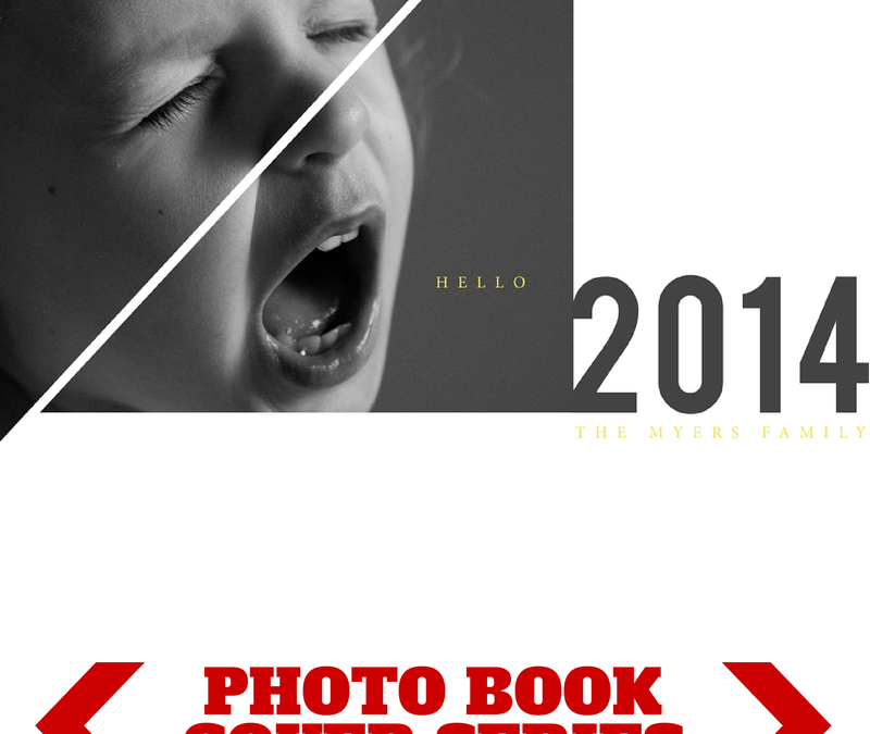
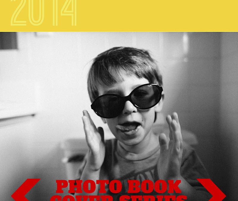
Hello 2014!
I’ve got a fun photo book cover design today! And it starts with the photo. We all know it’s common for children to have their moments of screaming and crying. Here’s your opportunity to photograph this moment and turn it into something creative for your photo book cover.
I broke up the photograph using triangular shapes via the pen tool in InDesign. This added more interest to the photo but definitely not necessary. The photo in a rectangular box can stand on it’s own too.
Pairing this photo with a bold font for the year and a small, classic font in a stand-out color (yellow) helps to make this dynamic cover design down to each detail.
Let me know in the comments below what you think!

by Stacey Wiseman | Aug 10, 2014 | Cover Series
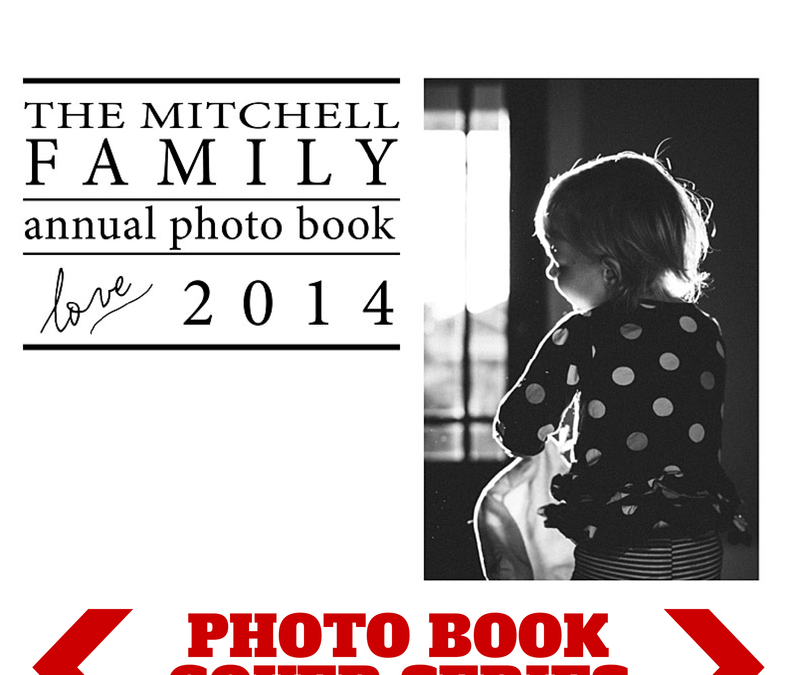
This photo book cover design is a fantastic option if you want to include more text on your photo book cover. I used a vertical photo which is typically harder to use for a landscape book cover and increased the amount and size of text in the remaining space.
In this example, I selected a classic font and mixed the font size and upper/lower case to add variety. I added a small word ‘love’ in a script font. Here’s where you can choose a different word and search for a font style that matches your family style.
If you love this cover, make sure you pin it!

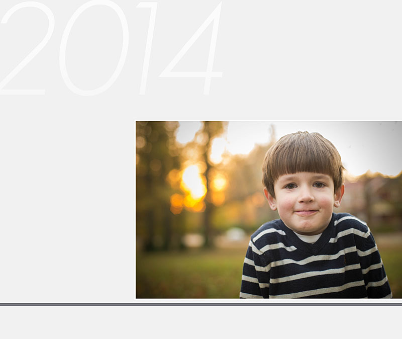
by Stacey Wiseman | Aug 2, 2014 | Cover Series, Family Photographs, Inspiration
Even though it may seem counterintuitive, if you make something really small and/or really minimal – it can heighten the experience.
Think about it, if you are in a crowded busy place, a whisper isn’t going to make much of an impact. However, if the space is cleared out, there are no distractions, a soft whisper becomes amplified and sole attention. It doesn’t have to be loud at that point because all of the focus zeros in on the very quiet voice speaking. In fact, you listen more attentively and pour your whole energy into what is being said.
The same is true with design. By stripping the page down and adding something very small, it creates laser focus directly in on the photo or small text that is included.
This concept is exhibited in this week’s photo book cover design. I added a soft color and a very small photo. Yet it speaks volumes and makes a large impact. It’s hard to not pay attention to this cover. And I love when being minimal provide maximum results.
Check it out, pin it and share it!

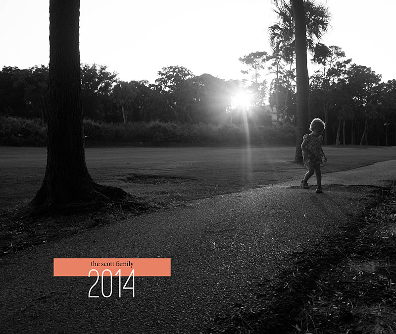
by Stacey Wiseman | Jul 25, 2014 | Cover Series, Family Photographs
I love this photo book cover design so much because it’s super quick and easy to create. The basis – a black and white photo. Take any b/w photo you have – it could be a family photo, a portrait, a scene from everyday life. Then pair it with a really bold color band at the top.
For this example I chose a bright golden yellow color.
Pair that with a unique font to announce the year and Viola! A simple and fun photo book cover design!!!

by Stacey Wiseman | Jul 11, 2014 | Cover Series, Family Photographs
In this photo book cover example, I decided to use two main elements: a line running under the photo and a large font calling out the year, to really set this cover apart. Simple. Yet focused.
Even though it is really simple, the adorable expression on my son’s face totally makes this cover stand out. Find a photo that has that classic expression and use it to make your photo book cover stand out!

by Stacey Wiseman | Jul 5, 2014 | Cover Series, Family Photographs
Are you looking to dress up a full photo cover design?
Add a small bar of color to provide a little something extra. In this case, I’ve overlapped the year with color rectangle. Being the year “2014”, I found a way to line up the small upper serif of the “2” with the bottom edge of the rectangle. This adds that little bit of specificity and intention to the design.
One other aspect…select a bold, dramatic color that is in stark contrast with the photograph. As shown here, a black and white photo makes it easier to select and set apart the color.
What do you think?


by Stacey Wiseman | Jun 26, 2014 | Cover Series, Family Photographs
In this week’s photo book cover design, I wanted to create a simple cover with color. I’m playing with the blue on my son’s life jacket to create a light blue color with a deeper blue color at the top and bottom edge. To make the photo stand out a little bit more, I put a white border around it.
Using a creative,handwriting style font adds to the fun of the photo and can give a sense of the book.
If you wanted to adapt this style for your photo book, you could use a family photo or a photo that encapsulates a major even to your year. Pull complimentary colors from the photo to design the background and color for the font. If the color is too strong, you can always adjust the saturation and tint.


