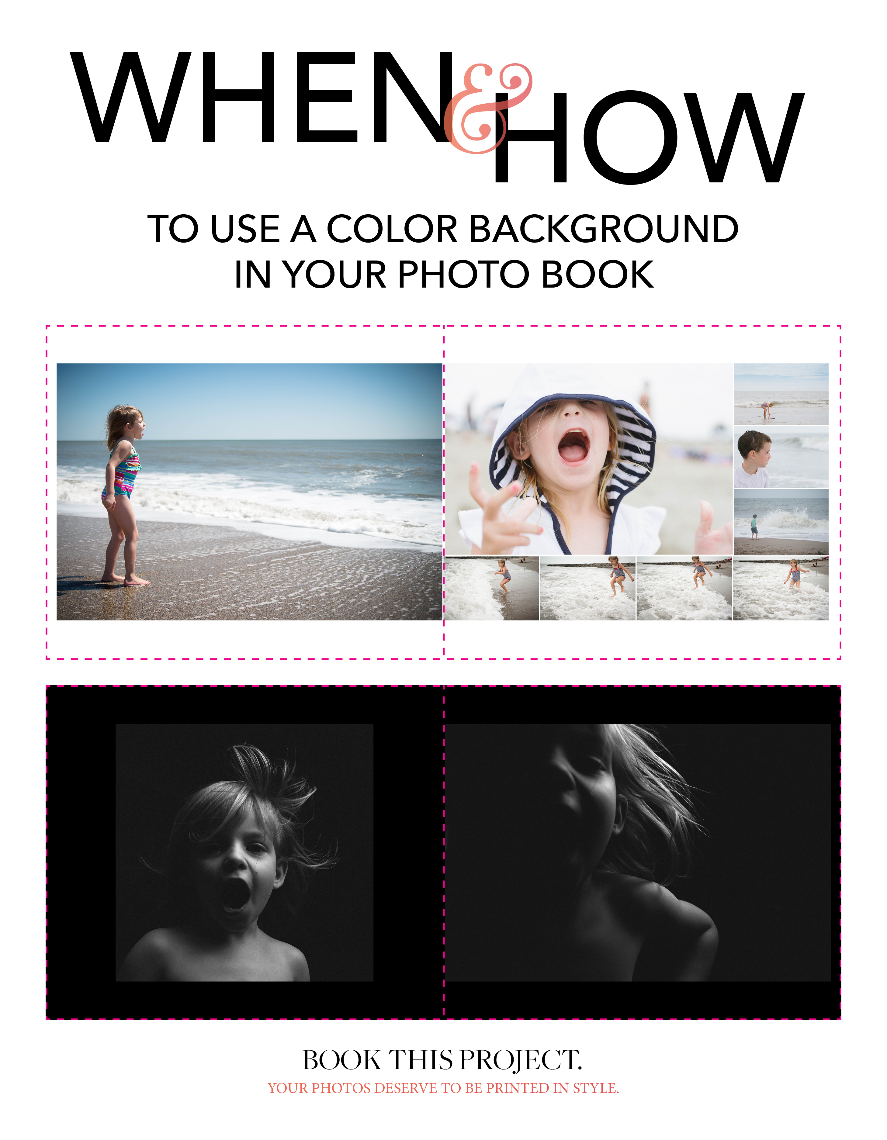
White Background versus Black Background
When I’ve seen successful photo books with a black background, it’s typically for books containing a majority of black and white photos with high contrast – or – to create photo books a dramatic, enveloping mood. With a black background, it is easier to establish a high level of contrast or striking difference between the photos and the page.
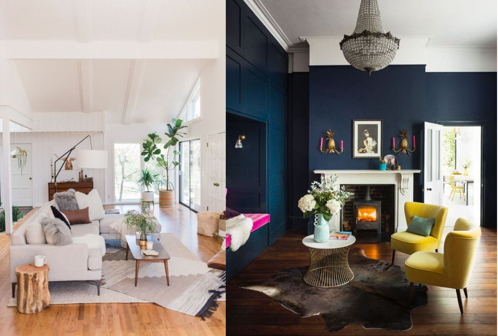
An easy way to think about this is with interior spaces. I’m sure if you’ve been around pinterest, picked up an interior design magazine or watched HGTV at all, you’ve seen light and airy living rooms with clean white walls and maybe you’ve come across a more dramatic living room with dark walls. (And of course, all of the varying shades of paint color in between….but for this example, I want to stick with the extreme ends of the spectrum.)
Look at these two examples below found on pinterest. Are you immediately drawn to one example? What do you like about it? What feeling or emotion does it invoke? Or if you are indecisive like me and feel drawn to both – what are the characteristics of each that you like and how does that start to shape your vision?
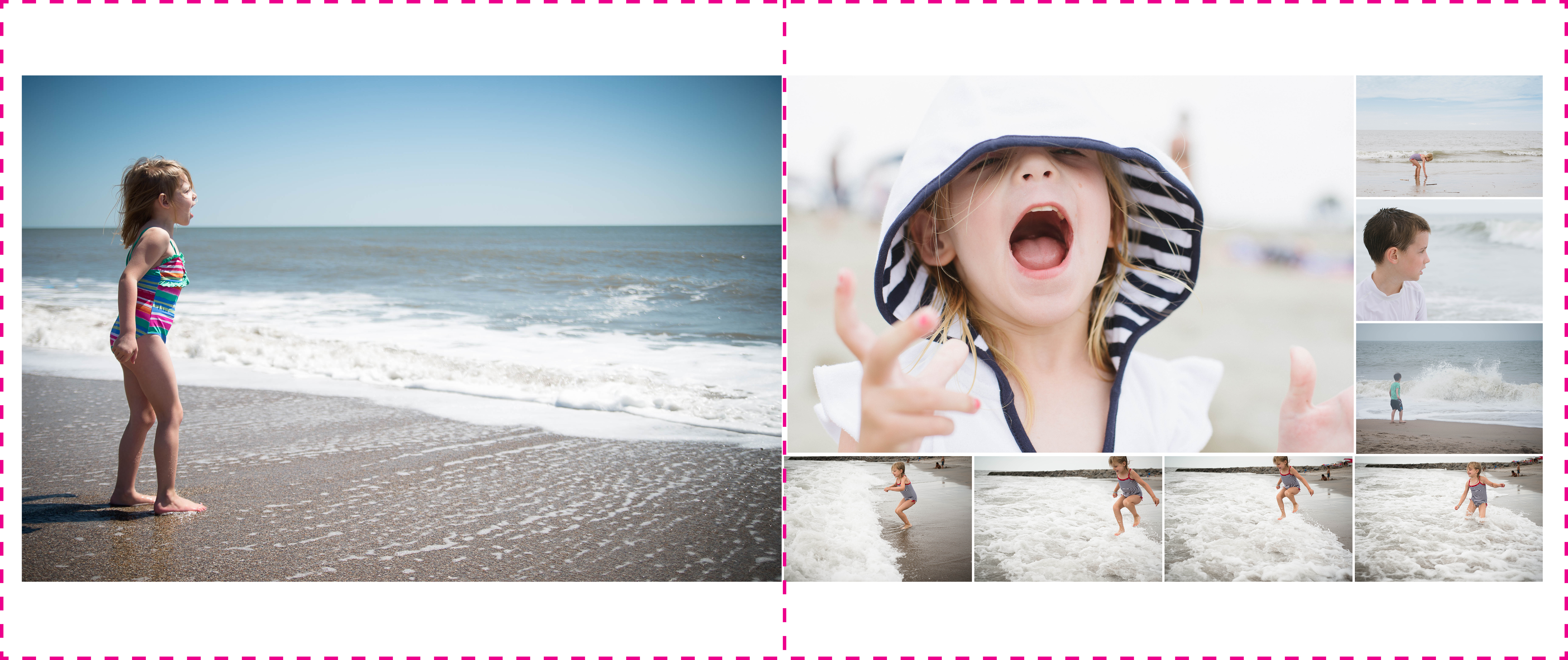
For example, if you’ve returned from a tropical vacation and wanted to make a travel book of your photos, chances are you’d have a lot of colorful, vibrant photos. The colors in the photos may pop more against a white background. A black background may overwhelm the photos.
On the other hand, if you wanted to make a photo book of your street photography, those photos may have a high degree of contrast and stark divisions between the bright whites and deep blacks. A black background will help ground and immerse the photos and almost create a more intimate experience in which to view photos.
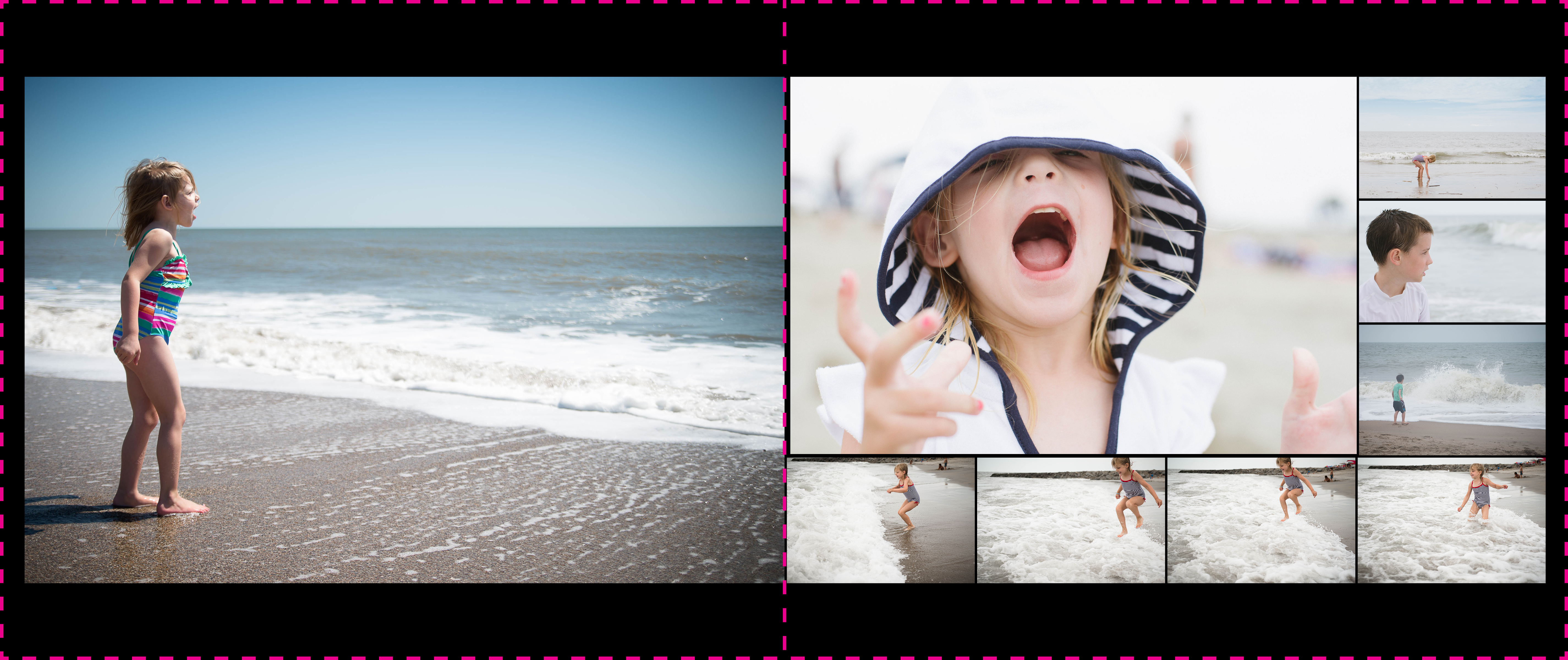
Comparing White and Black Backgrounds
As I mentioned at the beginning, using color really does come down to personal preference. So, I thought it would be fun to share two layouts with both a white and a black background for you to determine what you think works best.


Creative Use for a Color Background
The great thing about using a color background on important pages, particularly if it covers a decent amount of spreads, you’ll be able to quickly find this section of your photo book by looking at the edge of the book.
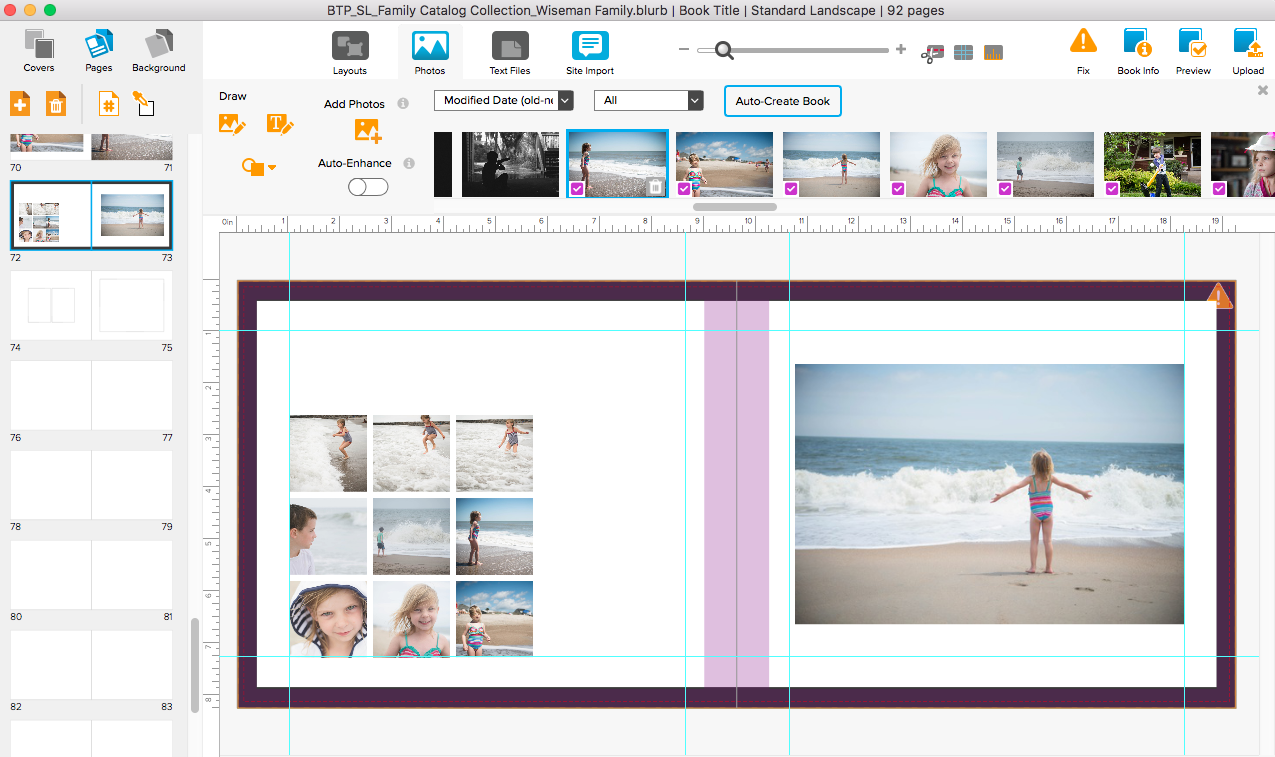
In my recently released Catalog Collection photo book template, I spent quite a bit of time analyzing catalogs and one of the things I noticed in a J. Crew catalog was their use of a white background for the pages featuring women’s clothing. For the men’s clothing, the pages had a small black border around the edge of the page. It created a bit of separation without it becoming too apparent. True to their brand, it was classic, refined, structured, and intentional.