As I recently wrote, in my Photo Book Club, we are working on a special photo book project in 2017. I’m planning to document 2 weekends spaced over 6 months in 1 photo book.
With this project, the goal is to reduce the amount of photos – only use photos from a particular time period – in order to focus on the design. Fewer photos means less to select, edit, and decide how to incorporate in layouts. This opens up some time and energy to exploring design concepts you wouldn’t normally try.
When it comes to photo books, I tend to be more engaged and finish a project if I’m able to try something new that excites me.
As I’ve been working with my photo book club members, a lot of the students are interested in trying a magazine-style layout. I wanted to share a few key points with you. If you want to go deeper, all photo book club members get access a PDF with more detail and my analysis of existing magazine layouts. And bonus – you’ll get a new inspiring PDF every month.
1: Orientation
Most of my workshop participants prefer to use the landscape orientation for their photo books. Either the standard size (similar to a size of paper) or the oversize version. This makes sense, particularly if you normally shoot in a landscape orientation. However, magazine are almost always portrait (vertical) orientation. So the first easy step to achieving a magazine-style photo book is to flip the orientation and make a portrait book.
2: Text
I know, I know….adding text to a photo book is another layer of work that people just don’t get it. I completely get it! I’m the same way. After I get through the photos, and layout the pages, it’s hard for me to go back in and add a caption to the photos. However, if you’re looking to make a layout more magazine-like, it helps to have some amount of text on the spread. Whether it’s a title, a quote or a caption, find small ways you can add text.
3: Negative Space
While this may not be true for all magazines, I tend to notice negative space – either in the photos or the layouts. Having negative space gives a little extra room so the layouts don’t feel too overwhelming. For me, if I’m looking through a photo book or magazine crammed with a lot of photos, page after page, I start to get overwhelmed. Plus, incorporating negative space adds space for text, as I discussed in tip #2.
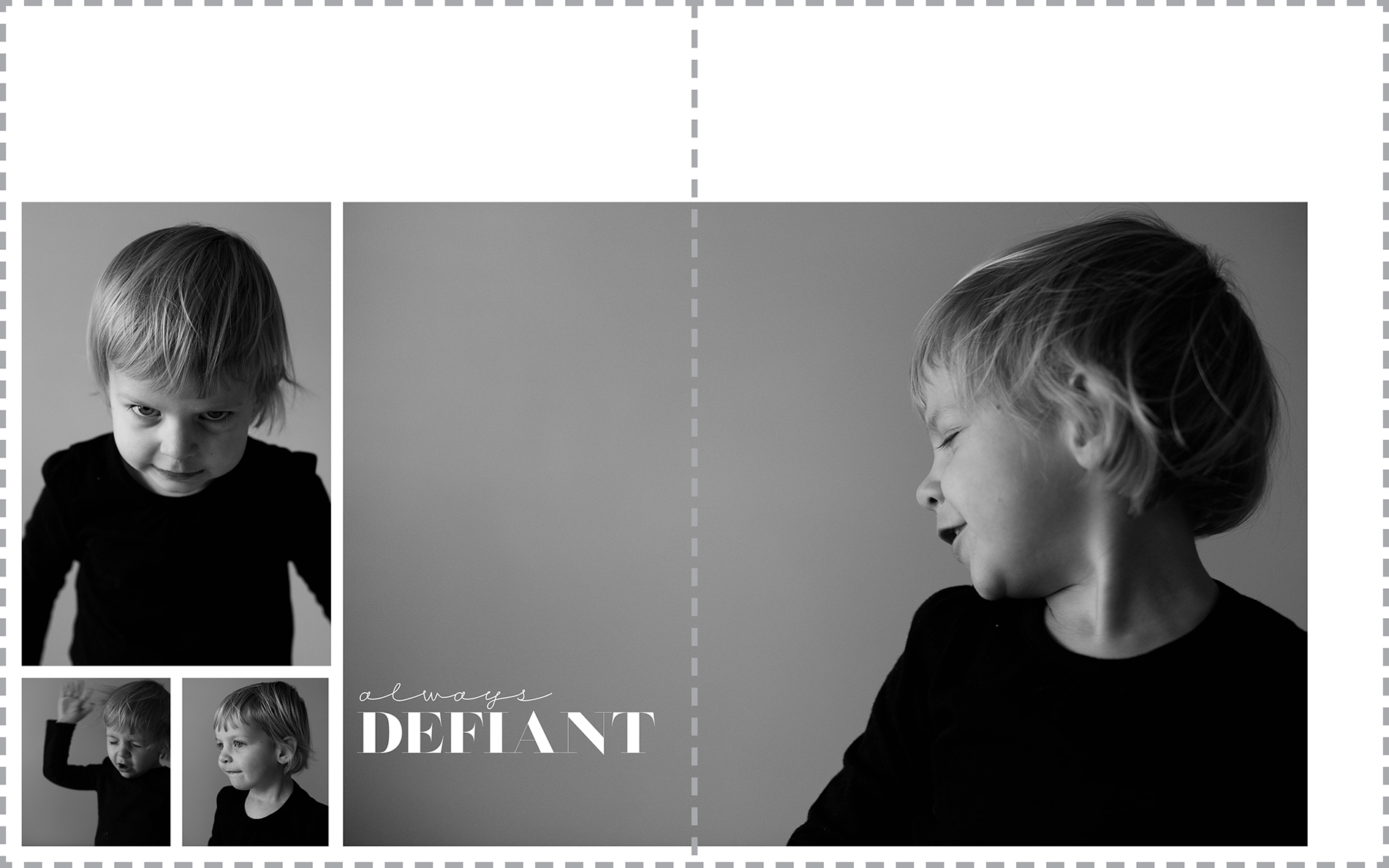
Here’s a sample of the first three tips in one layout:
4: Sketches
One of the best pieces of advice I can share to understanding a layout you love is to sketch it out. As silly as it sounds, I firmly believe that translating something from eye to hand provides a better knowledge of why something works. Next time you see a layout you really like, take out a piece of paper and sketch out the photo boxes and how the positioned on the spread. It may take several tries – but this all helps in the absorbing the mechanics of the layout.
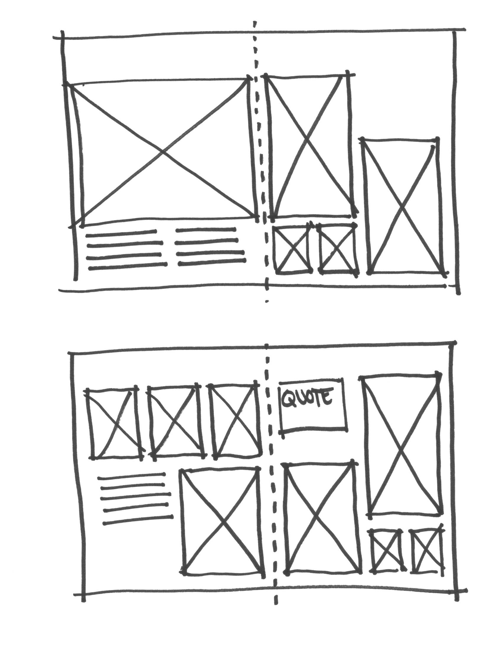
If you want to sketch inspiring layouts, download my free sketch template that is proportional to 3 standard Blurb photo book sizes: Magazine, Portrait and Landscape.
5: Photo Selection
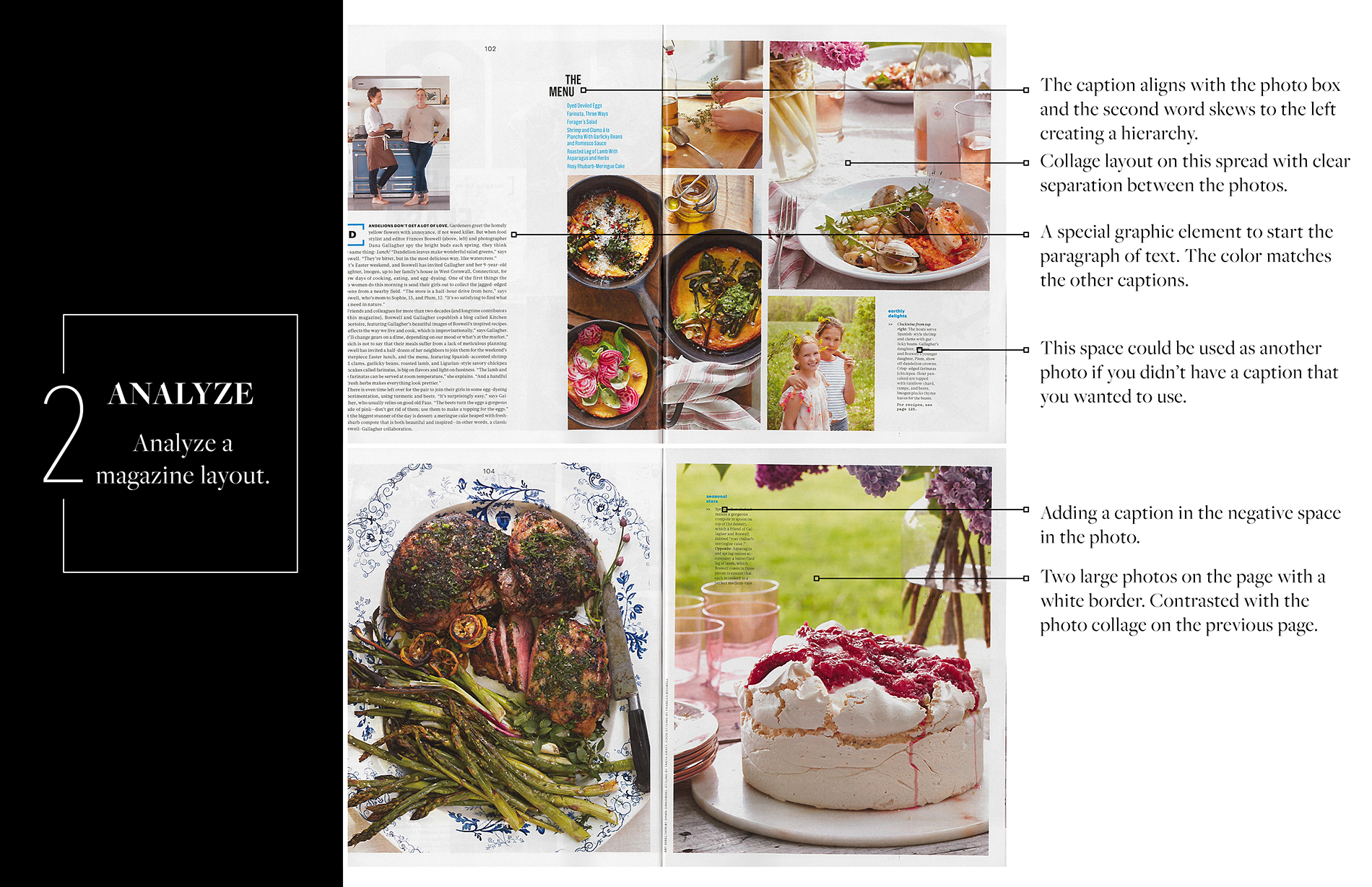
It’s important to take and select photos that have your design vision in mind. In my latest Photo Book Club PDF, I share how to analyze photos used in magazines and examples on pinterest to help you align your photos with a concept.
Here’s one page from my April Photo Book Club PDF.
The full lesson is included in my Photo Book Club Guide which you can check out here.